 我的书签
我的书签
 添加书签
添加书签 移除书签
移除书签- Skeleton骨架屏
- 何时使用
- 代码演示
- API
- Skeleton
- SkeletonAvatarProps
- SkeletonTitleProps
- SkeletonParagraphProps
Skeleton骨架屏
在需要等待加载内容的位置提供一个占位图形组合。
何时使用
网络较慢,需要长时间等待加载处理的情况下。
图文信息内容较多的列表/卡片中。
只适合用在第一次加载数据的场景。
可以被 Spin 完全代替,但是在可用的场景下可以比 Spin 提供更好的视觉效果和用户体验。
代码演示
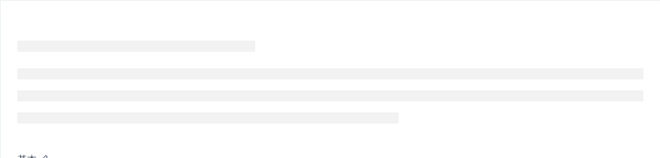
基本
最简单的占位效果。
import { Skeleton } from 'antd';ReactDOM.render(<Skeleton />, mountNode);
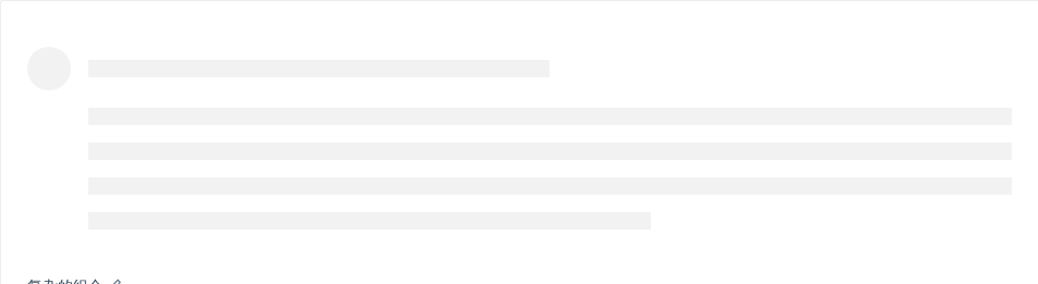
复杂的组合
更复杂的组合。
import { Skeleton } from 'antd';ReactDOM.render(<Skeleton avatar paragraph={{ rows: 4 }} />, mountNode);
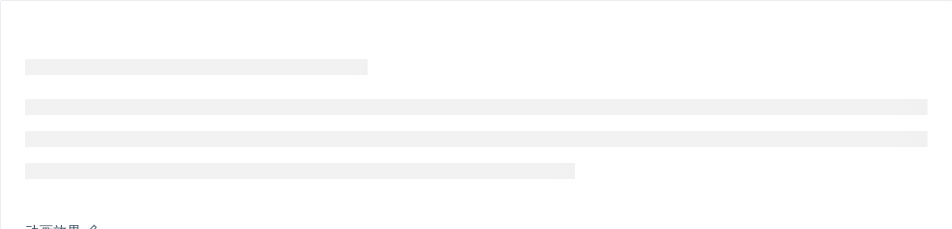
动画效果
显示动画效果。
import { Skeleton } from 'antd';ReactDOM.render(<Skeleton active />, mountNode);
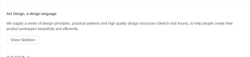
包含子组件
加载占位图包含子组件。
import { Skeleton, Button } from 'antd';class Demo extends React.Component {state = {loading: false,};showSkeleton = () => {this.setState({ loading: true });setTimeout(() => {this.setState({ loading: false });}, 3000);};render() {return (<div className="article"><Skeleton loading={this.state.loading}><div><h4>Ant Design, a design language</h4><p>We supply a series of design principles, practical patterns and high quality designresources (Sketch and Axure), to help people create their product prototypesbeautifully and efficiently.</p></div></Skeleton><Button onClick={this.showSkeleton} disabled={this.state.loading}>Show Skeleton</Button></div>);}}ReactDOM.render(<Demo />, mountNode);
列表
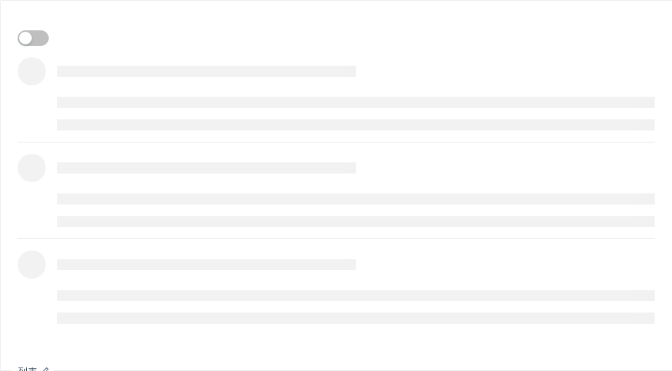
在列表组件中使用加载占位符。
import { Skeleton, Switch, List, Avatar, Icon } from 'antd';const listData = [];for (let i = 0; i < 3; i++) {listData.push({href: 'http://ant.design',title: `ant design part ${i}`,avatar: 'https://zos.alipayobjects.com/rmsportal/ODTLcjxAfvqbxHnVXCYX.png',description:'Ant Design, a design language for background applications, is refined by Ant UED Team.',content:'We supply a series of design principles, practical patterns and high quality design resources (Sketch and Axure), to help people create their product prototypes beautifully and efficiently.',});}const IconText = ({ type, text }) => (<span><Icon type={type} style={{ marginRight: 8 }} />{text}</span>);class App extends React.Component {state = {loading: true,};onChange = checked => {this.setState({ loading: !checked });};render() {const { loading } = this.state;return (<div><Switch checked={!loading} onChange={this.onChange} /><ListitemLayout="vertical"size="large"dataSource={listData}renderItem={item => (<List.Itemkey={item.title}actions={!loading && [<IconText type="star-o" text="156" />,<IconText type="like-o" text="156" />,<IconText type="message" text="2" />,]}extra={!loading && (<imgwidth={272}alt="logo"src="https://gw.alipayobjects.com/zos/rmsportal/mqaQswcyDLcXyDKnZfES.png"/>)}><Skeleton loading={loading} active avatar><List.Item.Metaavatar={<Avatar src={item.avatar} />}title={<a href={item.href}>{item.title}</a>}description={item.description}/>{item.content}</Skeleton></List.Item>)}/></div>);}}ReactDOM.render(<App />, mountNode);
API
Skeleton
| 属性 | 说明 | 类型 | 默认值 |
|---|---|---|---|
| active | 是否展示动画效果 | boolean | false |
| avatar | 是否显示头像占位图 | boolean | SkeletonAvatarProps | false |
| loading | 为 true 时,显示占位图。反之则直接展示子组件 | boolean | - |
| paragraph | 是否显示段落占位图 | boolean | SkeletonParagraphProps | true |
| title | 是否显示标题占位图 | boolean | SkeletonTitleProps | true |
SkeletonAvatarProps
| 属性 | 说明 | 类型 | 默认值 |
|---|---|---|---|
| size | 设置头像占位图的大小 | number | Enum{ 'large', 'small', 'default' } | - |
| shape | 指定头像的形状 | Enum{ 'circle', 'square' } | - |
SkeletonTitleProps
| 属性 | 说明 | 类型 | 默认值 |
|---|---|---|---|
| width | 设置标题占位图的宽度 | number | string | - |
SkeletonParagraphProps
| 属性 | 说明 | 类型 | 默认值 |
|---|---|---|---|
| rows | 设置段落占位图的行数 | number | - |
| width | 设置段落占位图的宽度,若为数组时则为对应的每行宽度,反之则是最后一行的宽度 | number | string | Array<number | string> | - |
