 我的书签
我的书签
 添加书签
添加书签 移除书签
移除书签- Carousel走马灯
- 何时使用
- 代码演示
- API
- 方法
Carousel走马灯
旋转木马,一组轮播的区域。
何时使用
当有一组平级的内容。
当内容空间不足时,可以用走马灯的形式进行收纳,进行轮播展现。
常用于一组图片或卡片轮播。
代码演示
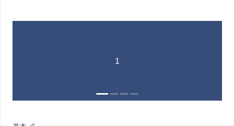
基本
最简单的用法。
import { Carousel } from 'antd';function onChange(a, b, c) {console.log(a, b, c);}ReactDOM.render(<Carousel afterChange={onChange}><div><h3>1</h3></div><div><h3>2</h3></div><div><h3>3</h3></div><div><h3>4</h3></div></Carousel>,mountNode,);
/* For demo */.ant-carousel .slick-slide {text-align: center;height: 160px;line-height: 160px;background: #364d79;overflow: hidden;}.ant-carousel .slick-slide h3 {color: #fff;}
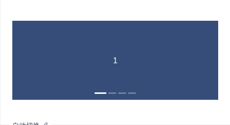
自动切换
定时切换下一张。
import { Carousel } from 'antd';ReactDOM.render(<Carousel autoplay><div><h3>1</h3></div><div><h3>2</h3></div><div><h3>3</h3></div><div><h3>4</h3></div></Carousel>,mountNode,);
/* For demo */.ant-carousel .slick-slide {text-align: center;height: 160px;line-height: 160px;background: #364d79;overflow: hidden;}.ant-carousel .slick-slide h3 {color: #fff;}
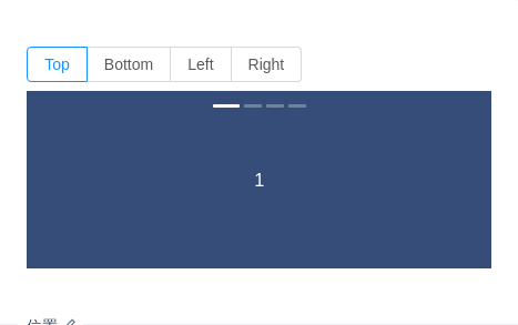
位置
位置有 4 个方向。
import { Carousel, Radio } from 'antd';class PositionCarouselDemo extends React.Component {state = {dotPosition: 'top',};handlePositionChange = ({ target: { value: dotPosition } }) => this.setState({ dotPosition });render() {const { dotPosition } = this.state;return (<div><Radio.GrouponChange={this.handlePositionChange}value={dotPosition}style={{ marginBottom: 8 }}><Radio.Button value="top">Top</Radio.Button><Radio.Button value="bottom">Bottom</Radio.Button><Radio.Button value="left">Left</Radio.Button><Radio.Button value="right">Right</Radio.Button></Radio.Group><Carousel dotPosition={dotPosition}><div><h3>1</h3></div><div><h3>2</h3></div><div><h3>3</h3></div><div><h3>4</h3></div></Carousel></div>);}}ReactDOM.render(<PositionCarouselDemo />, mountNode);
/* For demo */.ant-carousel .slick-slide {text-align: center;height: 160px;line-height: 160px;background: #364d79;overflow: hidden;}.ant-carousel .slick-slide h3 {color: #fff;}
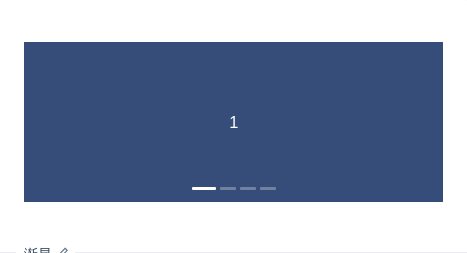
渐显
切换效果为渐显。
import { Carousel } from 'antd';ReactDOM.render(<Carousel effect="fade"><div><h3>1</h3></div><div><h3>2</h3></div><div><h3>3</h3></div><div><h3>4</h3></div></Carousel>,mountNode,);
/* For demo */.ant-carousel .slick-slide {text-align: center;height: 160px;line-height: 160px;background: #364d79;overflow: hidden;}.ant-carousel .slick-slide h3 {color: #fff;}
API
| 参数 | 说明 | 类型 | 默认值 | 版本 |
|---|---|---|---|---|
| afterChange | 切换面板的回调 | function(current) | 无 | |
| autoplay | 是否自动切换 | boolean | false | |
| beforeChange | 切换面板的回调 | function(from, to) | 无 | |
| dotPosition | 面板指示点位置,可选 top bottom left right | string | bottom | 3.17.0 |
| dots | 是否显示面板指示点 | boolean | true | |
| easing | 动画效果 | string | linear | |
| effect | 动画效果函数,可取 scrollx, fade | string | scrollx |
方法
| 名称 | 描述 |
|---|---|
| goTo(slideNumber, dontAnimate) | 切换到指定面板, dontAnimate = true 时,不使用动画 |
| next() | 切换到下一面板 |
| prev() | 切换到上一面板 |
更多参数可参考:https://github.com/akiran/react-slick
