 我的书签
我的书签
 添加书签
添加书签 移除书签
移除书签- Radio单选框
- 何时使用
- 代码演示
- API
- Radio
- RadioGroup
- 方法
- Radio
- Radio
Radio单选框
单选框。
何时使用
用于在多个备选项中选中单个状态。
和 Select 的区别是,Radio 所有选项默认可见,方便用户在比较中选择,因此选项不宜过多。
代码演示
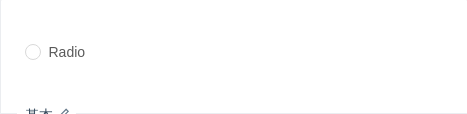
基本
最简单的用法。
import { Radio } from 'antd';ReactDOM.render(<Radio>Radio</Radio>, mountNode);
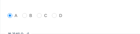
单选组合
一组互斥的 Radio 配合使用。
import { Radio } from 'antd';const RadioGroup = Radio.Group;class App extends React.Component {state = {value: 1,};onChange = e => {console.log('radio checked', e.target.value);this.setState({value: e.target.value,});};render() {return (<RadioGroup onChange={this.onChange} value={this.state.value}><Radio value={1}>A</Radio><Radio value={2}>B</Radio><Radio value={3}>C</Radio><Radio value={4}>D</Radio></RadioGroup>);}}ReactDOM.render(<App />, mountNode);
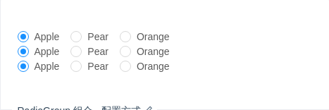
RadioGroup 组合 - 配置方式
通过配置 options 参数来渲染单选框。
import { Radio } from 'antd';const RadioGroup = Radio.Group;const plainOptions = ['Apple', 'Pear', 'Orange'];const options = [{ label: 'Apple', value: 'Apple' },{ label: 'Pear', value: 'Pear' },{ label: 'Orange', value: 'Orange' },];const optionsWithDisabled = [{ label: 'Apple', value: 'Apple' },{ label: 'Pear', value: 'Pear' },{ label: 'Orange', value: 'Orange', disabled: false },];class App extends React.Component {state = {value1: 'Apple',value2: 'Apple',value3: 'Apple',};onChange1 = e => {console.log('radio1 checked', e.target.value);this.setState({value1: e.target.value,});};onChange2 = e => {console.log('radio2 checked', e.target.value);this.setState({value2: e.target.value,});};onChange3 = e => {console.log('radio3 checked', e.target.value);this.setState({value3: e.target.value,});};render() {return (<div><RadioGroup options={plainOptions} onChange={this.onChange1} value={this.state.value1} /><RadioGroup options={options} onChange={this.onChange2} value={this.state.value2} /><RadioGroupoptions={optionsWithDisabled}onChange={this.onChange3}value={this.state.value3}/></div>);}}ReactDOM.render(<App />, mountNode);
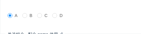
单选组合 - 配合 name 使用
可以为 RadioGroup 配置 name 参数,为组合内的 input 元素赋予相同的 name 属性,使浏览器把 RadioGroup 下的 Radio 真正看作是一组(例如可以通过方向键始终在同一组内更改选项)。
import { Radio } from 'antd';const RadioGroup = Radio.Group;function App() {return (<RadioGroup name="radiogroup" defaultValue={1}><Radio value={1}>A</Radio><Radio value={2}>B</Radio><Radio value={3}>C</Radio><Radio value={4}>D</Radio></RadioGroup>);}ReactDOM.render(<App />, mountNode);
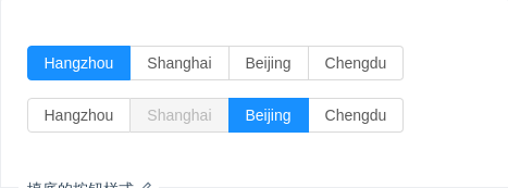
填底的按钮样式
实色填底的单选按钮样式。
import { Radio } from 'antd';ReactDOM.render(<div><div><Radio.Group defaultValue="a" buttonStyle="solid"><Radio.Button value="a">Hangzhou</Radio.Button><Radio.Button value="b">Shanghai</Radio.Button><Radio.Button value="c">Beijing</Radio.Button><Radio.Button value="d">Chengdu</Radio.Button></Radio.Group></div><div style={{ marginTop: 16 }}><Radio.Group defaultValue="c" buttonStyle="solid"><Radio.Button value="a">Hangzhou</Radio.Button><Radio.Button value="b" disabled>Shanghai</Radio.Button><Radio.Button value="c">Beijing</Radio.Button><Radio.Button value="d">Chengdu</Radio.Button></Radio.Group></div></div>,mountNode,);
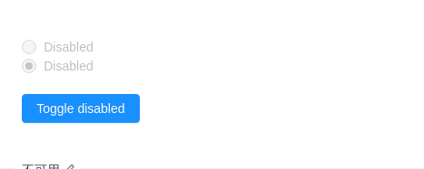
不可用
Radio 不可用。
import { Radio, Button } from 'antd';class App extends React.Component {state = {disabled: true,};toggleDisabled = () => {this.setState({disabled: !this.state.disabled,});};render() {return (<div><Radio defaultChecked={false} disabled={this.state.disabled}>Disabled</Radio><br /><Radio defaultChecked disabled={this.state.disabled}>Disabled</Radio><div style={{ marginTop: 20 }}><Button type="primary" onClick={this.toggleDisabled}>Toggle disabled</Button></div></div>);}}ReactDOM.render(<App />, mountNode);
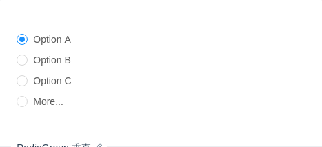
RadioGroup 垂直
垂直的 RadioGroup,配合更多输入框选项。
import { Radio, Input } from 'antd';const RadioGroup = Radio.Group;class App extends React.Component {state = {value: 1,};onChange = e => {console.log('radio checked', e.target.value);this.setState({value: e.target.value,});};render() {const radioStyle = {display: 'block',height: '30px',lineHeight: '30px',};return (<RadioGroup onChange={this.onChange} value={this.state.value}><Radio style={radioStyle} value={1}>Option A</Radio><Radio style={radioStyle} value={2}>Option B</Radio><Radio style={radioStyle} value={3}>Option C</Radio><Radio style={radioStyle} value={4}>More...{this.state.value === 4 ? <Input style={{ width: 100, marginLeft: 10 }} /> : null}</Radio></RadioGroup>);}}ReactDOM.render(<App />, mountNode);
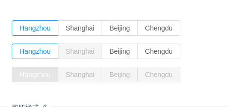
按钮样式
按钮样式的单选组合。
import { Radio } from 'antd';const RadioButton = Radio.Button;const RadioGroup = Radio.Group;function onChange(e) {console.log(`radio checked:${e.target.value}`);}ReactDOM.render(<div><div><RadioGroup onChange={onChange} defaultValue="a"><RadioButton value="a">Hangzhou</RadioButton><RadioButton value="b">Shanghai</RadioButton><RadioButton value="c">Beijing</RadioButton><RadioButton value="d">Chengdu</RadioButton></RadioGroup></div><div style={{ marginTop: 16 }}><RadioGroup onChange={onChange} defaultValue="a"><RadioButton value="a">Hangzhou</RadioButton><RadioButton value="b" disabled>Shanghai</RadioButton><RadioButton value="c">Beijing</RadioButton><RadioButton value="d">Chengdu</RadioButton></RadioGroup></div><div style={{ marginTop: 16 }}><RadioGroup disabled onChange={onChange} defaultValue="a"><RadioButton value="a">Hangzhou</RadioButton><RadioButton value="b">Shanghai</RadioButton><RadioButton value="c">Beijing</RadioButton><RadioButton value="d">Chengdu</RadioButton></RadioGroup></div></div>,mountNode,);
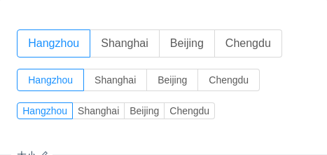
大小
大中小三种组合,可以和表单输入框进行对应配合。
import { Radio } from 'antd';const RadioButton = Radio.Button;const RadioGroup = Radio.Group;ReactDOM.render(<div><div><RadioGroup defaultValue="a" size="large"><RadioButton value="a">Hangzhou</RadioButton><RadioButton value="b">Shanghai</RadioButton><RadioButton value="c">Beijing</RadioButton><RadioButton value="d">Chengdu</RadioButton></RadioGroup></div><div style={{ marginTop: 16 }}><RadioGroup defaultValue="a"><RadioButton value="a">Hangzhou</RadioButton><RadioButton value="b">Shanghai</RadioButton><RadioButton value="c">Beijing</RadioButton><RadioButton value="d">Chengdu</RadioButton></RadioGroup></div><div style={{ marginTop: 16 }}><RadioGroup defaultValue="a" size="small"><RadioButton value="a">Hangzhou</RadioButton><RadioButton value="b">Shanghai</RadioButton><RadioButton value="c">Beijing</RadioButton><RadioButton value="d">Chengdu</RadioButton></RadioGroup></div></div>,mountNode,);
API
Radio
| 参数 | 说明 | 类型 | 默认值 |
|---|---|---|---|
| autoFocus | 自动获取焦点 | boolean | false |
| checked | 指定当前是否选中 | boolean | false |
| defaultChecked | 初始是否选中 | boolean | false |
| value | 根据 value 进行比较,判断是否选中 | any | - |
RadioGroup
单选框组合,用于包裹一组 Radio。
| 参数 | 说明 | 类型 | 默认值 |
|---|---|---|---|
| defaultValue | 默认选中的值 | any | - |
| disabled | 禁选所有子单选器 | boolean | false |
| name | RadioGroup 下所有 input[type="radio"] 的 name 属性 | string | - |
| options | 以配置形式设置子元素 | string[] | Array<{ label: string value: string disabled?: boolean }> | - |
| size | 大小,只对按钮样式生效 | large | default | small | default |
| value | 用于设置当前选中的值 | any | - |
| onChange | 选项变化时的回调函数 | Function(e:Event) | - |
| buttonStyle | RadioButton 的风格样式,目前有描边和填色两种风格 | outline | solid | outline |
方法
Radio
| 名称 | 描述 |
|---|---|
| blur() | 移除焦点 |
| focus() | 获取焦点 |
