 我的书签
我的书签
 添加书签
添加书签 移除书签
移除书签- Input输入框
- 何时使用
- 代码演示
- API
- Input
- Input.TextArea
- Input.Search
- Input.Group
- Input.Password (3.12.0 中新增)
- FAQ
- 为什么我动态改变 prefix/suffix 时,Input 会失去焦点?
- 为什么我动态改变 prefix/suffix 时,Input 会失去焦点?
Input输入框
通过鼠标或键盘输入内容,是最基础的表单域的包装。
何时使用
需要用户输入表单域内容时。
提供组合型输入框,带搜索的输入框,还可以进行大小选择。
代码演示
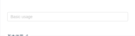
基本使用
基本使用。
import { Input } from 'antd';ReactDOM.render(<Input placeholder="Basic usage" />, mountNode);
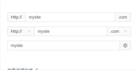
前置/后置标签
用于配置一些固定组合。
import { Input, Select, Icon } from 'antd';const Option = Select.Option;const selectBefore = (<Select defaultValue="Http://" style={{ width: 90 }}><Option value="Http://">Http://</Option><Option value="Https://">Https://</Option></Select>);const selectAfter = (<Select defaultValue=".com" style={{ width: 80 }}><Option value=".com">.com</Option><Option value=".jp">.jp</Option><Option value=".cn">.cn</Option><Option value=".org">.org</Option></Select>);ReactDOM.render(<div><div style={{ marginBottom: 16 }}><Input addonBefore="Http://" addonAfter=".com" defaultValue="mysite" /></div><div style={{ marginBottom: 16 }}><Input addonBefore={selectBefore} addonAfter={selectAfter} defaultValue="mysite" /></div><div style={{ marginBottom: 16 }}><Input addonAfter={<Icon type="setting" />} defaultValue="mysite" /></div></div>,mountNode,);
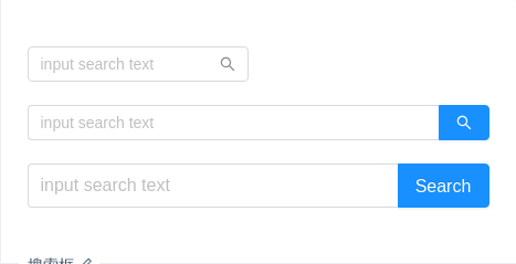
搜索框
带有搜索按钮的输入框,2.5.0 时新增。
import { Input } from 'antd';const Search = Input.Search;ReactDOM.render(<div><Searchplaceholder="input search text"onSearch={value => console.log(value)}style={{ width: 200 }}/><br /><br /><Search placeholder="input search text" onSearch={value => console.log(value)} enterButton /><br /><br /><Searchplaceholder="input search text"enterButton="Search"size="large"onSearch={value => console.log(value)}/></div>,mountNode,);
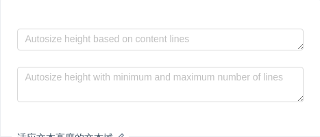
适应文本高度的文本域
autosize 属性适用于 textarea 节点,并且只有高度会自动变化。另外 autosize 可以设定为一个对象,指定最小行数和最大行数。
import { Input } from 'antd';const { TextArea } = Input;ReactDOM.render(<div><TextArea placeholder="Autosize height based on content lines" autosize /><div style={{ margin: '24px 0' }} /><TextAreaplaceholder="Autosize height with minimum and maximum number of lines"autosize={{ minRows: 2, maxRows: 6 }}/></div>,mountNode,);
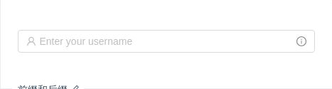
前缀和后缀
在输入框上添加前缀或后缀图标。
import { Input, Tooltip, Icon } from 'antd';ReactDOM.render(<Inputplaceholder="Enter your username"prefix={<Icon type="user" style={{ color: 'rgba(0,0,0,.25)' }} />}suffix={<Tooltip title="Extra information"><Icon type="info-circle" style={{ color: 'rgba(0,0,0,.45)' }} /></Tooltip>}/>,mountNode,);
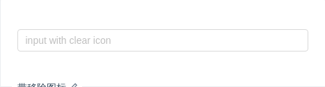
带移除图标
带移除图标的输入框,点击图标删除所有内容。
import { Input } from 'antd';const onChange = e => {console.log(e);};ReactDOM.render(<Input placeholder="input with clear icon" allowClear onChange={onChange} />,mountNode,);
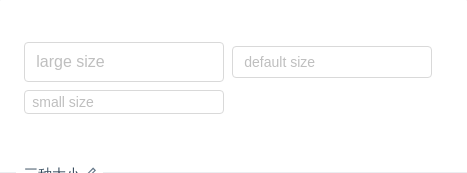
三种大小
我们为 <Input /> 输入框定义了三种尺寸(大、默认、小),高度分别为 40px、32px 和 24px。
import { Input } from 'antd';ReactDOM.render(<div className="example-input"><Input size="large" placeholder="large size" /><Input placeholder="default size" /><Input size="small" placeholder="small size" /></div>,mountNode,);
.example-input .ant-input {width: 200px;margin: 0 8px 8px 0;}
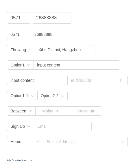
输入框组合
输入框的组合展现。
注意:使用 compact 模式时,不需要通过 Col 来控制宽度。
import { Input, Col, Row, Select, InputNumber, DatePicker, AutoComplete, Cascader } from 'antd';const InputGroup = Input.Group;const Option = Select.Option;const options = [{value: 'zhejiang',label: 'Zhejiang',children: [{value: 'hangzhou',label: 'Hangzhou',children: [{value: 'xihu',label: 'West Lake',},],},],},{value: 'jiangsu',label: 'Jiangsu',children: [{value: 'nanjing',label: 'Nanjing',children: [{value: 'zhonghuamen',label: 'Zhong Hua Men',},],},],},];class CompactDemo extends React.Component {state = {dataSource: [],};handleChange = value => {this.setState({dataSource:!value || value.indexOf('@') >= 0? []: [`${value}@gmail.com`, `${value}@163.com`, `${value}@qq.com`],});};render() {return (<div><InputGroup size="large"><Row gutter={8}><Col span={5}><Input defaultValue="0571" /></Col><Col span={8}><Input defaultValue="26888888" /></Col></Row></InputGroup><br /><InputGroup compact><Input style={{ width: '20%' }} defaultValue="0571" /><Input style={{ width: '30%' }} defaultValue="26888888" /></InputGroup><br /><InputGroup compact><Select defaultValue="Zhejiang"><Option value="Zhejiang">Zhejiang</Option><Option value="Jiangsu">Jiangsu</Option></Select><Input style={{ width: '50%' }} defaultValue="Xihu District, Hangzhou" /></InputGroup><br /><InputGroup compact><Select defaultValue="Option1"><Option value="Option1">Option1</Option><Option value="Option2">Option2</Option></Select><Input style={{ width: '50%' }} defaultValue="input content" /><InputNumber /></InputGroup><br /><InputGroup compact><Input style={{ width: '50%' }} defaultValue="input content" /><DatePicker style={{ width: '50%' }} /></InputGroup><br /><InputGroup compact><Select defaultValue="Option1-1"><Option value="Option1-1">Option1-1</Option><Option value="Option1-2">Option1-2</Option></Select><Select defaultValue="Option2-2"><Option value="Option2-1">Option2-1</Option><Option value="Option2-2">Option2-2</Option></Select></InputGroup><br /><InputGroup compact><Select defaultValue="1"><Option value="1">Between</Option><Option value="2">Except</Option></Select><Input style={{ width: 100, textAlign: 'center' }} placeholder="Minimum" /><Inputstyle={{width: 30,borderLeft: 0,pointerEvents: 'none',backgroundColor: '#fff',}}placeholder="~"disabled/><Input style={{ width: 100, textAlign: 'center', borderLeft: 0 }} placeholder="Maximum" /></InputGroup><br /><InputGroup compact><Select defaultValue="Sign Up"><Option value="Sign Up">Sign Up</Option><Option value="Sign In">Sign In</Option></Select><AutoCompletedataSource={this.state.dataSource}style={{ width: 200 }}onChange={this.handleChange}placeholder="Email"/></InputGroup><br /><InputGroup compact><Select style={{ width: '30%' }} defaultValue="Home"><Option value="Home">Home</Option><Option value="Company">Company</Option></Select><Cascader style={{ width: '70%' }} options={options} placeholder="Select Address" /></InputGroup></div>);}}ReactDOM.render(<CompactDemo />, mountNode);
文本域
用于多行输入。
import { Input } from 'antd';const { TextArea } = Input;ReactDOM.render(<TextArea rows={4} />, mountNode);
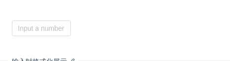
输入时格式化展示
结合 Tooltip 组件,实现一个数值输入框,方便内容超长时的全量展现。
import { Input, Tooltip } from 'antd';function formatNumber(value) {value += '';const list = value.split('.');const prefix = list[0].charAt(0) === '-' ? '-' : '';let num = prefix ? list[0].slice(1) : list[0];let result = '';while (num.length > 3) {result = `,${num.slice(-3)}${result}`;num = num.slice(0, num.length - 3);}if (num) {result = num + result;}return `${prefix}${result}${list[1] ? `.${list[1]}` : ''}`;}class NumericInput extends React.Component {onChange = e => {const { value } = e.target;const reg = /^-?(0|[1-9][0-9]*)(\.[0-9]*)?$/;if ((!Number.isNaN(value) && reg.test(value)) || value === '' || value === '-') {this.props.onChange(value);}};// '.' at the end or only '-' in the input box.onBlur = () => {const { value, onBlur, onChange } = this.props;if (value.charAt(value.length - 1) === '.' || value === '-') {onChange(value.slice(0, -1));}if (onBlur) {onBlur();}};render() {const { value } = this.props;const title = value ? (<span className="numeric-input-title">{value !== '-' ? formatNumber(value) : '-'}</span>) : ('Input a number');return (<Tooltiptrigger={['focus']}title={title}placement="topLeft"overlayClassName="numeric-input"><Input{...this.props}onChange={this.onChange}onBlur={this.onBlur}placeholder="Input a number"maxLength={25}/></Tooltip>);}}class NumericInputDemo extends React.Component {constructor(props) {super(props);this.state = { value: '' };}onChange = value => {this.setState({ value });};render() {return (<NumericInput style={{ width: 120 }} value={this.state.value} onChange={this.onChange} />);}}ReactDOM.render(<NumericInputDemo />, mountNode);
/* to prevent the arrow overflow the popup container,or the height is not enough when content is empty */.numeric-input .ant-tooltip-inner {min-width: 32px;min-height: 37px;}.numeric-input .numeric-input-title {font-size: 14px;}
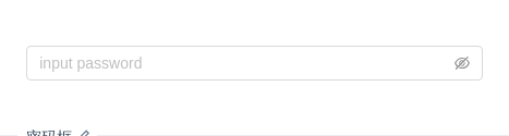
密码框
密码框,版本 3.12.0 中新增。
import { Input } from 'antd';ReactDOM.render(<Input.Password placeholder="input password" />, mountNode);
API
Input
| 参数 | 说明 | 类型 | 默认值 |
|---|---|---|---|
| addonAfter | 带标签的 input,设置后置标签 | string|ReactNode | |
| addonBefore | 带标签的 input,设置前置标签 | string|ReactNode | |
| defaultValue | 输入框默认内容 | string | |
| disabled | 是否禁用状态,默认为 false | boolean | false |
| id | 输入框的 id | string | |
| prefix | 带有前缀图标的 input | string|ReactNode | |
| size | 控件大小。注:标准表单内的输入框大小限制为 large。可选 large default small | string | default |
| suffix | 带有后缀图标的 input | string|ReactNode | |
| type | 声明 input 类型,同原生 input 标签的 type 属性,见:MDN(请直接使用 Input.TextArea 代替 type="textarea")。 | string | text |
| value | 输入框内容 | string | |
| onChange | 输入框内容变化时的回调 | function(e) | |
| onPressEnter | 按下回车的回调 | function(e) | |
| allowClear | 可以点击清除图标删除内容 | boolean |
如果
Input在Form.Item内,并且Form.Item设置了id和options属性,则valuedefaultValue和id属性会被自动设置。
Input 的其他属性和 React 自带的 input 一致。
Input.TextArea
2.12后新增的组件,旧版请使用Input[type=textarea]。
| 参数 | 说明 | 类型 | 默认值 |
|---|---|---|---|
| autosize | 自适应内容高度,可设置为 true|false 或对象:{ minRows: 2, maxRows: 6 } | boolean|object | false |
| defaultValue | 输入框默认内容 | string | |
| value | 输入框内容 | string | |
| onPressEnter | 按下回车的回调 | function(e) |
Input.TextArea 的其他属性和浏览器自带的 textarea 一致。
Input.Search
| 参数 | 说明 | 类型 | 默认值 |
|---|---|---|---|
| enterButton | 是否有确认按钮,可设为按钮文字。该属性会与 addon 冲突。 | boolean|ReactNode | false |
| onSearch | 点击搜索或按下回车键时的回调 | function(value, event) |
其余属性和 Input 一致。
Input.Group
| 参数 | 说明 | 类型 | 默认值 |
|---|---|---|---|
| compact | 是否用紧凑模式 | boolean | false |
| size | Input.Group 中所有的 Input 的大小,可选 large default small | string | default |
<Input.Group><input /><input /></Input.Group>
Input.Password (3.12.0 中新增)
| 参数 | 说明 | 类型 | 默认值 |
|---|---|---|---|
| visibilityToggle | 是否显示切换按钮 | boolean | true |
FAQ
为什么我动态改变 prefix/suffix 时,Input 会失去焦点?
当 Input 动态添加或者删除 prefix/suffix 时,React 会重新创建 DOM 结构而新的 input 是没有焦点的。你可以预设一个空的 <span /> 来保持 DOM 结构不变:
const suffix = condition ? <Icon type="smile" /> : <span />;<Input suffix={suffix} />;
