 我的书签
我的书签
 添加书签
添加书签 移除书签
移除书签- Progress进度条
- 何时使用
- 代码演示
- API
- type="line"
- type="circle"
- type="dashboard"
Progress进度条
展示操作的当前进度。
何时使用
在操作需要较长时间才能完成时,为用户显示该操作的当前进度和状态。
当一个操作会打断当前界面,或者需要在后台运行,且耗时可能超过 2 秒时;
当需要显示一个操作完成的百分比时。
代码演示
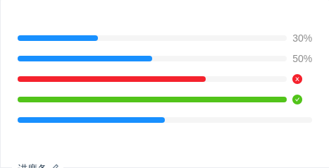
进度条
标准的进度条。
import { Progress } from 'antd';ReactDOM.render(<div><Progress percent={30} /><Progress percent={50} status="active" /><Progress percent={70} status="exception" /><Progress percent={100} /><Progress percent={50} showInfo={false} /></div>,mountNode,);

小型进度条
适合放在较狭窄的区域内。
import { Progress } from 'antd';ReactDOM.render(<div style={{ width: 170 }}><Progress percent={30} size="small" /><Progress percent={50} size="small" status="active" /><Progress percent={70} size="small" status="exception" /><Progress percent={100} size="small" /></div>,mountNode,);

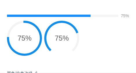
进度圈动态展示
会动的进度条才是好进度条。
import { Progress, Button } from 'antd';const ButtonGroup = Button.Group;class App extends React.Component {state = {percent: 0,};increase = () => {let percent = this.state.percent + 10;if (percent > 100) {percent = 100;}this.setState({ percent });};decline = () => {let percent = this.state.percent - 10;if (percent < 0) {percent = 0;}this.setState({ percent });};render() {return (<div><Progress type="circle" percent={this.state.percent} /><ButtonGroup><Button onClick={this.decline} icon="minus" /><Button onClick={this.increase} icon="plus" /></ButtonGroup></div>);}}ReactDOM.render(<App />, mountNode);

自定义文字格式
format 属性指定格式。
import { Progress } from 'antd';ReactDOM.render(<div><Progress type="circle" percent={75} format={percent => `${percent} Days`} /><Progress type="circle" percent={100} format={() => 'Done'} /></div>,mountNode,);
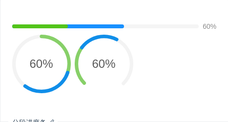
分段进度条
标准的进度条。
import { Tooltip, Progress } from 'antd';ReactDOM.render(<div><Tooltip title="3 done / 3 in progress / 4 to do"><Progress percent={60} successPercent={30} /></Tooltip><Tooltip title="3 done / 3 in progress / 4 to do"><Progress percent={60} successPercent={30} type="circle" /></Tooltip><Tooltip title="3 done / 3 in progress / 4 to do"><Progress percent={60} successPercent={30} type="dashboard" /></Tooltip></div>,mountNode,);
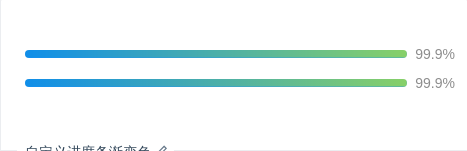
自定义进度条渐变色
linear-gradient 的封装。推荐只传两种颜色。
import { Progress } from 'antd';const Demo = () => (<div><ProgressstrokeColor={{'0%': '#108ee9','100%': '#87d068',}}percent={99.9}/><ProgressstrokeColor={{from: '#108ee9',to: '#87d068',}}percent={99.9}status="active"/></div>);ReactDOM.render(<Demo />, mountNode);
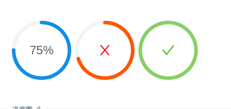
进度圈
圈形的进度。
import { Progress } from 'antd';ReactDOM.render(<div><Progress type="circle" percent={75} /><Progress type="circle" percent={70} status="exception" /><Progress type="circle" percent={100} /></div>,mountNode,);

小型进度圈
小一号的圈形进度。
import { Progress } from 'antd';ReactDOM.render(<div><Progress type="circle" percent={30} width={80} /><Progress type="circle" percent={70} width={80} status="exception" /><Progress type="circle" percent={100} width={80} /></div>,mountNode,);
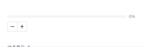
动态展示
会动的进度条才是好进度条。
import { Progress, Button } from 'antd';const ButtonGroup = Button.Group;class App extends React.Component {state = {percent: 0,};increase = () => {let percent = this.state.percent + 10;if (percent > 100) {percent = 100;}this.setState({ percent });};decline = () => {let percent = this.state.percent - 10;if (percent < 0) {percent = 0;}this.setState({ percent });};render() {return (<div><Progress percent={this.state.percent} /><ButtonGroup><Button onClick={this.decline} icon="minus" /><Button onClick={this.increase} icon="plus" /></ButtonGroup></div>);}}ReactDOM.render(<App />, mountNode);

仪表盘
通过设置 type=dashboard,可以很方便地实现仪表盘样式的进度条。
import { Progress } from 'antd';ReactDOM.render(<Progress type="dashboard" percent={75} />, mountNode);
圆角/方角边缘
通过设定 strokeLinecap="square|round" 可以调整进度条边缘的形状。
import { Progress } from 'antd';ReactDOM.render(<div><Progress strokeLinecap="square" percent={75} /><Progress strokeLinecap="square" type="circle" percent={75} /><Progress strokeLinecap="square" type="dashboard" percent={75} /></div>,mountNode,);
API
各类型共用的属性。
| 属性 | 说明 | 类型 | 默认值 |
|---|---|---|---|
| type | 类型,可选 line circle dashboard | string | line |
| format | 内容的模板函数 | function(percent, successPercent) | percent => percent + '%' |
| percent | 百分比 | number | 0 |
| showInfo | 是否显示进度数值或状态图标 | boolean | true |
| status | 状态,可选:success exception active normal | string | - |
| strokeLinecap | Enum{ 'round', 'square' } | round | |
| strokeColor | 进度条的色彩 | string | - |
| successPercent | 已完成的分段百分比 | number | 0 |
type="line"
| 属性 | 说明 | 类型 | 默认值 |
|---|---|---|---|
| strokeWidth | 进度条线的宽度,单位 px | number | 10 |
| strokeColor | 进度条的色彩,传入 object 时为渐变 | string | { from: string; to: string; direction: string } | - |
type="circle"
| 属性 | 说明 | 类型 | 默认值 |
|---|---|---|---|
| width | 圆形进度条画布宽度,单位 px | number | 132 |
| strokeWidth | 圆形进度条线的宽度,单位是进度条画布宽度的百分比 | number | 6 |
type="dashboard"
| 属性 | 说明 | 类型 | 默认值 |
|---|---|---|---|
| width | 仪表盘进度条画布宽度,单位 px | number | 132 |
| strokeWidth | 仪表盘进度条线的宽度,单位是进度条画布宽度的百分比 | number | 6 |
| gapDegree | 仪表盘进度条缺口角度,可取值 0 ~ 360 | number | 0 |
| gapPosition | 仪表盘进度条缺口位置 | Enum{ 'top', 'bottom', 'left', 'right' } | top |
