 我的书签
我的书签
 添加书签
添加书签 移除书签
移除书签- Popconfirm气泡确认框
- 何时使用
- 代码演示
- API
- 注意
Popconfirm气泡确认框
点击元素,弹出气泡式的确认框。
何时使用
目标元素的操作需要用户进一步的确认时,在目标元素附近弹出浮层提示,询问用户。
和 confirm 弹出的全屏居中模态对话框相比,交互形式更轻量。
代码演示
基本
最简单的用法。
import { Popconfirm, message } from 'antd';function confirm(e) {console.log(e);message.success('Click on Yes');}function cancel(e) {console.log(e);message.error('Click on No');}ReactDOM.render(<Popconfirmtitle="Are you sure delete this task?"onConfirm={confirm}onCancel={cancel}okText="Yes"cancelText="No"><a href="#">Delete</a></Popconfirm>,mountNode,);
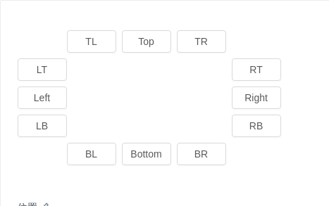
位置
位置有十二个方向。如需箭头指向目标元素中心,可以设置 arrowPointAtCenter。
import { Popconfirm, message, Button } from 'antd';const text = 'Are you sure to delete this task?';function confirm() {message.info('Clicked on Yes.');}ReactDOM.render(<div className="demo"><div style={{ marginLeft: 70, whiteSpace: 'nowrap' }}><Popconfirm placement="topLeft" title={text} onConfirm={confirm} okText="Yes" cancelText="No"><Button>TL</Button></Popconfirm><Popconfirm placement="top" title={text} onConfirm={confirm} okText="Yes" cancelText="No"><Button>Top</Button></Popconfirm><Popconfirmplacement="topRight"title={text}onConfirm={confirm}okText="Yes"cancelText="No"><Button>TR</Button></Popconfirm></div><div style={{ width: 70, float: 'left' }}><Popconfirm placement="leftTop" title={text} onConfirm={confirm} okText="Yes" cancelText="No"><Button>LT</Button></Popconfirm><Popconfirm placement="left" title={text} onConfirm={confirm} okText="Yes" cancelText="No"><Button>Left</Button></Popconfirm><Popconfirmplacement="leftBottom"title={text}onConfirm={confirm}okText="Yes"cancelText="No"><Button>LB</Button></Popconfirm></div><div style={{ width: 70, marginLeft: 304 }}><Popconfirmplacement="rightTop"title={text}onConfirm={confirm}okText="Yes"cancelText="No"><Button>RT</Button></Popconfirm><Popconfirm placement="right" title={text} onConfirm={confirm} okText="Yes" cancelText="No"><Button>Right</Button></Popconfirm><Popconfirmplacement="rightBottom"title={text}onConfirm={confirm}okText="Yes"cancelText="No"><Button>RB</Button></Popconfirm></div><div style={{ marginLeft: 70, clear: 'both', whiteSpace: 'nowrap' }}><Popconfirmplacement="bottomLeft"title={text}onConfirm={confirm}okText="Yes"cancelText="No"><Button>BL</Button></Popconfirm><Popconfirm placement="bottom" title={text} onConfirm={confirm} okText="Yes" cancelText="No"><Button>Bottom</Button></Popconfirm><Popconfirmplacement="bottomRight"title={text}onConfirm={confirm}okText="Yes"cancelText="No"><Button>BR</Button></Popconfirm></div></div>,mountNode,);
自定义 Icon 图标
使用 icon 自定义提示 icon。
import { Popconfirm, Icon } from 'antd';ReactDOM.render(<Popconfirmtitle="Are you sure?"icon={<Icon type="question-circle-o" style={{ color: 'red' }} />}><a href="#">Delete</a></Popconfirm>,mountNode,);
国际化
使用 okText 和 cancelText 自定义按钮文字。
import { Popconfirm } from 'antd';ReactDOM.render(<Popconfirm title="Are you sure?" okText="Yes" cancelText="No"><a href="#">Delete</a></Popconfirm>,mountNode,);
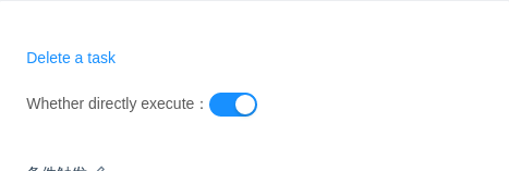
条件触发
可以判断是否需要弹出。
import { Popconfirm, Switch, message } from 'antd';class App extends React.Component {state = {visible: false,condition: true, // Whether meet the condition, if not show popconfirm.};changeCondition = value => {this.setState({ condition: value });};confirm = () => {this.setState({ visible: false });message.success('Next step.');};cancel = () => {this.setState({ visible: false });message.error('Click on cancel.');};handleVisibleChange = visible => {if (!visible) {this.setState({ visible });return;}// Determining condition before show the popconfirm.console.log(this.state.condition);if (this.state.condition) {this.confirm(); // next step} else {this.setState({ visible }); // show the popconfirm}};render() {return (<div><Popconfirmtitle="Are you sure delete this task?"visible={this.state.visible}onVisibleChange={this.handleVisibleChange}onConfirm={this.confirm}onCancel={this.cancel}okText="Yes"cancelText="No"><a href="#">Delete a task</a></Popconfirm><br /><br />Whether directly execute:<Switch defaultChecked onChange={this.changeCondition} /></div>);}}ReactDOM.render(<App />, mountNode);
API
| 参数 | 说明 | 类型 | 默认值 |
|---|---|---|---|
| cancelText | 取消按钮文字 | string | 取消 |
| okText | 确认按钮文字 | string | 确定 |
| okType | 确认按钮类型 | string | primary |
| title | 确认框的描述 | string|ReactNode | 无 |
| onCancel | 点击取消的回调 | function(e) | 无 |
| onConfirm | 点击确认的回调 | function(e) | 无 |
| icon | 自定义弹出气泡 Icon 图标 | ReactNode | <Icon type="exclamation-circle" /> |
更多属性请参考 Tooltip。
注意
请确保 Popconfirm 的子元素能接受 onMouseEnter、onMouseLeave、onFocus、onClick 事件。
