 我的书签
我的书签
 添加书签
添加书签 移除书签
移除书签- Tag标签
- 何时使用
- 代码演示
- API
- Tag
- Tag.CheckableTag
Tag标签
进行标记和分类的小标签。
何时使用
用于标记事物的属性和维度。
进行分类。
代码演示
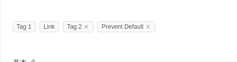
基本
基本标签的用法,可以通过添加 closable 变为可关闭标签。可关闭标签具有 onClose 事件。
import { Tag } from 'antd';function log(e) {console.log(e);}function preventDefault(e) {e.preventDefault();console.log('Clicked! But prevent default.');}ReactDOM.render(<div><Tag>Tag 1</Tag><Tag><a href="https://github.com/ant-design/ant-design/issues/1862">Link</a></Tag><Tag closable onClose={log}>Tag 2</Tag><Tag closable onClose={preventDefault}>Prevent Default</Tag></div>,mountNode,);
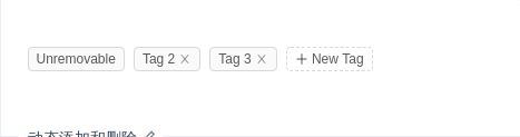
动态添加和删除
用数组生成一组标签,可以动态添加和删除。
import { Tag, Input, Tooltip, Icon } from 'antd';class EditableTagGroup extends React.Component {state = {tags: ['Unremovable', 'Tag 2', 'Tag 3'],inputVisible: false,inputValue: '',};handleClose = removedTag => {const tags = this.state.tags.filter(tag => tag !== removedTag);console.log(tags);this.setState({ tags });};showInput = () => {this.setState({ inputVisible: true }, () => this.input.focus());};handleInputChange = e => {this.setState({ inputValue: e.target.value });};handleInputConfirm = () => {const { inputValue } = this.state;let { tags } = this.state;if (inputValue && tags.indexOf(inputValue) === -1) {tags = [...tags, inputValue];}console.log(tags);this.setState({tags,inputVisible: false,inputValue: '',});};saveInputRef = input => (this.input = input);render() {const { tags, inputVisible, inputValue } = this.state;return (<div>{tags.map((tag, index) => {const isLongTag = tag.length > 20;const tagElem = (<Tag key={tag} closable={index !== 0} onClose={() => this.handleClose(tag)}>{isLongTag ? `${tag.slice(0, 20)}...` : tag}</Tag>);return isLongTag ? (<Tooltip title={tag} key={tag}>{tagElem}</Tooltip>) : (tagElem);})}{inputVisible && (<Inputref={this.saveInputRef}type="text"size="small"style={{ width: 78 }}value={inputValue}onChange={this.handleInputChange}onBlur={this.handleInputConfirm}onPressEnter={this.handleInputConfirm}/>)}{!inputVisible && (<Tag onClick={this.showInput} style={{ background: '#fff', borderStyle: 'dashed' }}><Icon type="plus" /> New Tag</Tag>)}</div>);}}ReactDOM.render(<EditableTagGroup />, mountNode);
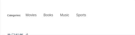
热门标签
选择你感兴趣的话题。
import { Tag } from 'antd';const CheckableTag = Tag.CheckableTag;const tagsFromServer = ['Movies', 'Books', 'Music', 'Sports'];class HotTags extends React.Component {state = {selectedTags: [],};handleChange(tag, checked) {const { selectedTags } = this.state;const nextSelectedTags = checked ? [...selectedTags, tag] : selectedTags.filter(t => t !== tag);console.log('You are interested in: ', nextSelectedTags);this.setState({ selectedTags: nextSelectedTags });}render() {const { selectedTags } = this.state;return (<div><h6 style={{ marginRight: 8, display: 'inline' }}>Categories:</h6>{tagsFromServer.map(tag => (<CheckableTagkey={tag}checked={selectedTags.indexOf(tag) > -1}onChange={checked => this.handleChange(tag, checked)}>{tag}</CheckableTag>))}</div>);}}ReactDOM.render(<HotTags />, mountNode);
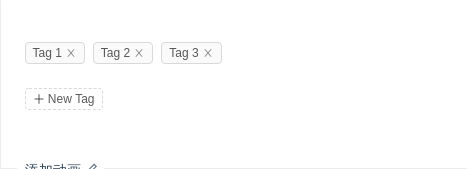
添加动画
使用 rc-tween-one 给标签增加添加或删除动画。
import { Tag, Input, Icon } from 'antd';import { TweenOneGroup } from 'rc-tween-one';class EditableTagGroup extends React.Component {state = {tags: ['Tag 1', 'Tag 2', 'Tag 3'],inputVisible: false,inputValue: '',};handleClose = removedTag => {const tags = this.state.tags.filter(tag => tag !== removedTag);console.log(tags);this.setState({ tags });};showInput = () => {this.setState({ inputVisible: true }, () => this.input.focus());};handleInputChange = e => {this.setState({ inputValue: e.target.value });};handleInputConfirm = () => {const { inputValue } = this.state;let { tags } = this.state;if (inputValue && tags.indexOf(inputValue) === -1) {tags = [...tags, inputValue];}console.log(tags);this.setState({tags,inputVisible: false,inputValue: '',});};saveInputRef = input => (this.input = input);forMap = tag => {const tagElem = (<TagclosableonClose={e => {e.preventDefault();this.handleClose(tag);}}>{tag}</Tag>);return (<span key={tag} style={{ display: 'inline-block' }}>{tagElem}</span>);};render() {const { tags, inputVisible, inputValue } = this.state;const tagChild = tags.map(this.forMap);return (<div><div style={{ marginBottom: 16 }}><TweenOneGroupenter={{scale: 0.8,opacity: 0,type: 'from',duration: 100,onComplete: e => {e.target.style = '';},}}leave={{ opacity: 0, width: 0, scale: 0, duration: 200 }}appear={false}>{tagChild}</TweenOneGroup></div>{inputVisible && (<Inputref={this.saveInputRef}type="text"size="small"style={{ width: 78 }}value={inputValue}onChange={this.handleInputChange}onBlur={this.handleInputConfirm}onPressEnter={this.handleInputConfirm}/>)}{!inputVisible && (<Tag onClick={this.showInput} style={{ background: '#fff', borderStyle: 'dashed' }}><Icon type="plus" /> New Tag</Tag>)}</div>);}}ReactDOM.render(<EditableTagGroup />, mountNode);
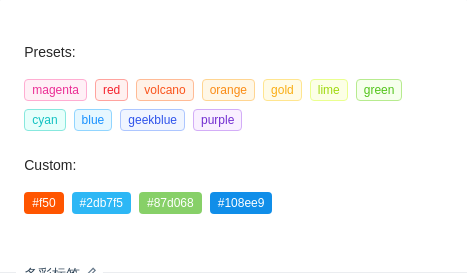
多彩标签
我们添加了多种预设色彩的标签样式,用作不同场景使用。如果预设值不能满足你的需求,可以设置为具体的色值。
import { Tag } from 'antd';ReactDOM.render(<div><h4 style={{ marginBottom: 16 }}>Presets:</h4><div><Tag color="magenta">magenta</Tag><Tag color="red">red</Tag><Tag color="volcano">volcano</Tag><Tag color="orange">orange</Tag><Tag color="gold">gold</Tag><Tag color="lime">lime</Tag><Tag color="green">green</Tag><Tag color="cyan">cyan</Tag><Tag color="blue">blue</Tag><Tag color="geekblue">geekblue</Tag><Tag color="purple">purple</Tag></div><h4 style={{ margin: '16px 0' }}>Custom:</h4><div><Tag color="#f50">#f50</Tag><Tag color="#2db7f5">#2db7f5</Tag><Tag color="#87d068">#87d068</Tag><Tag color="#108ee9">#108ee9</Tag></div></div>,mountNode,);
.ant-tag {margin-bottom: 8px;}
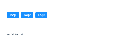
可选择
可通过 CheckableTag 实现类似 Checkbox 的效果,点击切换选中效果。
该组件为完全受控组件,不支持非受控用法。
import { Tag } from 'antd';const { CheckableTag } = Tag;class MyTag extends React.Component {state = { checked: true };handleChange = checked => {this.setState({ checked });};render() {return (<CheckableTag {...this.props} checked={this.state.checked} onChange={this.handleChange} />);}}ReactDOM.render(<div><MyTag>Tag1</MyTag><MyTag>Tag2</MyTag><MyTag>Tag3</MyTag></div>,mountNode,);
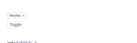
控制关闭状态
通过 visible 属性控制关闭状态。
import { Tag, Button } from 'antd';class Demo extends React.Component {state = {visible: true,};render() {return (<div><Tagclosablevisible={this.state.visible}onClose={() => this.setState({ visible: false })}>Movies</Tag><br /><Button size="small" onClick={() => this.setState({ visible: !this.state.visible })}>Toggle</Button></div>);}}ReactDOM.render(<Demo />, mountNode);
API
Tag
| 参数 | 说明 | 类型 | 默认值 |
|---|---|---|---|
| afterClose | 关闭动画完成后的回调,请使用 onClose, 我们将在下个版本删除此项 | () => void | - |
| closable | 标签是否可以关闭 | boolean | false |
| color | 标签色 | string | - |
| onClose | 关闭时的回调 | (e) => void | - |
| visible | 是否显示标签 | boolean | true |
Tag.CheckableTag
| 参数 | 说明 | 类型 | 默认值 |
|---|---|---|---|
| checked | 设置标签的选中状态 | boolean | false |
| onChange | 点击标签时触发的回调 | (checked) => void | - |
