 我的书签
我的书签
 添加书签
添加书签 移除书签
移除书签- Drawer抽屉
- 何时使用
- 代码演示
- API
Drawer抽屉
屏幕边缘滑出的浮层面板。
何时使用
抽屉从父窗体边缘滑入,覆盖住部分父窗体内容。用户在抽屉内操作时不必离开当前任务,操作完成后,可以平滑地回到到原任务。
当需要一个附加的面板来控制父窗体内容,这个面板在需要时呼出。比如,控制界面展示样式,往界面中添加内容。
当需要在当前任务流中插入临时任务,创建或预览附加内容。比如展示协议条款,创建子对象。
代码演示
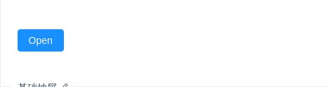
基础抽屉
基础抽屉,点击触发按钮抽屉从右滑出,点击遮罩区关闭
import { Drawer, Button } from 'antd';class App extends React.Component {state = { visible: false };showDrawer = () => {this.setState({visible: true,});};onClose = () => {this.setState({visible: false,});};render() {return (<div><Button type="primary" onClick={this.showDrawer}>Open</Button><Drawertitle="Basic Drawer"placement="right"closable={false}onClose={this.onClose}visible={this.state.visible}><p>Some contents...</p><p>Some contents...</p><p>Some contents...</p></Drawer></div>);}}ReactDOM.render(<App />, mountNode);
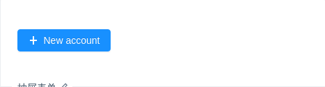
抽屉表单
在抽屉中使用表单。
import { Drawer, Form, Button, Col, Row, Input, Select, DatePicker, Icon } from 'antd';const { Option } = Select;class DrawerForm extends React.Component {state = { visible: false };showDrawer = () => {this.setState({visible: true,});};onClose = () => {this.setState({visible: false,});};render() {const { getFieldDecorator } = this.props.form;return (<div><Button type="primary" onClick={this.showDrawer}><Icon type="plus" /> New account</Button><Drawertitle="Create a new account"width={720}onClose={this.onClose}visible={this.state.visible}><Form layout="vertical" hideRequiredMark><Row gutter={16}><Col span={12}><Form.Item label="Name">{getFieldDecorator('name', {rules: [{ required: true, message: 'Please enter user name' }],})(<Input placeholder="Please enter user name" />)}</Form.Item></Col><Col span={12}><Form.Item label="Url">{getFieldDecorator('url', {rules: [{ required: true, message: 'Please enter url' }],})(<Inputstyle={{ width: '100%' }}addonBefore="http://"addonAfter=".com"placeholder="Please enter url"/>,)}</Form.Item></Col></Row><Row gutter={16}><Col span={12}><Form.Item label="Owner">{getFieldDecorator('owner', {rules: [{ required: true, message: 'Please select an owner' }],})(<Select placeholder="Please select an owner"><Option value="xiao">Xiaoxiao Fu</Option><Option value="mao">Maomao Zhou</Option></Select>,)}</Form.Item></Col><Col span={12}><Form.Item label="Type">{getFieldDecorator('type', {rules: [{ required: true, message: 'Please choose the type' }],})(<Select placeholder="Please choose the type"><Option value="private">Private</Option><Option value="public">Public</Option></Select>,)}</Form.Item></Col></Row><Row gutter={16}><Col span={12}><Form.Item label="Approver">{getFieldDecorator('approver', {rules: [{ required: true, message: 'Please choose the approver' }],})(<Select placeholder="Please choose the approver"><Option value="jack">Jack Ma</Option><Option value="tom">Tom Liu</Option></Select>,)}</Form.Item></Col><Col span={12}><Form.Item label="DateTime">{getFieldDecorator('dateTime', {rules: [{ required: true, message: 'Please choose the dateTime' }],})(<DatePicker.RangePickerstyle={{ width: '100%' }}getPopupContainer={trigger => trigger.parentNode}/>,)}</Form.Item></Col></Row><Row gutter={16}><Col span={24}><Form.Item label="Description">{getFieldDecorator('description', {rules: [{required: true,message: 'please enter url description',},],})(<Input.TextArea rows={4} placeholder="please enter url description" />)}</Form.Item></Col></Row></Form><divstyle={{position: 'absolute',left: 0,bottom: 0,width: '100%',borderTop: '1px solid #e9e9e9',padding: '10px 16px',background: '#fff',textAlign: 'right',}}><Button onClick={this.onClose} style={{ marginRight: 8 }}>Cancel</Button><Button onClick={this.onClose} type="primary">Submit</Button></div></Drawer></div>);}}const App = Form.create()(DrawerForm);ReactDOM.render(<App />, mountNode);
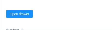
多层抽屉
在抽屉内打开新的抽屉,用以解决多分支任务的复杂状况。
import { Drawer, Button } from 'antd';class App extends React.Component {state = { visible: false, childrenDrawer: false };showDrawer = () => {this.setState({visible: true,});};onClose = () => {this.setState({visible: false,});};showChildrenDrawer = () => {this.setState({childrenDrawer: true,});};onChildrenDrawerClose = () => {this.setState({childrenDrawer: false,});};render() {return (<div><Button type="primary" onClick={this.showDrawer}>Open drawer</Button><Drawertitle="Multi-level drawer"width={520}closable={false}onClose={this.onClose}visible={this.state.visible}><Button type="primary" onClick={this.showChildrenDrawer}>Two-level drawer</Button><Drawertitle="Two-level Drawer"width={320}closable={false}onClose={this.onChildrenDrawerClose}visible={this.state.childrenDrawer}>This is two-level drawer</Drawer><divstyle={{position: 'absolute',bottom: 0,width: '100%',borderTop: '1px solid #e8e8e8',padding: '10px 16px',textAlign: 'right',left: 0,background: '#fff',borderRadius: '0 0 4px 4px',}}><Buttonstyle={{marginRight: 8,}}onClick={this.onClose}>Cancel</Button><Button onClick={this.onClose} type="primary">Submit</Button></div></Drawer></div>);}}ReactDOM.render(<App />, mountNode);
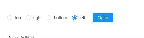
自定义位置
自定义位置,点击触发按钮抽屉从相应的位置滑出,点击遮罩区关闭
import { Drawer, Button, Radio } from 'antd';const RadioGroup = Radio.Group;class App extends React.Component {state = { visible: false, placement: 'left' };showDrawer = () => {this.setState({visible: true,});};onClose = () => {this.setState({visible: false,});};onChange = e => {this.setState({placement: e.target.value,});};render() {return (<div><RadioGroupstyle={{ marginRight: 8 }}defaultValue={this.state.placement}onChange={this.onChange}><Radio value="top">top</Radio><Radio value="right">right</Radio><Radio value="bottom">bottom</Radio><Radio value="left">left</Radio></RadioGroup><Button type="primary" onClick={this.showDrawer}>Open</Button><Drawertitle="Basic Drawer"placement={this.state.placement}closable={false}onClose={this.onClose}visible={this.state.visible}><p>Some contents...</p><p>Some contents...</p><p>Some contents...</p></Drawer></div>);}}ReactDOM.render(<App />, mountNode);
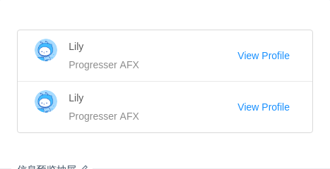
信息预览抽屉
需要快速预览对象概要时使用,点击遮罩区关闭。
import { Drawer, List, Avatar, Divider, Col, Row } from 'antd';const pStyle = {fontSize: 16,color: 'rgba(0,0,0,0.85)',lineHeight: '24px',display: 'block',marginBottom: 16,};const DescriptionItem = ({ title, content }) => (<divstyle={{fontSize: 14,lineHeight: '22px',marginBottom: 7,color: 'rgba(0,0,0,0.65)',}}><pstyle={{marginRight: 8,display: 'inline-block',color: 'rgba(0,0,0,0.85)',}}>{title}:</p>{content}</div>);class App extends React.Component {state = { visible: false };showDrawer = () => {this.setState({visible: true,});};onClose = () => {this.setState({visible: false,});};render() {return (<div><ListdataSource={[{name: 'Lily',},{name: 'Lily',},]}borderedrenderItem={item => (<List.Item key={item.id} actions={[<a onClick={this.showDrawer}>View Profile</a>]}><List.Item.Metaavatar={<Avatar src="https://gw.alipayobjects.com/zos/rmsportal/BiazfanxmamNRoxxVxka.png" />}title={<a href="https://ant.design/index-cn">{item.name}</a>}description="Progresser AFX"/></List.Item>)}/><Drawerwidth={640}placement="right"closable={false}onClose={this.onClose}visible={this.state.visible}><p style={{ ...pStyle, marginBottom: 24 }}>User Profile</p><p style={pStyle}>Personal</p><Row><Col span={12}><DescriptionItem title="Full Name" content="Lily" />{' '}</Col><Col span={12}><DescriptionItem title="Account" content="AntDesign@example.com" /></Col></Row><Row><Col span={12}><DescriptionItem title="City" content="HangZhou" /></Col><Col span={12}><DescriptionItem title="Country" content="China??" /></Col></Row><Row><Col span={12}><DescriptionItem title="Birthday" content="February 2,1900" /></Col><Col span={12}><DescriptionItem title="Website" content="-" /></Col></Row><Row><Col span={24}><DescriptionItemtitle="Message"content="Make things as simple as possible but no simpler."/></Col></Row><Divider /><p style={pStyle}>Company</p><Row><Col span={12}><DescriptionItem title="Position" content="Programmer" /></Col><Col span={12}><DescriptionItem title="Responsibilities" content="Coding" /></Col></Row><Row><Col span={12}><DescriptionItem title="Department" content="AFX" /></Col><Col span={12}><DescriptionItem title="Supervisor" content={<a>Lin</a>} /></Col></Row><Row><Col span={24}><DescriptionItemtitle="Skills"content="C / C + +, data structures, software engineering, operating systems, computer networks, databases, compiler theory, computer architecture, Microcomputer Principle and Interface Technology, Computer English, Java, ASP, etc."/></Col></Row><Divider /><p style={pStyle}>Contacts</p><Row><Col span={12}><DescriptionItem title="Email" content="AntDesign@example.com" /></Col><Col span={12}><DescriptionItem title="Phone Number" content="+86 181 0000 0000" /></Col></Row><Row><Col span={24}><DescriptionItemtitle="Github"content={<a href="http://github.com/ant-design/ant-design/">github.com/ant-design/ant-design/</a>}/></Col></Row></Drawer></div>);}}ReactDOM.render(<App />, mountNode);
API
| 参数 | 说明 | 类型 | 默认值 |
|---|---|---|---|
| closable | 是否显示右上角的关闭按钮 | boolean | true |
| destroyOnClose | 关闭时销毁 Drawer 里的子元素 | boolean | false |
| getContainer | 指定 Drawer 挂载的 HTML 节点 | HTMLElement | () => HTMLElement | Selectors | 'body' |
| maskClosable | 点击蒙层是否允许关闭 | boolean | true |
| mask | 是否展示遮罩 | Boolean | true |
| maskStyle | 遮罩样式 | object | {} |
| style | 可用于设置 Drawer 最外层容器的样式 | object | - |
| bodyStyle | 可用于设置 Drawer 的样式,调整浮层位置等 | object | - |
| title | 标题 | string | ReactNode | - |
| visible | Drawer 是否可见 | boolean | - |
| width | 宽度 | string | number | 256 |
| height | 高度, 在 placement 为 top 或 bottom 时使用 | string | number | 256 |
| className | 对话框外层容器的类名 | string | - |
| zIndex | 设置 Drawer 的 z-index | Number | 1000 |
| placement | 抽屉的方向 | 'top' | 'right' | 'bottom' | 'left' | 'right' |
| onClose | 点击遮罩层或右上角叉或取消按钮的回调 | function(e) | 无 |
| afterVisibleChange | 切换抽屉时动画结束后的回调 | function(visible) | 无 |
