 我的书签
我的书签
 添加书签
添加书签 移除书签
移除书签- Form表单
- 何时使用
- 表单
- 表单域
- 代码演示
- API
- Form
- Form.create(options)
- validateFields/validateFieldsAndScroll
- validateFields 的 callback 参数示例
- Form.createFormField
- this.props.form.getFieldDecorator(id, options)
- 特别注意
- getFieldDecorator(id, options) 参数
- Form.Item
- 校验规则
- 在 TypeScript 中使用
Form表单
具有数据收集、校验和提交功能的表单,包含复选框、单选框、输入框、下拉选择框等元素。
何时使用
用于创建一个实体或收集信息。
需要对输入的数据类型进行校验时。
表单
我们为 form 提供了以下三种排列方式:
水平排列:标签和表单控件水平排列;(默认)
垂直排列:标签和表单控件上下垂直排列;
行内排列:表单项水平行内排列。
表单域
表单一定会包含表单域,表单域可以是输入控件,标准表单域,标签,下拉菜单,文本域等。
这里我们封装了表单域 <Form.Item /> 。
<Form.Item {...props}>{children}</Form.Item>
代码演示

水平登录栏
水平登录栏,常用在顶部导航栏中。
import { Form, Icon, Input, Button } from 'antd';function hasErrors(fieldsError) {return Object.keys(fieldsError).some(field => fieldsError[field]);}class HorizontalLoginForm extends React.Component {componentDidMount() {// To disabled submit button at the beginning.this.props.form.validateFields();}handleSubmit = e => {e.preventDefault();this.props.form.validateFields((err, values) => {if (!err) {console.log('Received values of form: ', values);}});};render() {const { getFieldDecorator, getFieldsError, getFieldError, isFieldTouched } = this.props.form;// Only show error after a field is touched.const usernameError = isFieldTouched('username') && getFieldError('username');const passwordError = isFieldTouched('password') && getFieldError('password');return (<Form layout="inline" onSubmit={this.handleSubmit}><Form.Item validateStatus={usernameError ? 'error' : ''} help={usernameError || ''}>{getFieldDecorator('username', {rules: [{ required: true, message: 'Please input your username!' }],})(<Inputprefix={<Icon type="user" style={{ color: 'rgba(0,0,0,.25)' }} />}placeholder="Username"/>,)}</Form.Item><Form.Item validateStatus={passwordError ? 'error' : ''} help={passwordError || ''}>{getFieldDecorator('password', {rules: [{ required: true, message: 'Please input your Password!' }],})(<Inputprefix={<Icon type="lock" style={{ color: 'rgba(0,0,0,.25)' }} />}type="password"placeholder="Password"/>,)}</Form.Item><Form.Item><Button type="primary" htmlType="submit" disabled={hasErrors(getFieldsError())}>Log in</Button></Form.Item></Form>);}}const WrappedHorizontalLoginForm = Form.create({ name: 'horizontal_login' })(HorizontalLoginForm);ReactDOM.render(<WrappedHorizontalLoginForm />, mountNode);

登录框
普通的登录框,可以容纳更多的元素。
import { Form, Icon, Input, Button, Checkbox } from 'antd';class NormalLoginForm extends React.Component {handleSubmit = e => {e.preventDefault();this.props.form.validateFields((err, values) => {if (!err) {console.log('Received values of form: ', values);}});};render() {const { getFieldDecorator } = this.props.form;return (<Form onSubmit={this.handleSubmit} className="login-form"><Form.Item>{getFieldDecorator('username', {rules: [{ required: true, message: 'Please input your username!' }],})(<Inputprefix={<Icon type="user" style={{ color: 'rgba(0,0,0,.25)' }} />}placeholder="Username"/>,)}</Form.Item><Form.Item>{getFieldDecorator('password', {rules: [{ required: true, message: 'Please input your Password!' }],})(<Inputprefix={<Icon type="lock" style={{ color: 'rgba(0,0,0,.25)' }} />}type="password"placeholder="Password"/>,)}</Form.Item><Form.Item>{getFieldDecorator('remember', {valuePropName: 'checked',initialValue: true,})(<Checkbox>Remember me</Checkbox>)}<a className="login-form-forgot" href="">Forgot password</a><Button type="primary" htmlType="submit" className="login-form-button">Log in</Button>Or <a href="">register now!</a></Form.Item></Form>);}}const WrappedNormalLoginForm = Form.create({ name: 'normal_login' })(NormalLoginForm);ReactDOM.render(<WrappedNormalLoginForm />, mountNode);
#components-form-demo-normal-login .login-form {max-width: 300px;}#components-form-demo-normal-login .login-form-forgot {float: right;}#components-form-demo-normal-login .login-form-button {width: 100%;}
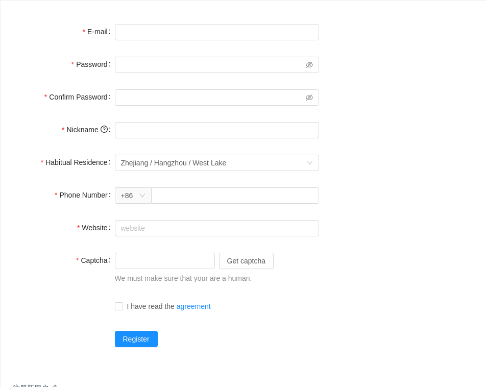
注册新用户
用户填写必须的信息以注册新用户。
import {Form,Input,Tooltip,Icon,Cascader,Select,Row,Col,Checkbox,Button,AutoComplete,} from 'antd';const { Option } = Select;const AutoCompleteOption = AutoComplete.Option;const residences = [{value: 'zhejiang',label: 'Zhejiang',children: [{value: 'hangzhou',label: 'Hangzhou',children: [{value: 'xihu',label: 'West Lake',},],},],},{value: 'jiangsu',label: 'Jiangsu',children: [{value: 'nanjing',label: 'Nanjing',children: [{value: 'zhonghuamen',label: 'Zhong Hua Men',},],},],},];class RegistrationForm extends React.Component {state = {confirmDirty: false,autoCompleteResult: [],};handleSubmit = e => {e.preventDefault();this.props.form.validateFieldsAndScroll((err, values) => {if (!err) {console.log('Received values of form: ', values);}});};handleConfirmBlur = e => {const value = e.target.value;this.setState({ confirmDirty: this.state.confirmDirty || !!value });};compareToFirstPassword = (rule, value, callback) => {const form = this.props.form;if (value && value !== form.getFieldValue('password')) {callback('Two passwords that you enter is inconsistent!');} else {callback();}};validateToNextPassword = (rule, value, callback) => {const form = this.props.form;if (value && this.state.confirmDirty) {form.validateFields(['confirm'], { force: true });}callback();};handleWebsiteChange = value => {let autoCompleteResult;if (!value) {autoCompleteResult = [];} else {autoCompleteResult = ['.com', '.org', '.net'].map(domain => `${value}${domain}`);}this.setState({ autoCompleteResult });};render() {const { getFieldDecorator } = this.props.form;const { autoCompleteResult } = this.state;const formItemLayout = {labelCol: {xs: { span: 24 },sm: { span: 8 },},wrapperCol: {xs: { span: 24 },sm: { span: 16 },},};const tailFormItemLayout = {wrapperCol: {xs: {span: 24,offset: 0,},sm: {span: 16,offset: 8,},},};const prefixSelector = getFieldDecorator('prefix', {initialValue: '86',})(<Select style={{ width: 70 }}><Option value="86">+86</Option><Option value="87">+87</Option></Select>,);const websiteOptions = autoCompleteResult.map(website => (<AutoCompleteOption key={website}>{website}</AutoCompleteOption>));return (<Form {...formItemLayout} onSubmit={this.handleSubmit}><Form.Item label="E-mail">{getFieldDecorator('email', {rules: [{type: 'email',message: 'The input is not valid E-mail!',},{required: true,message: 'Please input your E-mail!',},],})(<Input />)}</Form.Item><Form.Item label="Password" hasFeedback>{getFieldDecorator('password', {rules: [{required: true,message: 'Please input your password!',},{validator: this.validateToNextPassword,},],})(<Input.Password />)}</Form.Item><Form.Item label="Confirm Password" hasFeedback>{getFieldDecorator('confirm', {rules: [{required: true,message: 'Please confirm your password!',},{validator: this.compareToFirstPassword,},],})(<Input.Password onBlur={this.handleConfirmBlur} />)}</Form.Item><Form.Itemlabel={<span>Nickname <Tooltip title="What do you want others to call you?"><Icon type="question-circle-o" /></Tooltip></span>}>{getFieldDecorator('nickname', {rules: [{ required: true, message: 'Please input your nickname!', whitespace: true }],})(<Input />)}</Form.Item><Form.Item label="Habitual Residence">{getFieldDecorator('residence', {initialValue: ['zhejiang', 'hangzhou', 'xihu'],rules: [{ type: 'array', required: true, message: 'Please select your habitual residence!' },],})(<Cascader options={residences} />)}</Form.Item><Form.Item label="Phone Number">{getFieldDecorator('phone', {rules: [{ required: true, message: 'Please input your phone number!' }],})(<Input addonBefore={prefixSelector} style={{ width: '100%' }} />)}</Form.Item><Form.Item label="Website">{getFieldDecorator('website', {rules: [{ required: true, message: 'Please input website!' }],})(<AutoCompletedataSource={websiteOptions}onChange={this.handleWebsiteChange}placeholder="website"><Input /></AutoComplete>,)}</Form.Item><Form.Item label="Captcha" extra="We must make sure that your are a human."><Row gutter={8}><Col span={12}>{getFieldDecorator('captcha', {rules: [{ required: true, message: 'Please input the captcha you got!' }],})(<Input />)}</Col><Col span={12}><Button>Get captcha</Button></Col></Row></Form.Item><Form.Item {...tailFormItemLayout}>{getFieldDecorator('agreement', {valuePropName: 'checked',})(<Checkbox>I have read the <a href="">agreement</a></Checkbox>,)}</Form.Item><Form.Item {...tailFormItemLayout}><Button type="primary" htmlType="submit">Register</Button></Form.Item></Form>);}}const WrappedRegistrationForm = Form.create({ name: 'register' })(RegistrationForm);ReactDOM.render(<WrappedRegistrationForm />, mountNode);
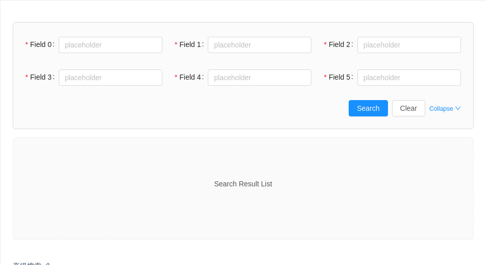
高级搜索
三列栅格式的表单排列方式,常用于数据表格的高级搜索。
有部分定制的样式代码,由于输入标签长度不确定,需要根据具体情况自行调整。
import { Form, Row, Col, Input, Button, Icon } from 'antd';class AdvancedSearchForm extends React.Component {state = {expand: false,};// To generate mock Form.ItemgetFields() {const count = this.state.expand ? 10 : 6;const { getFieldDecorator } = this.props.form;const children = [];for (let i = 0; i < 10; i++) {children.push(<Col span={8} key={i} style={{ display: i < count ? 'block' : 'none' }}><Form.Item label={`Field ${i}`}>{getFieldDecorator(`field-${i}`, {rules: [{required: true,message: 'Input something!',},],})(<Input placeholder="placeholder" />)}</Form.Item></Col>,);}return children;}handleSearch = e => {e.preventDefault();this.props.form.validateFields((err, values) => {console.log('Received values of form: ', values);});};handleReset = () => {this.props.form.resetFields();};toggle = () => {const { expand } = this.state;this.setState({ expand: !expand });};render() {return (<Form className="ant-advanced-search-form" onSubmit={this.handleSearch}><Row gutter={24}>{this.getFields()}</Row><Row><Col span={24} style={{ textAlign: 'right' }}><Button type="primary" htmlType="submit">Search</Button><Button style={{ marginLeft: 8 }} onClick={this.handleReset}>Clear</Button><a style={{ marginLeft: 8, fontSize: 12 }} onClick={this.toggle}>Collapse <Icon type={this.state.expand ? 'up' : 'down'} /></a></Col></Row></Form>);}}const WrappedAdvancedSearchForm = Form.create({ name: 'advanced_search' })(AdvancedSearchForm);ReactDOM.render(<div><WrappedAdvancedSearchForm /><div className="search-result-list">Search Result List</div></div>,mountNode,);
.ant-advanced-search-form {padding: 24px;background: #fbfbfb;border: 1px solid #d9d9d9;border-radius: 6px;}.ant-advanced-search-form .ant-form-item {display: flex;}.ant-advanced-search-form .ant-form-item-control-wrapper {flex: 1;}

弹出层中的新建表单
当用户访问一个展示了某个列表的页面,想新建一项但又不想跳转页面时,可以用 Modal 弹出一个表单,用户填写必要信息后创建新的项。
import { Button, Modal, Form, Input, Radio } from 'antd';const CollectionCreateForm = Form.create({ name: 'form_in_modal' })(// eslint-disable-next-lineclass extends React.Component {render() {const { visible, onCancel, onCreate, form } = this.props;const { getFieldDecorator } = form;return (<Modalvisible={visible}title="Create a new collection"okText="Create"onCancel={onCancel}onOk={onCreate}><Form layout="vertical"><Form.Item label="Title">{getFieldDecorator('title', {rules: [{ required: true, message: 'Please input the title of collection!' }],})(<Input />)}</Form.Item><Form.Item label="Description">{getFieldDecorator('description')(<Input type="textarea" />)}</Form.Item><Form.Item className="collection-create-form_last-form-item">{getFieldDecorator('modifier', {initialValue: 'public',})(<Radio.Group><Radio value="public">Public</Radio><Radio value="private">Private</Radio></Radio.Group>,)}</Form.Item></Form></Modal>);}},);class CollectionsPage extends React.Component {state = {visible: false,};showModal = () => {this.setState({ visible: true });};handleCancel = () => {this.setState({ visible: false });};handleCreate = () => {const form = this.formRef.props.form;form.validateFields((err, values) => {if (err) {return;}console.log('Received values of form: ', values);form.resetFields();this.setState({ visible: false });});};saveFormRef = formRef => {this.formRef = formRef;};render() {return (<div><Button type="primary" onClick={this.showModal}>New Collection</Button><CollectionCreateFormwrappedComponentRef={this.saveFormRef}visible={this.state.visible}onCancel={this.handleCancel}onCreate={this.handleCreate}/></div>);}}ReactDOM.render(<CollectionsPage />, mountNode);
.collection-create-form_last-form-item {margin-bottom: 0;}

动态增减表单项
动态增加、减少表单项。
import { Form, Input, Icon, Button } from 'antd';let id = 0;class DynamicFieldSet extends React.Component {remove = k => {const { form } = this.props;// can use data-binding to getconst keys = form.getFieldValue('keys');// We need at least one passengerif (keys.length === 1) {return;}// can use data-binding to setform.setFieldsValue({keys: keys.filter(key => key !== k),});};add = () => {const { form } = this.props;// can use data-binding to getconst keys = form.getFieldValue('keys');const nextKeys = keys.concat(id++);// can use data-binding to set// important! notify form to detect changesform.setFieldsValue({keys: nextKeys,});};handleSubmit = e => {e.preventDefault();this.props.form.validateFields((err, values) => {if (!err) {const { keys, names } = values;console.log('Received values of form: ', values);console.log('Merged values:', keys.map(key => names[key]));}});};render() {const { getFieldDecorator, getFieldValue } = this.props.form;const formItemLayout = {labelCol: {xs: { span: 24 },sm: { span: 4 },},wrapperCol: {xs: { span: 24 },sm: { span: 20 },},};const formItemLayoutWithOutLabel = {wrapperCol: {xs: { span: 24, offset: 0 },sm: { span: 20, offset: 4 },},};getFieldDecorator('keys', { initialValue: [] });const keys = getFieldValue('keys');const formItems = keys.map((k, index) => (<Form.Item{...(index === 0 ? formItemLayout : formItemLayoutWithOutLabel)}label={index === 0 ? 'Passengers' : ''}required={false}key={k}>{getFieldDecorator(`names[${k}]`, {validateTrigger: ['onChange', 'onBlur'],rules: [{required: true,whitespace: true,message: "Please input passenger's name or delete this field.",},],})(<Input placeholder="passenger name" style={{ width: '60%', marginRight: 8 }} />)}{keys.length > 1 ? (<IconclassName="dynamic-delete-button"type="minus-circle-o"onClick={() => this.remove(k)}/>) : null}</Form.Item>));return (<Form onSubmit={this.handleSubmit}>{formItems}<Form.Item {...formItemLayoutWithOutLabel}><Button type="dashed" onClick={this.add} style={{ width: '60%' }}><Icon type="plus" /> Add field</Button></Form.Item><Form.Item {...formItemLayoutWithOutLabel}><Button type="primary" htmlType="submit">Submit</Button></Form.Item></Form>);}}const WrappedDynamicFieldSet = Form.create({ name: 'dynamic_form_item' })(DynamicFieldSet);ReactDOM.render(<WrappedDynamicFieldSet />, mountNode);
.dynamic-delete-button {cursor: pointer;position: relative;top: 4px;font-size: 24px;color: #999;transition: all 0.3s;}.dynamic-delete-button:hover {color: #777;}.dynamic-delete-button[disabled] {cursor: not-allowed;opacity: 0.5;}
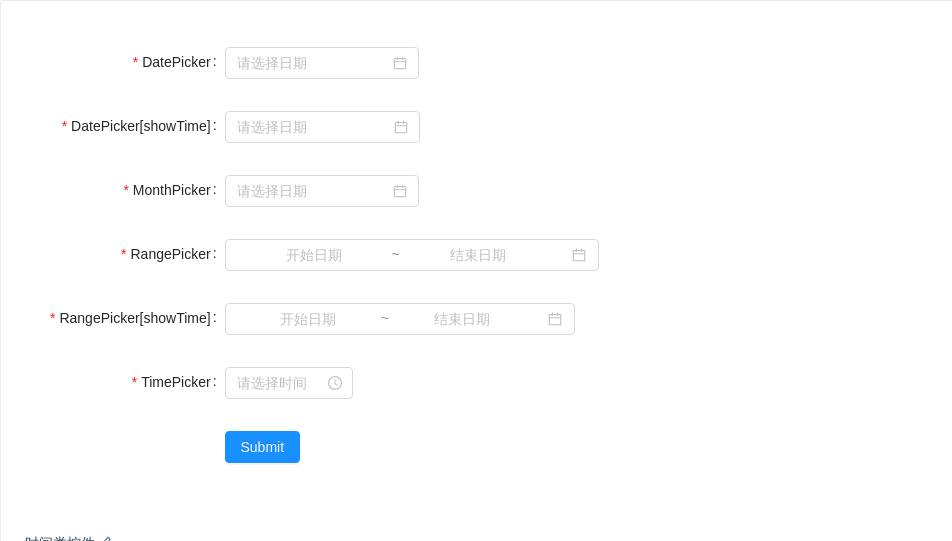
时间类控件
时间类组件的 value 类型为 moment 对象,所以在提交服务器前需要预处理。
import { Form, DatePicker, TimePicker, Button } from 'antd';const { MonthPicker, RangePicker } = DatePicker;class TimeRelatedForm extends React.Component {handleSubmit = e => {e.preventDefault();this.props.form.validateFields((err, fieldsValue) => {if (err) {return;}// Should format date value before submit.const rangeValue = fieldsValue['range-picker'];const rangeTimeValue = fieldsValue['range-time-picker'];const values = {...fieldsValue,'date-picker': fieldsValue['date-picker'].format('YYYY-MM-DD'),'date-time-picker': fieldsValue['date-time-picker'].format('YYYY-MM-DD HH:mm:ss'),'month-picker': fieldsValue['month-picker'].format('YYYY-MM'),'range-picker': [rangeValue[0].format('YYYY-MM-DD'), rangeValue[1].format('YYYY-MM-DD')],'range-time-picker': [rangeTimeValue[0].format('YYYY-MM-DD HH:mm:ss'),rangeTimeValue[1].format('YYYY-MM-DD HH:mm:ss'),],'time-picker': fieldsValue['time-picker'].format('HH:mm:ss'),};console.log('Received values of form: ', values);});};render() {const { getFieldDecorator } = this.props.form;const formItemLayout = {labelCol: {xs: { span: 24 },sm: { span: 8 },},wrapperCol: {xs: { span: 24 },sm: { span: 16 },},};const config = {rules: [{ type: 'object', required: true, message: 'Please select time!' }],};const rangeConfig = {rules: [{ type: 'array', required: true, message: 'Please select time!' }],};return (<Form {...formItemLayout} onSubmit={this.handleSubmit}><Form.Item label="DatePicker">{getFieldDecorator('date-picker', config)(<DatePicker />)}</Form.Item><Form.Item label="DatePicker[showTime]">{getFieldDecorator('date-time-picker', config)(<DatePicker showTime format="YYYY-MM-DD HH:mm:ss" />,)}</Form.Item><Form.Item label="MonthPicker">{getFieldDecorator('month-picker', config)(<MonthPicker />)}</Form.Item><Form.Item label="RangePicker">{getFieldDecorator('range-picker', rangeConfig)(<RangePicker />)}</Form.Item><Form.Item label="RangePicker[showTime]">{getFieldDecorator('range-time-picker', rangeConfig)(<RangePicker showTime format="YYYY-MM-DD HH:mm:ss" />,)}</Form.Item><Form.Item label="TimePicker">{getFieldDecorator('time-picker', config)(<TimePicker />)}</Form.Item><Form.ItemwrapperCol={{xs: { span: 24, offset: 0 },sm: { span: 16, offset: 8 },}}><Button type="primary" htmlType="submit">Submit</Button></Form.Item></Form>);}}const WrappedTimeRelatedForm = Form.create({ name: 'time_related_controls' })(TimeRelatedForm);ReactDOM.render(<WrappedTimeRelatedForm />, mountNode);
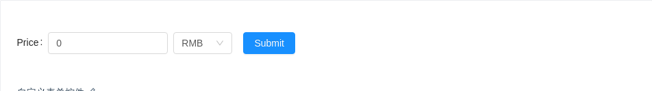
自定义表单控件
自定义或第三方的表单控件,也可以与 Form 组件一起使用。只要该组件遵循以下的约定:
提供受控属性
value或其它与valuePropName的值同名的属性。提供
onChange事件或trigger的值同名的事件。支持 ref:
React@16.3.0 之前只有 Class 组件支持。
React@16.3.0 及之后可以通过 forwardRef 添加 ref 支持。(示例)
import { Form, Input, Select, Button } from 'antd';const { Option } = Select;class PriceInput extends React.Component {static getDerivedStateFromProps(nextProps) {// Should be a controlled component.if ('value' in nextProps) {return {...(nextProps.value || {}),};}return null;}constructor(props) {super(props);const value = props.value || {};this.state = {number: value.number || 0,currency: value.currency || 'rmb',};}handleNumberChange = e => {const number = parseInt(e.target.value || 0, 10);if (Number.isNaN(number)) {return;}if (!('value' in this.props)) {this.setState({ number });}this.triggerChange({ number });};handleCurrencyChange = currency => {if (!('value' in this.props)) {this.setState({ currency });}this.triggerChange({ currency });};triggerChange = changedValue => {// Should provide an event to pass value to Form.const onChange = this.props.onChange;if (onChange) {onChange(Object.assign({}, this.state, changedValue));}};render() {const { size } = this.props;const state = this.state;return (<span><Inputtype="text"size={size}value={state.number}onChange={this.handleNumberChange}style={{ width: '65%', marginRight: '3%' }}/><Selectvalue={state.currency}size={size}style={{ width: '32%' }}onChange={this.handleCurrencyChange}><Option value="rmb">RMB</Option><Option value="dollar">Dollar</Option></Select></span>);}}class Demo extends React.Component {handleSubmit = e => {e.preventDefault();this.props.form.validateFields((err, values) => {if (!err) {console.log('Received values of form: ', values);}});};checkPrice = (rule, value, callback) => {if (value.number > 0) {callback();return;}callback('Price must greater than zero!');};render() {const { getFieldDecorator } = this.props.form;return (<Form layout="inline" onSubmit={this.handleSubmit}><Form.Item label="Price">{getFieldDecorator('price', {initialValue: { number: 0, currency: 'rmb' },rules: [{ validator: this.checkPrice }],})(<PriceInput />)}</Form.Item><Form.Item><Button type="primary" htmlType="submit">Submit</Button></Form.Item></Form>);}}const WrappedDemo = Form.create({ name: 'customized_form_controls' })(Demo);ReactDOM.render(<WrappedDemo />, mountNode);
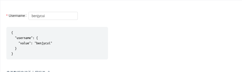
表单数据存储于上层组件
通过使用 onFieldsChange 与 mapPropsToFields,可以把表单的数据存储到上层组件或者 Redux、dva 中,更多可参考 rc-form 示例。
注意:mapPropsToFields 里面返回的表单域数据必须使用 Form.createFormField 包装。
import { Form, Input } from 'antd';const CustomizedForm = Form.create({name: 'global_state',onFieldsChange(props, changedFields) {props.onChange(changedFields);},mapPropsToFields(props) {return {username: Form.createFormField({...props.username,value: props.username.value,}),};},onValuesChange(_, values) {console.log(values);},})(props => {const { getFieldDecorator } = props.form;return (<Form layout="inline"><Form.Item label="Username">{getFieldDecorator('username', {rules: [{ required: true, message: 'Username is required!' }],})(<Input />)}</Form.Item></Form>);});class Demo extends React.Component {state = {fields: {username: {value: 'benjycui',},},};handleFormChange = changedFields => {this.setState(({ fields }) => ({fields: { ...fields, ...changedFields },}));};render() {const fields = this.state.fields;return (<div><CustomizedForm {...fields} onChange={this.handleFormChange} /><pre className="language-bash">{JSON.stringify(fields, null, 2)}</pre></div>);}}ReactDOM.render(<Demo />, mountNode);

自行处理表单数据
使用 Form.create 处理后的表单具有自动收集数据并校验的功能,但如果您不需要这个功能,或者默认的行为无法满足业务需求,可以选择不使用 Form.create 并自行处理数据。
import { Form, InputNumber } from 'antd';function validatePrimeNumber(number) {if (number === 11) {return {validateStatus: 'success',errorMsg: null,};}return {validateStatus: 'error',errorMsg: 'The prime between 8 and 12 is 11!',};}class RawForm extends React.Component {state = {number: {value: 11,},};handleNumberChange = value => {this.setState({number: {...validatePrimeNumber(value),value,},});};render() {const formItemLayout = {labelCol: { span: 7 },wrapperCol: { span: 12 },};const number = this.state.number;const tips ='A prime is a natural number greater than 1 that has no positive divisors other than 1 and itself.';return (<Form><Form.Item{...formItemLayout}label="Prime between 8 & 12"validateStatus={number.validateStatus}help={number.errorMsg || tips}><InputNumber min={8} max={12} value={number.value} onChange={this.handleNumberChange} /></Form.Item></Form>);}}ReactDOM.render(<RawForm />, mountNode);
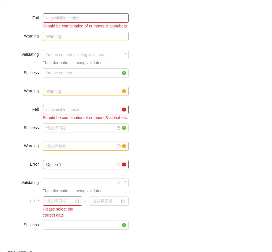
自定义校验
我们提供了 validateStatus help hasFeedback 等属性,你可以不需要使用 Form.create 和 getFieldDecorator,自己定义校验的时机和内容。
validateStatus: 校验状态,可选 'success', 'warning', 'error', 'validating'。hasFeedback:用于给输入框添加反馈图标。help:设置校验文案。
import { Form, Input, DatePicker, TimePicker, Select, Cascader, InputNumber } from 'antd';const { Option } = Select;const formItemLayout = {labelCol: {xs: { span: 24 },sm: { span: 5 },},wrapperCol: {xs: { span: 24 },sm: { span: 12 },},};ReactDOM.render(<Form {...formItemLayout}><Form.Itemlabel="Fail"validateStatus="error"help="Should be combination of numbers & alphabets"><Input placeholder="unavailable choice" id="error" /></Form.Item><Form.Item label="Warning" validateStatus="warning"><Input placeholder="Warning" id="warning" /></Form.Item><Form.Itemlabel="Validating"hasFeedbackvalidateStatus="validating"help="The information is being validated..."><Input placeholder="I'm the content is being validated" id="validating" /></Form.Item><Form.Item label="Success" hasFeedback validateStatus="success"><Input placeholder="I'm the content" id="success" /></Form.Item><Form.Item label="Warning" hasFeedback validateStatus="warning"><Input placeholder="Warning" id="warning2" /></Form.Item><Form.Itemlabel="Fail"hasFeedbackvalidateStatus="error"help="Should be combination of numbers & alphabets"><Input placeholder="unavailable choice" id="error2" /></Form.Item><Form.Item label="Success" hasFeedback validateStatus="success"><DatePicker style={{ width: '100%' }} /></Form.Item><Form.Item label="Warning" hasFeedback validateStatus="warning"><TimePicker style={{ width: '100%' }} /></Form.Item><Form.Item label="Error" hasFeedback validateStatus="error"><Select defaultValue="1"><Option value="1">Option 1</Option><Option value="2">Option 2</Option><Option value="3">Option 3</Option></Select></Form.Item><Form.Itemlabel="Validating"hasFeedbackvalidateStatus="validating"help="The information is being validated..."><Cascader defaultValue={['1']} options={[]} /></Form.Item><Form.Item label="inline" style={{ marginBottom: 0 }}><Form.ItemvalidateStatus="error"help="Please select the correct date"style={{ display: 'inline-block', width: 'calc(50% - 12px)' }}><DatePicker /></Form.Item><span style={{ display: 'inline-block', width: '24px', textAlign: 'center' }}>-</span><Form.Item style={{ display: 'inline-block', width: 'calc(50% - 12px)' }}><DatePicker /></Form.Item></Form.Item><Form.Item label="Success" hasFeedback validateStatus="success"><InputNumber style={{ width: '100%' }} /></Form.Item></Form>,mountNode,);
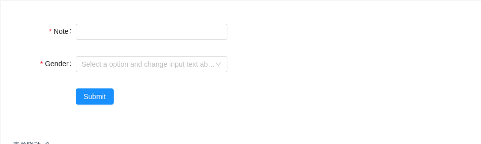
表单联动
使用 setFieldsValue 来动态设置其他控件的值。
import { Form, Select, Input, Button } from 'antd';const { Option } = Select;class App extends React.Component {handleSubmit = e => {e.preventDefault();this.props.form.validateFields((err, values) => {if (!err) {console.log('Received values of form: ', values);}});};handleSelectChange = value => {console.log(value);this.props.form.setFieldsValue({note: `Hi, ${value === 'male' ? 'man' : 'lady'}!`,});};render() {const { getFieldDecorator } = this.props.form;return (<Form labelCol={{ span: 5 }} wrapperCol={{ span: 12 }} onSubmit={this.handleSubmit}><Form.Item label="Note">{getFieldDecorator('note', {rules: [{ required: true, message: 'Please input your note!' }],})(<Input />)}</Form.Item><Form.Item label="Gender">{getFieldDecorator('gender', {rules: [{ required: true, message: 'Please select your gender!' }],})(<Selectplaceholder="Select a option and change input text above"onChange={this.handleSelectChange}><Option value="male">male</Option><Option value="female">female</Option></Select>,)}</Form.Item><Form.Item wrapperCol={{ span: 12, offset: 5 }}><Button type="primary" htmlType="submit">Submit</Button></Form.Item></Form>);}}const WrappedApp = Form.create({ name: 'coordinated' })(App);ReactDOM.render(<WrappedApp />, mountNode);
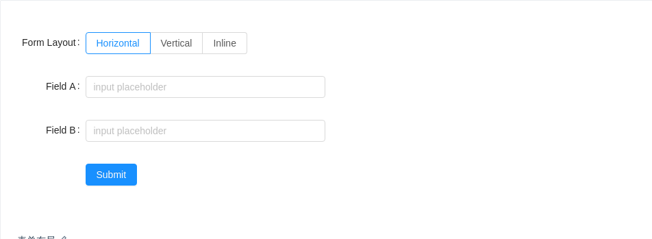
表单布局
表单有三种布局。
import { Form, Input, Button, Radio } from 'antd';class FormLayoutDemo extends React.Component {constructor() {super();this.state = {formLayout: 'horizontal',};}handleFormLayoutChange = e => {this.setState({ formLayout: e.target.value });};render() {const { formLayout } = this.state;const formItemLayout =formLayout === 'horizontal'? {labelCol: { span: 4 },wrapperCol: { span: 14 },}: null;const buttonItemLayout =formLayout === 'horizontal'? {wrapperCol: { span: 14, offset: 4 },}: null;return (<div><Form layout={formLayout}><Form.Item label="Form Layout" {...formItemLayout}><Radio.Group defaultValue="horizontal" onChange={this.handleFormLayoutChange}><Radio.Button value="horizontal">Horizontal</Radio.Button><Radio.Button value="vertical">Vertical</Radio.Button><Radio.Button value="inline">Inline</Radio.Button></Radio.Group></Form.Item><Form.Item label="Field A" {...formItemLayout}><Input placeholder="input placeholder" /></Form.Item><Form.Item label="Field B" {...formItemLayout}><Input placeholder="input placeholder" /></Form.Item><Form.Item {...buttonItemLayout}><Button type="primary">Submit</Button></Form.Item></Form></div>);}}ReactDOM.render(<FormLayoutDemo />, mountNode);
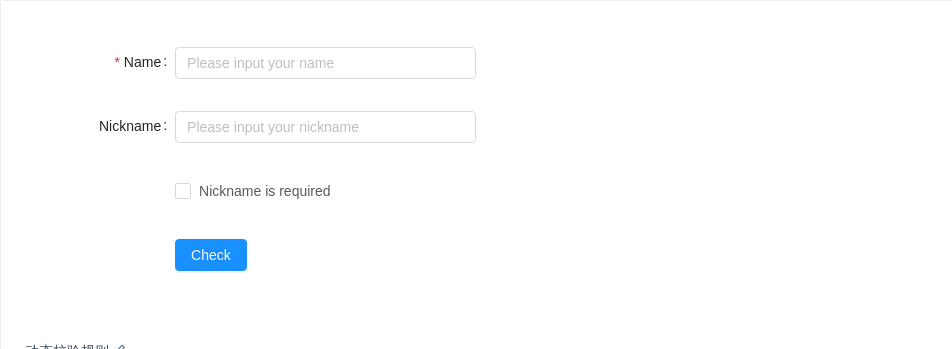
动态校验规则
根据不同情况执行不同的校验规则。
import { Form, Input, Button, Checkbox } from 'antd';const formItemLayout = {labelCol: { span: 4 },wrapperCol: { span: 8 },};const formTailLayout = {labelCol: { span: 4 },wrapperCol: { span: 8, offset: 4 },};class DynamicRule extends React.Component {state = {checkNick: false,};check = () => {this.props.form.validateFields(err => {if (!err) {console.info('success');}});};handleChange = e => {this.setState({checkNick: e.target.checked,},() => {this.props.form.validateFields(['nickname'], { force: true });},);};render() {const { getFieldDecorator } = this.props.form;return (<div><Form.Item {...formItemLayout} label="Name">{getFieldDecorator('username', {rules: [{required: true,message: 'Please input your name',},],})(<Input placeholder="Please input your name" />)}</Form.Item><Form.Item {...formItemLayout} label="Nickname">{getFieldDecorator('nickname', {rules: [{required: this.state.checkNick,message: 'Please input your nickname',},],})(<Input placeholder="Please input your nickname" />)}</Form.Item><Form.Item {...formTailLayout}><Checkbox checked={this.state.checkNick} onChange={this.handleChange}>Nickname is required</Checkbox></Form.Item><Form.Item {...formTailLayout}><Button type="primary" onClick={this.check}>Check</Button></Form.Item></div>);}}const WrappedDynamicRule = Form.create({ name: 'dynamic_rule' })(DynamicRule);ReactDOM.render(<WrappedDynamicRule />, mountNode);
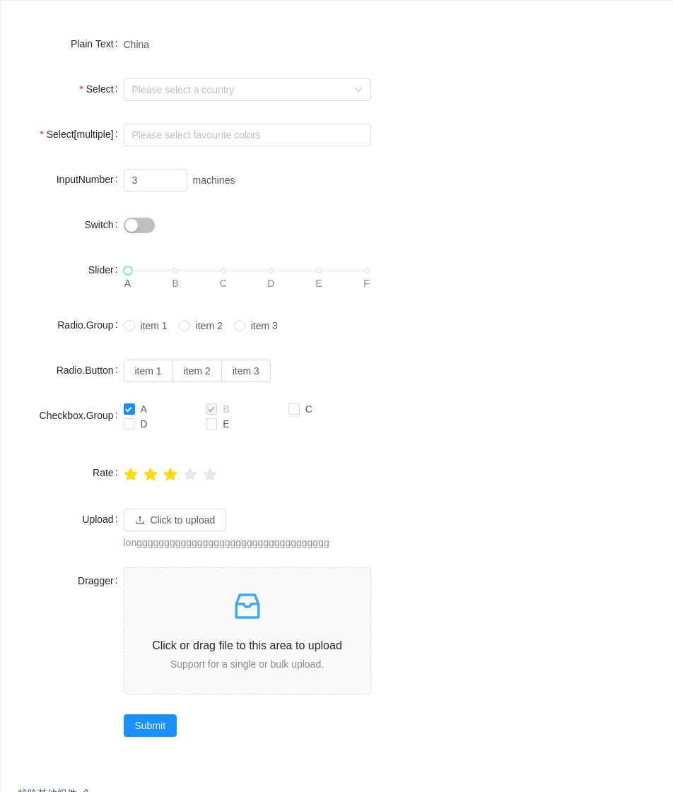
校验其他组件
以上演示没有出现的表单控件对应的校验演示。
import {Form,Select,InputNumber,Switch,Radio,Slider,Button,Upload,Icon,Rate,Checkbox,Row,Col,} from 'antd';const { Option } = Select;class Demo extends React.Component {handleSubmit = e => {e.preventDefault();this.props.form.validateFields((err, values) => {if (!err) {console.log('Received values of form: ', values);}});};normFile = e => {console.log('Upload event:', e);if (Array.isArray(e)) {return e;}return e && e.fileList;};render() {const { getFieldDecorator } = this.props.form;const formItemLayout = {labelCol: { span: 6 },wrapperCol: { span: 14 },};return (<Form {...formItemLayout} onSubmit={this.handleSubmit}><Form.Item label="Plain Text"><span className="ant-form-text">China</span></Form.Item><Form.Item label="Select" hasFeedback>{getFieldDecorator('select', {rules: [{ required: true, message: 'Please select your country!' }],})(<Select placeholder="Please select a country"><Option value="china">China</Option><Option value="usa">U.S.A</Option></Select>,)}</Form.Item><Form.Item label="Select[multiple]">{getFieldDecorator('select-multiple', {rules: [{ required: true, message: 'Please select your favourite colors!', type: 'array' },],})(<Select mode="multiple" placeholder="Please select favourite colors"><Option value="red">Red</Option><Option value="green">Green</Option><Option value="blue">Blue</Option></Select>,)}</Form.Item><Form.Item label="InputNumber">{getFieldDecorator('input-number', { initialValue: 3 })(<InputNumber min={1} max={10} />)}<span className="ant-form-text"> machines</span></Form.Item><Form.Item label="Switch">{getFieldDecorator('switch', { valuePropName: 'checked' })(<Switch />)}</Form.Item><Form.Item label="Slider">{getFieldDecorator('slider')(<Slidermarks={{0: 'A',20: 'B',40: 'C',60: 'D',80: 'E',100: 'F',}}/>,)}</Form.Item><Form.Item label="Radio.Group">{getFieldDecorator('radio-group')(<Radio.Group><Radio value="a">item 1</Radio><Radio value="b">item 2</Radio><Radio value="c">item 3</Radio></Radio.Group>,)}</Form.Item><Form.Item label="Radio.Button">{getFieldDecorator('radio-button')(<Radio.Group><Radio.Button value="a">item 1</Radio.Button><Radio.Button value="b">item 2</Radio.Button><Radio.Button value="c">item 3</Radio.Button></Radio.Group>,)}</Form.Item><Form.Item label="Checkbox.Group">{getFieldDecorator('checkbox-group', {initialValue: ['A', 'B'],})(<Checkbox.Group style={{ width: '100%' }}><Row><Col span={8}><Checkbox value="A">A</Checkbox></Col><Col span={8}><Checkbox disabled value="B">B</Checkbox></Col><Col span={8}><Checkbox value="C">C</Checkbox></Col><Col span={8}><Checkbox value="D">D</Checkbox></Col><Col span={8}><Checkbox value="E">E</Checkbox></Col></Row></Checkbox.Group>,)}</Form.Item><Form.Item label="Rate">{getFieldDecorator('rate', {initialValue: 3.5,})(<Rate />)}</Form.Item><Form.Item label="Upload" extra="longgggggggggggggggggggggggggggggggggg">{getFieldDecorator('upload', {valuePropName: 'fileList',getValueFromEvent: this.normFile,})(<Upload name="logo" action="/upload.do" listType="picture"><Button><Icon type="upload" /> Click to upload</Button></Upload>,)}</Form.Item><Form.Item label="Dragger"><div className="dropbox">{getFieldDecorator('dragger', {valuePropName: 'fileList',getValueFromEvent: this.normFile,})(<Upload.Dragger name="files" action="/upload.do"><p className="ant-upload-drag-icon"><Icon type="inbox" /></p><p className="ant-upload-text">Click or drag file to this area to upload</p><p className="ant-upload-hint">Support for a single or bulk upload.</p></Upload.Dragger>,)}</div></Form.Item><Form.Item wrapperCol={{ span: 12, offset: 6 }}><Button type="primary" htmlType="submit">Submit</Button></Form.Item></Form>);}}const WrappedDemo = Form.create({ name: 'validate_other' })(Demo);ReactDOM.render(<WrappedDemo />, mountNode);
#components-form-demo-validate-other .dropbox {height: 180px;line-height: 1.5;}
API
Form
更多示例参考 rc-form。
| 参数 | 说明 | 类型 | 默认值 |
|---|---|---|---|
| form | 经 Form.create() 包装过的组件会自带 this.props.form 属性 | object | - |
| hideRequiredMark | 隐藏所有表单项的必选标记 | Boolean | false |
| labelAlign | label 标签的文本对齐方式 | 'left' | 'right' | 'right' |
| labelCol | (3.14.0 新增,之前的版本只能设置到 FormItem 上。)label 标签布局,同 <Col> 组件,设置 span offset 值,如 {span: 3, offset: 12} 或 sm: {span: 3, offset: 12} | object | |
| layout | 表单布局 | 'horizontal'|'vertical'|'inline' | 'horizontal' |
| onSubmit | 数据验证成功后回调事件 | Function(e:Event) | |
| wrapperCol | (3.14.0 新增,之前的版本只能设置到 FormItem 上。)需要为输入控件设置布局样式时,使用该属性,用法同 labelCol | object | |
| colon | 配置 Form.Item 的 colon 的默认值 | boolean | true |
Form.create(options)
使用方式如下:
class CustomizedForm extends React.Component {}CustomizedForm = Form.create({})(CustomizedForm);
options 的配置项如下。
| 参数 | 说明 | 类型 |
|---|---|---|
| mapPropsToFields | 把父组件的属性映射到表单项上(如:把 Redux store 中的值读出),需要对返回值中的表单域数据用 Form.createFormField 标记,注意表单项将变成受控组件, error 等也需要一并手动传入 | (props) => ({ [fieldName]: FormField { value } }) |
| name | 设置表单域内字段 id 的前缀 | - |
| validateMessages | 默认校验信息,可用于把默认错误信息改为中文等,格式与 newMessages 返回值一致 | Object { [nested.path]: String } |
| onFieldsChange | 当 Form.Item 子节点的值(包括 error)发生改变时触发,可以把对应的值转存到 Redux store | Function(props, changedFields, allFields) |
| onValuesChange | 任一表单域的值发生改变时的回调 | (props, changedValues, allValues) => void |
经过 Form.create 之后如果要拿到 ref,可以使用 rc-form 提供的 wrappedComponentRef,详细内容可以查看这里。
class CustomizedForm extends React.Component { ... }// use wrappedComponentRefconst EnhancedForm = Form.create()(CustomizedForm);<EnhancedForm wrappedComponentRef={(form) => this.form = form} />this.form // => The instance of CustomizedForm
经过 Form.create 包装的组件将会自带 this.props.form 属性,this.props.form 提供的 API 如下:
注意:使用
getFieldsValuegetFieldValuesetFieldsValue等时,应确保对应的 field 已经用getFieldDecorator注册过了。
| 方法 | 说明 | 类型 |
|---|---|---|
| getFieldDecorator | 用于和表单进行双向绑定,详见下方描述 | |
| getFieldError | 获取某个输入控件的 Error | Function(name) |
| getFieldsError | 获取一组输入控件的 Error ,如不传入参数,则获取全部组件的 Error | Function([names: string[]]) |
| getFieldsValue | 获取一组输入控件的值,如不传入参数,则获取全部组件的值 | Function([fieldNames: string[]]) |
| getFieldValue | 获取一个输入控件的值 | Function(fieldName: string) |
| isFieldsTouched | 判断是否任一输入控件经历过 getFieldDecorator 的值收集时机 options.trigger | (names?: string[]) => boolean |
| isFieldTouched | 判断一个输入控件是否经历过 getFieldDecorator 的值收集时机 options.trigger | (name: string) => boolean |
| isFieldValidating | 判断一个输入控件是否在校验状态 | Function(name) |
| resetFields | 重置一组输入控件的值(为 initialValue)与状态,如不传入参数,则重置所有组件 | Function([names: string[]]) |
| setFields | 设置一组输入控件的值与错误状态:代码 | ({ [fieldName]: {value: any, errors: [Error] }}) => void |
| setFieldsValue | 设置一组输入控件的值(注意:不要在 componentWillReceiveProps 内使用,否则会导致死循环,原因) | ({ [fieldName]: value }) => void |
| validateFields | 校验并获取一组输入域的值与 Error,若 fieldNames 参数为空,则校验全部组件 | ( [fieldNames: string[]], [options: object], callback(errors, values)) => void |
| validateFieldsAndScroll | 与 validateFields 相似,但校验完后,如果校验不通过的菜单域不在可见范围内,则自动滚动进可见范围 | 参考 validateFields |
validateFields/validateFieldsAndScroll
const {form: { validateFields },} = this.props;validateFields((errors, values) => {// ...});validateFields(['field1', 'field2'], (errors, values) => {// ...});validateFields(['field1', 'field2'], options, (errors, values) => {// ...});
| 参数 | 说明 | 类型 | 默认值 |
|---|---|---|---|
| options.first | 若为 true,则每一表单域的都会在碰到第一个失败了的校验规则后停止校验 | boolean | false |
| options.firstFields | 指定表单域会在碰到第一个失败了的校验规则后停止校验 | String[] | [] |
| options.force | 对已经校验过的表单域,在 validateTrigger 再次被触发时是否再次校验 | boolean | false |
| options.scroll | 定义 validateFieldsAndScroll 的滚动行为,详细配置见 dom-scroll-into-view config | Object | {} |
validateFields 的 callback 参数示例
errors:
{"username": {"errors": [{"message": "Please input your username!","field": "username"}]},"password": {"errors": [{"message": "Please input your Password!","field": "password"}]}}
values:
{"username": "username","password": "password",}
Form.createFormField
用于标记 mapPropsToFields 返回的表单域数据,例子。
this.props.form.getFieldDecorator(id, options)
经过 getFieldDecorator 包装的控件,表单控件会自动添加 value(或 valuePropName 指定的其他属性) onChange(或 trigger 指定的其他属性),数据同步将被 Form 接管,这会导致以下结果:
你不再需要也不应该用
onChange来做同步,但还是可以继续监听onChange等事件。你不能用控件的
valuedefaultValue等属性来设置表单域的值,默认值可以用getFieldDecorator里的initialValue。你不应该用
setState,可以使用this.props.form.setFieldsValue来动态改变表单值。
特别注意
如果使用的是 react@<15.3.0,则 getFieldDecorator 调用不能位于纯函数组件中: https://github.com/facebook/react/pull/6534
getFieldDecorator(id, options) 参数
| 参数 | 说明 | 类型 | 默认值 |
|---|---|---|---|
| id | 必填输入控件唯一标志。支持嵌套式的写法。 | string | |
| options.getValueFromEvent | 可以把 onChange 的参数(如 event)转化为控件的值 | function(..args) | reference |
| options.initialValue | 子节点的初始值,类型、可选值均由子节点决定(注意:由于内部校验时使用 === 判断是否变化,建议使用变量缓存所需设置的值而非直接使用字面量)) | ||
| options.normalize | 转换默认的 value 给控件,一个选择全部的例子 | function(value, prevValue, allValues): any | - |
| options.preserve | 即便字段不再使用,也保留该字段的值 | boolean | - |
| options.rules | 校验规则,参考下方文档 | object[] | |
| options.trigger | 收集子节点的值的时机 | string | 'onChange' |
| options.validateFirst | 当某一规则校验不通过时,是否停止剩下的规则的校验 | boolean | false |
| options.validateTrigger | 校验子节点值的时机 | string|string[] | 'onChange' |
| options.valuePropName | 子节点的值的属性,如 Switch 的是 'checked' | string | 'value' |
更多参数请查看 rc-form option。
Form.Item
注意:一个 Form.Item 建议只放一个被 getFieldDecorator 装饰过的 child,当有多个被装饰过的 child 时,help required validateStatus 无法自动生成。
| 参数 | 说明 | 类型 | 默认值 | 版本 |
|---|---|---|---|---|
| colon | 配合 label 属性使用,表示是否显示 label 后面的冒号 | boolean | true | |
| extra | 额外的提示信息,和 help 类似,当需要错误信息和提示文案同时出现时,可以使用这个。 | string|ReactNode | ||
| hasFeedback | 配合 validateStatus 属性使用,展示校验状态图标,建议只配合 Input 组件使用 | boolean | false | |
| help | 提示信息,如不设置,则会根据校验规则自动生成 | string|ReactNode | ||
| htmlFor | 设置子元素 label htmlFor 属性 | string | 3.17.0 | |
| label | label 标签的文本 | string|ReactNode | ||
| labelCol | label 标签布局,同 <Col> 组件,设置 span offset 值,如 {span: 3, offset: 12} 或 sm: {span: 3, offset: 12}。在 3.14.0 之后,你可以通过 Form 的 labelCol 进行统一设置。当和 Form 同时设置时,以 FormItem 为准。 | object | ||
| required | 是否必填,如不设置,则会根据校验规则自动生成 | boolean | false | |
| validateStatus | 校验状态,如不设置,则会根据校验规则自动生成,可选:'success' 'warning' 'error' 'validating' | string | ||
| wrapperCol | 需要为输入控件设置布局样式时,使用该属性,用法同 labelCol。在 3.14.0 之后,你可以通过 Form 的 labelCol 进行统一设置。当和 Form 同时设置时,以 FormItem 为准。 | object |
校验规则
| 参数 | 说明 | 类型 | 默认值 |
|---|---|---|---|
| enum | 枚举类型 | string | - |
| len | 字段长度 | number | - |
| max | 最大长度 | number | - |
| message | 校验文案 | string|ReactNode | - |
| min | 最小长度 | number | - |
| pattern | 正则表达式校验 | RegExp | - |
| required | 是否必选 | boolean | false |
| transform | 校验前转换字段值 | function(value) => transformedValue:any | - |
| type | 内建校验类型,可选项 | string | 'string' |
| validator | 自定义校验(注意,callback 必须被调用) | function(rule, value, callback) | - |
| whitespace | 必选时,空格是否会被视为错误 | boolean | false |
更多高级用法可研究 async-validator。
在 TypeScript 中使用
import { Form } from 'antd';import { FormComponentProps } from 'antd/lib/form';interface UserFormProps extends FormComponentProps {age: number;name: string;}class UserForm extends React.Component<UserFormProps, any> {// ...}const App =Form.create <UserFormProps >{// ...}(UserForm);
