 我的书签
我的书签
 添加书签
添加书签 移除书签
移除书签- Collapse折叠面板
- 何时使用
- 代码演示
- API
- Collapse
- Collapse.Panel
Collapse折叠面板
可以折叠/展开的内容区域。
何时使用
对复杂区域进行分组和隐藏,保持页面的整洁。
手风琴是一种特殊的折叠面板,只允许单个内容区域展开。
代码演示
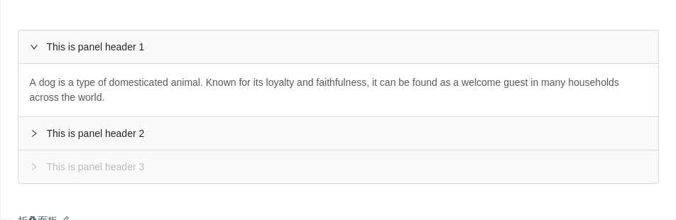
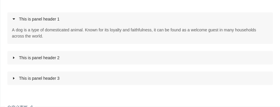
折叠面板
可以同时展开多个面板,这个例子默认展开了第一个。
import { Collapse } from 'antd';const Panel = Collapse.Panel;function callback(key) {console.log(key);}const text = `A dog is a type of domesticated animal.Known for its loyalty and faithfulness,it can be found as a welcome guest in many households across the world.`;ReactDOM.render(<Collapse defaultActiveKey={['1']} onChange={callback}><Panel header="This is panel header 1" key="1"><p>{text}</p></Panel><Panel header="This is panel header 2" key="2"><p>{text}</p></Panel><Panel header="This is panel header 3" key="3" disabled><p>{text}</p></Panel></Collapse>,mountNode,);
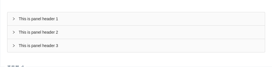
手风琴
手风琴,每次只打开一个 tab。
import { Collapse } from 'antd';const Panel = Collapse.Panel;const text = `A dog is a type of domesticated animal.Known for its loyalty and faithfulness,it can be found as a welcome guest in many households across the world.`;ReactDOM.render(<Collapse accordion><Panel header="This is panel header 1" key="1"><p>{text}</p></Panel><Panel header="This is panel header 2" key="2"><p>{text}</p></Panel><Panel header="This is panel header 3" key="3"><p>{text}</p></Panel></Collapse>,mountNode,);
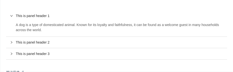
面板嵌套
嵌套折叠面板。
import { Collapse } from 'antd';const Panel = Collapse.Panel;function callback(key) {console.log(key);}const text = `A dog is a type of domesticated animal.Known for its loyalty and faithfulness,it can be found as a welcome guest in many households across the world.`;ReactDOM.render(<Collapse onChange={callback}><Panel header="This is panel header 1" key="1"><Collapse defaultActiveKey="1"><Panel header="This is panel nest panel" key="1"><p>{text}</p></Panel></Collapse></Panel><Panel header="This is panel header 2" key="2"><p>{text}</p></Panel><Panel header="This is panel header 3" key="3"><p>{text}</p></Panel></Collapse>,mountNode,);
简洁风格
一套没有边框的简洁样式。
import { Collapse } from 'antd';const Panel = Collapse.Panel;const text = (<p style={{ paddingLeft: 24 }}>A dog is a type of domesticated animal. Known for its loyalty and faithfulness, it can be foundas a welcome guest in many households across the world.</p>);ReactDOM.render(<Collapse bordered={false} defaultActiveKey={['1']}><Panel header="This is panel header 1" key="1">{text}</Panel><Panel header="This is panel header 2" key="2">{text}</Panel><Panel header="This is panel header 3" key="3">{text}</Panel></Collapse>,mountNode,);
自定义面板
自定义各个面板的背景色、圆角、边距和图标。
import { Collapse, Icon } from 'antd';const Panel = Collapse.Panel;const text = `A dog is a type of domesticated animal.Known for its loyalty and faithfulness,it can be found as a welcome guest in many households across the world.`;const customPanelStyle = {background: '#f7f7f7',borderRadius: 4,marginBottom: 24,border: 0,overflow: 'hidden',};ReactDOM.render(<Collapsebordered={false}defaultActiveKey={['1']}expandIcon={({ isActive }) => <Icon type="caret-right" rotate={isActive ? 90 : 0} />}><Panel header="This is panel header 1" key="1" style={customPanelStyle}><p>{text}</p></Panel><Panel header="This is panel header 2" key="2" style={customPanelStyle}><p>{text}</p></Panel><Panel header="This is panel header 3" key="3" style={customPanelStyle}><p>{text}</p></Panel></Collapse>,mountNode,);
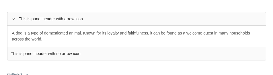
隐藏箭头
你可以通过 showArrow={false} 隐藏 CollapsePanel 组件的箭头图标。
import { Collapse } from 'antd';const Panel = Collapse.Panel;function callback(key) {console.log(key);}const text = `A dog is a type of domesticated animal.Known for its loyalty and faithfulness,it can be found as a welcome guest in many households across the world.`;ReactDOM.render(<Collapse defaultActiveKey={['1']} onChange={callback}><Panel header="This is panel header with arrow icon" key="1"><p>{text}</p></Panel><Panel showArrow={false} header="This is panel header with no arrow icon" key="2"><p>{text}</p></Panel></Collapse>,mountNode,);
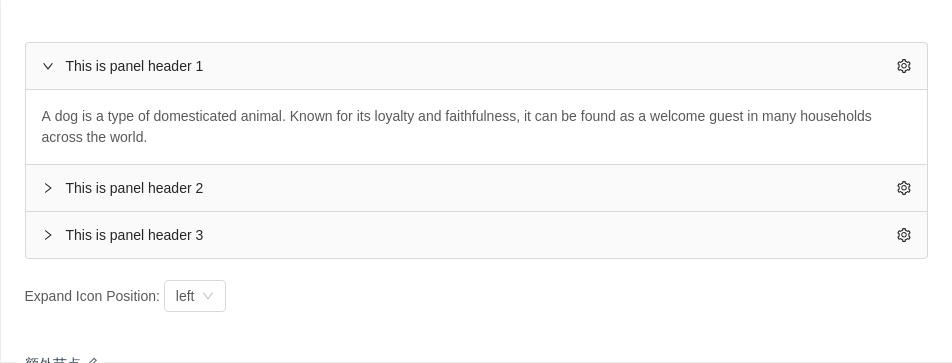
额外节点
可以同时展开多个面板,这个例子默认展开了第一个。
import { Collapse, Icon, Select } from 'antd';const { Panel } = Collapse;const { Option } = Select;function callback(key) {console.log(key);}const text = `A dog is a type of domesticated animal.Known for its loyalty and faithfulness,it can be found as a welcome guest in many households across the world.`;const genExtra = () => (<Icontype="setting"onClick={event => {// If you don't want click extra trigger collapse, you can prevent this:event.stopPropagation();}}/>);class Demo extends React.Component {state = {expandIconPosition: 'left',};onPositionChange = expandIconPosition => {this.setState({ expandIconPosition });};render() {const { expandIconPosition } = this.state;return (<div><CollapsedefaultActiveKey={['1']}onChange={callback}expandIconPosition={expandIconPosition}><Panel header="This is panel header 1" key="1" extra={genExtra()}><div>{text}</div></Panel><Panel header="This is panel header 2" key="2" extra={genExtra()}><div>{text}</div></Panel><Panel header="This is panel header 3" key="3" extra={genExtra()}><div>{text}</div></Panel></Collapse><br />Expand Icon Position:{' '}<Select value={expandIconPosition} onChange={this.onPositionChange}><Option value="left">left</Option><Option value="right">right</Option></Select></div>);}}ReactDOM.render(<Demo />, mountNode);
API
Collapse
| 参数 | 说明 | 类型 | 默认值 | 版本 |
|---|---|---|---|---|
| activeKey | 当前激活 tab 面板的 key | string[]|string | 默认无,accordion 模式下默认第一个元素 | |
| defaultActiveKey | 初始化选中面板的 key | string | 无 | |
| bordered | 带边框风格的折叠面板 | boolean | true | |
| accordion | 手风琴模式 | boolean | false | |
| onChange | 切换面板的回调 | Function | 无 | |
| expandIcon | 自定义切换图标 | (panelProps) => ReactNode | - | |
| expandIconPosition | 设置图标位置: left, right | left | - | 3.17.0 |
| destroyInactivePanel | 销毁折叠隐藏的面板 | boolean | false |
Collapse.Panel
| 参数 | 说明 | 类型 | 默认值 |
|---|---|---|---|
| disabled | 禁用后的面板展开与否将无法通过用户交互改变 | boolean | false |
| forceRender | 被隐藏时是否渲染 DOM 结构 | boolean | false |
| header | 面板头内容 | string|ReactNode | 无 |
| key | 对应 activeKey | string | 无 |
| showArrow | 是否展示当前面板上的箭头 | boolean | true |
| extra | 自定义渲染每个面板右上角的内容 | ReactNode | - |
