 我的书签
我的书签
 添加书签
添加书签 移除书签
移除书签- Badge徽标数
- 何时使用
- 代码演示
- API
Badge徽标数
图标右上角的圆形徽标数字。
何时使用
一般出现在通知图标或头像的右上角,用于显示需要处理的消息条数,通过醒目视觉形式吸引用户处理。
代码演示
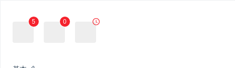
基本
简单的徽章展示,当 count 为 0 时,默认不显示,但是可以使用 showZero 修改为显示。
import { Badge, Icon } from 'antd';ReactDOM.render(<div><Badge count={5}><a href="#" className="head-example" /></Badge><Badge count={0} showZero><a href="#" className="head-example" /></Badge><Badge count={<Icon type="clock-circle" style={{ color: '#f5222d' }} />}><a href="#" className="head-example" /></Badge></div>,mountNode,);
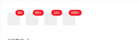
封顶数字
超过 overflowCount 的会显示为 ${overflowCount}+,默认的 overflowCount 为 99。
import { Badge } from 'antd';ReactDOM.render(<div><Badge count={99}><a href="#" className="head-example" /></Badge><Badge count={100}><a href="#" className="head-example" /></Badge><Badge count={99} overflowCount={10}><a href="#" className="head-example" /></Badge><Badge count={1000} overflowCount={999}><a href="#" className="head-example" /></Badge></div>,mountNode,);

可点击
用 a 标签进行包裹即可。
import { Badge } from 'antd';ReactDOM.render(<a href="#"><Badge count={5}><span className="head-example" /></Badge></a>,mountNode,);
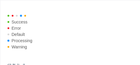
状态点
用于表示状态的小圆点。
import { Badge } from 'antd';ReactDOM.render(<div><Badge status="success" /><Badge status="error" /><Badge status="default" /><Badge status="processing" /><Badge status="warning" /><br /><Badge status="success" text="Success" /><br /><Badge status="error" text="Error" /><br /><Badge status="default" text="Default" /><br /><Badge status="processing" text="Processing" /><br /><Badge status="warning" text="Warning" /></div>,mountNode,);
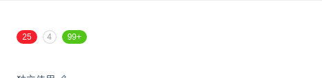
独立使用
不包裹任何元素即是独立使用,可自定样式展现。
在右上角的 badge 则限定为红色。
import { Badge } from 'antd';ReactDOM.render(<div><Badge count={25} /><Badgecount={4}style={{ backgroundColor: '#fff', color: '#999', boxShadow: '0 0 0 1px #d9d9d9 inset' }}/><Badge count={109} style={{ backgroundColor: '#52c41a' }} /></div>,mountNode,);

讨嫌的小红点
没有具体的数字。
import { Badge, Icon } from 'antd';ReactDOM.render(<div><Badge dot><Icon type="notification" /></Badge><Badge count={0} dot><Icon type="notification" /></Badge><Badge dot><a href="#">Link something</a></Badge></div>,mountNode,);
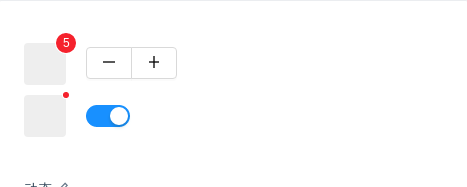
动态
展示动态变化的效果。
import { Badge, Button, Icon, Switch } from 'antd';const ButtonGroup = Button.Group;class Demo extends React.Component {state = {count: 5,show: true,};increase = () => {const count = this.state.count + 1;this.setState({ count });};decline = () => {let count = this.state.count - 1;if (count < 0) {count = 0;}this.setState({ count });};onChange = show => {this.setState({ show });};render() {return (<div><div><Badge count={this.state.count}><a href="#" className="head-example" /></Badge><ButtonGroup><Button onClick={this.decline}><Icon type="minus" /></Button><Button onClick={this.increase}><Icon type="plus" /></Button></ButtonGroup></div><div style={{ marginTop: 10 }}><Badge dot={this.state.show}><a href="#" className="head-example" /></Badge><Switch onChange={this.onChange} checked={this.state.show} /></div></div>);}}ReactDOM.render(<Demo />, mountNode);
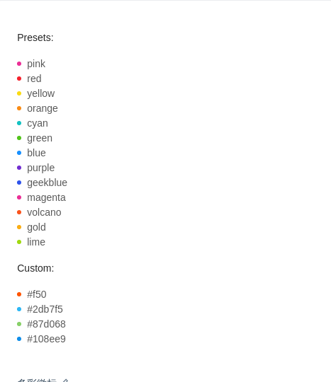
多彩徽标
3.16.0 后新增。我们添加了多种预设色彩的徽标样式,用作不同场景使用。如果预设值不能满足你的需求,可以设置为具体的色值。
import { Badge } from 'antd';const colors = ['pink','red','yellow','orange','cyan','green','blue','purple','geekblue','magenta','volcano','gold','lime',];ReactDOM.render(<div><h4 style={{ marginBottom: 16 }}>Presets:</h4><div>{colors.map(color => (<div key={color}><Badge color={color} text={color} /></div>))}</div><h4 style={{ margin: '16px 0' }}>Custom:</h4><div><Badge color="#f50" text="#f50" /><br /><Badge color="#2db7f5" text="#2db7f5" /><br /><Badge color="#87d068" text="#87d068" /><br /><Badge color="#108ee9" text="#108ee9" /></div></div>,mountNode,);
.ant-tag {margin-bottom: 8px;}
API
<Badge count={5}><a href="#" className="head-example" /></Badge>
<Badge count={5} />
| 参数 | 说明 | 类型 | 默认值 | 版本 |
|---|---|---|---|---|
| color | 自定义小圆点的颜色 | string | - | 3.16.0 |
| count | 展示的数字,大于 overflowCount 时显示为 ${overflowCount}+,为 0 时隐藏 | ReactNode | ||
| dot | 不展示数字,只有一个小红点 | boolean | false | |
| offset | 设置状态点的位置偏移,格式为 [x, y] | [number, number] | - | |
| overflowCount | 展示封顶的数字值 | number | 99 | |
| showZero | 当数值为 0 时,是否展示 Badge | boolean | false | |
| status | 设置 Badge 为状态点 | Enum{ 'success', 'processing, 'default', 'error', 'warning' } | '' | |
| text | 在设置了 status 的前提下有效,设置状态点的文本 | string | '' | |
| title | 设置鼠标放在状态点上时显示的文字 | string | count |
