 我的书签
我的书签
 添加书签
添加书签 移除书签
移除书签- Card卡片
- 何时使用
- 代码演示
- API
- Card
- Card.Grid
- Card.Meta
Card卡片
通用卡片容器。
何时使用
最基础的卡片容器,可承载文字、列表、图片、段落,常用于后台概览页面。
代码演示
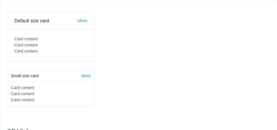
典型卡片
包含标题、内容、操作区域。
import { Card } from 'antd';ReactDOM.render(<div><Card title="Default size card" extra={<a href="#">More</a>} style={{ width: 300 }}><p>Card content</p><p>Card content</p><p>Card content</p></Card><Card size="small" title="Small size card" extra={<a href="#">More</a>} style={{ width: 300 }}><p>Card content</p><p>Card content</p><p>Card content</p></Card></div>,mountNode,);
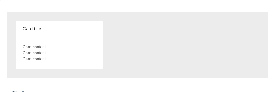
无边框
在灰色背景上使用无边框的卡片。
import { Card } from 'antd';ReactDOM.render(<div style={{ background: '#ECECEC', padding: '30px' }}><Card title="Card title" bordered={false} style={{ width: 300 }}><p>Card content</p><p>Card content</p><p>Card content</p></Card></div>,mountNode,);
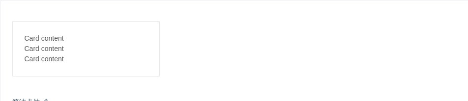
简洁卡片
只包含内容区域。
import { Card } from 'antd';ReactDOM.render(<Card style={{ width: 300 }}><p>Card content</p><p>Card content</p><p>Card content</p></Card>,mountNode,);

更灵活的内容展示
可以利用 Card.Meta 支持更灵活的内容。
import { Card } from 'antd';const { Meta } = Card;ReactDOM.render(<Cardhoverablestyle={{ width: 240 }}cover={<img alt="example" src="https://os.alipayobjects.com/rmsportal/QBnOOoLaAfKPirc.png" />}><Meta title="Europe Street beat" description="www.instagram.com" /></Card>,mountNode,);
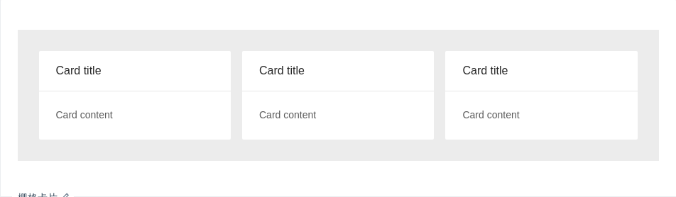
栅格卡片
在系统概览页面常常和栅格进行配合。
import { Card, Col, Row } from 'antd';ReactDOM.render(<div style={{ background: '#ECECEC', padding: '30px' }}><Row gutter={16}><Col span={8}><Card title="Card title" bordered={false}>Card content</Card></Col><Col span={8}><Card title="Card title" bordered={false}>Card content</Card></Col><Col span={8}><Card title="Card title" bordered={false}>Card content</Card></Col></Row></div>,mountNode,);
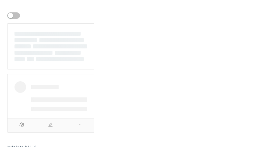
预加载的卡片
数据读入前会有文本块样式。
import { Skeleton, Switch, Card, Icon, Avatar } from 'antd';const { Meta } = Card;class App extends React.Component {state = {loading: true,};onChange = checked => {this.setState({ loading: !checked });};render() {const { loading } = this.state;return (<div><Switch checked={!loading} onChange={this.onChange} /><Card style={{ width: 300, marginTop: 16 }} loading={loading}><Metaavatar={<Avatar src="https://zos.alipayobjects.com/rmsportal/ODTLcjxAfvqbxHnVXCYX.png" />}title="Card title"description="This is the description"/></Card><Cardstyle={{ width: 300, marginTop: 16 }}actions={[<Icon type="setting" />, <Icon type="edit" />, <Icon type="ellipsis" />]}><Skeleton loading={loading} avatar active><Metaavatar={<Avatar src="https://zos.alipayobjects.com/rmsportal/ODTLcjxAfvqbxHnVXCYX.png" />}title="Card title"description="This is the description"/></Skeleton></Card></div>);}}ReactDOM.render(<App />, mountNode);

网格型内嵌卡片
一种常见的卡片内容区隔模式。
import { Card } from 'antd';const gridStyle = {width: '25%',textAlign: 'center',};ReactDOM.render(<Card title="Card Title"><Card.Grid style={gridStyle}>Content</Card.Grid><Card.Grid style={gridStyle}>Content</Card.Grid><Card.Grid style={gridStyle}>Content</Card.Grid><Card.Grid style={gridStyle}>Content</Card.Grid><Card.Grid style={gridStyle}>Content</Card.Grid><Card.Grid style={gridStyle}>Content</Card.Grid><Card.Grid style={gridStyle}>Content</Card.Grid></Card>,mountNode,);
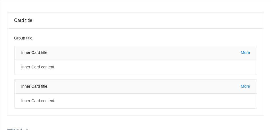
内部卡片
可以放在普通卡片内部,展示多层级结构的信息。
import { Card } from 'antd';ReactDOM.render(<Card title="Card title"><pstyle={{fontSize: 14,color: 'rgba(0, 0, 0, 0.85)',marginBottom: 16,fontWeight: 500,}}>Group title</p><Card type="inner" title="Inner Card title" extra={<a href="#">More</a>}>Inner Card content</Card><Cardstyle={{ marginTop: 16 }}type="inner"title="Inner Card title"extra={<a href="#">More</a>}>Inner Card content</Card></Card>,mountNode,);
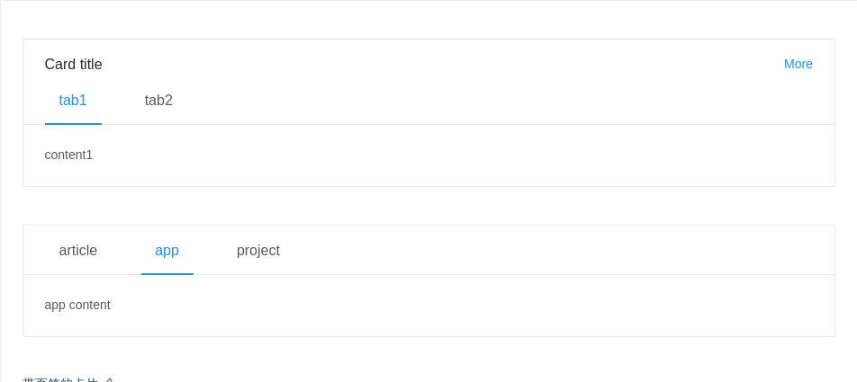
带页签的卡片
可承载更多内容。
import { Card } from 'antd';const tabList = [{key: 'tab1',tab: 'tab1',},{key: 'tab2',tab: 'tab2',},];const contentList = {tab1: <p>content1</p>,tab2: <p>content2</p>,};const tabListNoTitle = [{key: 'article',tab: 'article',},{key: 'app',tab: 'app',},{key: 'project',tab: 'project',},];const contentListNoTitle = {article: <p>article content</p>,app: <p>app content</p>,project: <p>project content</p>,};class TabsCard extends React.Component {state = {key: 'tab1',noTitleKey: 'app',};onTabChange = (key, type) => {console.log(key, type);this.setState({ [type]: key });};render() {return (<div><Cardstyle={{ width: '100%' }}title="Card title"extra={<a href="#">More</a>}tabList={tabList}activeTabKey={this.state.key}onTabChange={key => {this.onTabChange(key, 'key');}}>{contentList[this.state.key]}</Card><br /><br /><Cardstyle={{ width: '100%' }}tabList={tabListNoTitle}activeTabKey={this.state.noTitleKey}onTabChange={key => {this.onTabChange(key, 'noTitleKey');}}>{contentListNoTitle[this.state.noTitleKey]}</Card></div>);}}ReactDOM.render(<TabsCard />, mountNode);
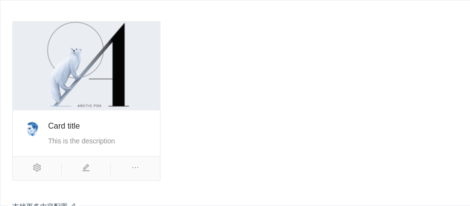
支持更多内容配置
一种支持封面、头像、标题和描述信息的卡片。
import { Card, Icon, Avatar } from 'antd';const { Meta } = Card;ReactDOM.render(<Cardstyle={{ width: 300 }}cover={<imgalt="example"src="https://gw.alipayobjects.com/zos/rmsportal/JiqGstEfoWAOHiTxclqi.png"/>}actions={[<Icon type="setting" />, <Icon type="edit" />, <Icon type="ellipsis" />]}><Metaavatar={<Avatar src="https://zos.alipayobjects.com/rmsportal/ODTLcjxAfvqbxHnVXCYX.png" />}title="Card title"description="This is the description"/></Card>,mountNode,);
API
<Card title="卡片标题">卡片内容</Card>
Card
| 参数 | 说明 | 类型 | 默认值 |
|---|---|---|---|
| actions | 卡片操作组,位置在卡片底部 | Array<ReactNode> | - |
| activeTabKey | 当前激活页签的 key | string | - |
| headStyle | 自定义标题区域样式 | object | - |
| bodyStyle | 内容区域自定义样式 | object | - |
| bordered | 是否有边框 | boolean | true |
| cover | 卡片封面 | ReactNode | - |
| defaultActiveTabKey | 初始化选中页签的 key,如果没有设置 activeTabKey | string | 第一个页签 |
| extra | 卡片右上角的操作区域 | string|ReactNode | - |
| hoverable | 鼠标移过时可浮起 | boolean | false |
| loading | 当卡片内容还在加载中时,可以用 loading 展示一个占位 | boolean | false |
| tabList | 页签标题列表 | Array<{key: string, tab: ReactNode}> | - |
| size | card 的尺寸 | default | small | default |
| title | 卡片标题 | string|ReactNode | - |
| type | 卡片类型,可设置为 inner 或 不设置 | string | - |
| onTabChange | 页签切换的回调 | (key) => void | - |
Card.Grid
| Property | Description | Type | Default |
|---|---|---|---|
| className | 网格容器类名 | string | - |
| style | 定义网格容器类名的样式 | object | - |
Card.Meta
| Property | Description | Type | Default |
|---|---|---|---|
| avatar | 头像/图标 | ReactNode | - |
| className | 容器类名 | string | - |
| description | 描述内容 | ReactNode | - |
| style | 定义容器类名的样式 | object | - |
| title | 标题内容 | ReactNode | - |
