 我的书签
我的书签
 添加书签
添加书签 移除书签
移除书签- Table表格
- 设计师专属
- 何时使用
- 如何使用
- 代码演示
- API
- Table
- onRow 用法
- Column
- ColumnGroup
- pagination
- rowSelection
- selection
- Table
- 在 TypeScript 中使用
- 注意
Table表格
展示行列数据。
设计师专属
安装 Kitchen Sketch 插件 ?,两步就可以自动生成 Ant Design 表格组件。
何时使用
当有大量结构化的数据需要展现时;
当需要对数据进行排序、搜索、分页、自定义操作等复杂行为时。
如何使用
指定表格的数据源 dataSource 为一个数组。
const dataSource = [{key: '1',name: '胡彦斌',age: 32,address: '西湖区湖底公园1号',},{key: '2',name: '胡彦祖',age: 42,address: '西湖区湖底公园1号',},];const columns = [{title: '姓名',dataIndex: 'name',key: 'name',},{title: '年龄',dataIndex: 'age',key: 'age',},{title: '住址',dataIndex: 'address',key: 'address',},];<Table dataSource={dataSource} columns={columns} />;
代码演示
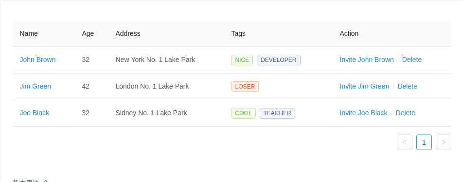
基本用法
简单的表格,最后一列是各种操作。
import { Table, Divider, Tag } from 'antd';const columns = [{title: 'Name',dataIndex: 'name',key: 'name',render: text => <a href="javascript:;">{text}</a>,},{title: 'Age',dataIndex: 'age',key: 'age',},{title: 'Address',dataIndex: 'address',key: 'address',},{title: 'Tags',key: 'tags',dataIndex: 'tags',render: tags => (<span>{tags.map(tag => {let color = tag.length > 5 ? 'geekblue' : 'green';if (tag === 'loser') {color = 'volcano';}return (<Tag color={color} key={tag}>{tag.toUpperCase()}</Tag>);})}</span>),},{title: 'Action',key: 'action',render: (text, record) => (<span><a href="javascript:;">Invite {record.name}</a><Divider type="vertical" /><a href="javascript:;">Delete</a></span>),},];const data = [{key: '1',name: 'John Brown',age: 32,address: 'New York No. 1 Lake Park',tags: ['nice', 'developer'],},{key: '2',name: 'Jim Green',age: 42,address: 'London No. 1 Lake Park',tags: ['loser'],},{key: '3',name: 'Joe Black',age: 32,address: 'Sidney No. 1 Lake Park',tags: ['cool', 'teacher'],},];ReactDOM.render(<Table columns={columns} dataSource={data} />, mountNode);
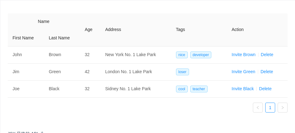
JSX 风格的 API
使用 JSX 风格的 API(2.5.0 以后引入)
这个只是一个描述
columns的语法糖,所以你不能用其他组件去包裹Column和ColumnGroup。
import { Table, Divider, Tag } from 'antd';const { Column, ColumnGroup } = Table;const data = [{key: '1',firstName: 'John',lastName: 'Brown',age: 32,address: 'New York No. 1 Lake Park',tags: ['nice', 'developer'],},{key: '2',firstName: 'Jim',lastName: 'Green',age: 42,address: 'London No. 1 Lake Park',tags: ['loser'],},{key: '3',firstName: 'Joe',lastName: 'Black',age: 32,address: 'Sidney No. 1 Lake Park',tags: ['cool', 'teacher'],},];ReactDOM.render(<Table dataSource={data}><ColumnGroup title="Name"><Column title="First Name" dataIndex="firstName" key="firstName" /><Column title="Last Name" dataIndex="lastName" key="lastName" /></ColumnGroup><Column title="Age" dataIndex="age" key="age" /><Column title="Address" dataIndex="address" key="address" /><Columntitle="Tags"dataIndex="tags"key="tags"render={tags => (<span>{tags.map(tag => (<Tag color="blue" key={tag}>{tag}</Tag>))}</span>)}/><Columntitle="Action"key="action"render={(text, record) => (<span><a href="javascript:;">Invite {record.lastName}</a><Divider type="vertical" /><a href="javascript:;">Delete</a></span>)}/></Table>,mountNode,);
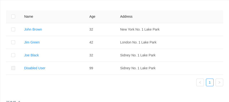
可选择
第一列是联动的选择框。
默认点击 checkbox 触发选择行为,需要点击行触发可以参考例子:https://codesandbox.io/s/000vqw38rl
import { Table } from 'antd';const columns = [{title: 'Name',dataIndex: 'name',render: text => <a href="javascript:;">{text}</a>,},{title: 'Age',dataIndex: 'age',},{title: 'Address',dataIndex: 'address',},];const data = [{key: '1',name: 'John Brown',age: 32,address: 'New York No. 1 Lake Park',},{key: '2',name: 'Jim Green',age: 42,address: 'London No. 1 Lake Park',},{key: '3',name: 'Joe Black',age: 32,address: 'Sidney No. 1 Lake Park',},{key: '4',name: 'Disabled User',age: 99,address: 'Sidney No. 1 Lake Park',},];// rowSelection object indicates the need for row selectionconst rowSelection = {onChange: (selectedRowKeys, selectedRows) => {console.log(`selectedRowKeys: ${selectedRowKeys}`, 'selectedRows: ', selectedRows);},getCheckboxProps: record => ({disabled: record.name === 'Disabled User', // Column configuration not to be checkedname: record.name,}),};ReactDOM.render(<Table rowSelection={rowSelection} columns={columns} dataSource={data} />,mountNode,);
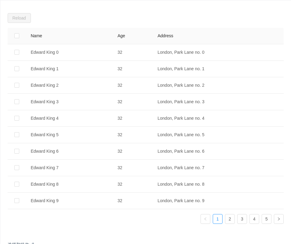
选择和操作
选择后进行操作,完成后清空选择,通过 rowSelection.selectedRowKeys 来控制选中项。
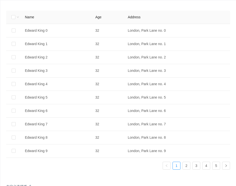
import { Table, Button } from 'antd';const columns = [{title: 'Name',dataIndex: 'name',},{title: 'Age',dataIndex: 'age',},{title: 'Address',dataIndex: 'address',},];const data = [];for (let i = 0; i < 46; i++) {data.push({key: i,name: `Edward King ${i}`,age: 32,address: `London, Park Lane no. ${i}`,});}class App extends React.Component {state = {selectedRowKeys: [], // Check here to configure the default columnloading: false,};start = () => {this.setState({ loading: true });// ajax request after empty completingsetTimeout(() => {this.setState({selectedRowKeys: [],loading: false,});}, 1000);};onSelectChange = selectedRowKeys => {console.log('selectedRowKeys changed: ', selectedRowKeys);this.setState({ selectedRowKeys });};render() {const { loading, selectedRowKeys } = this.state;const rowSelection = {selectedRowKeys,onChange: this.onSelectChange,};const hasSelected = selectedRowKeys.length > 0;return (<div><div style={{ marginBottom: 16 }}><Button type="primary" onClick={this.start} disabled={!hasSelected} loading={loading}>Reload</Button><span style={{ marginLeft: 8 }}>{hasSelected ? `Selected ${selectedRowKeys.length} items` : ''}</span></div><Table rowSelection={rowSelection} columns={columns} dataSource={data} /></div>);}}ReactDOM.render(<App />, mountNode);
自定义选择项
通过 rowSelection.selections 自定义选择项,默认不显示下拉选项,设为 true 时显示默认选择项。
import { Table } from 'antd';const columns = [{title: 'Name',dataIndex: 'name',},{title: 'Age',dataIndex: 'age',},{title: 'Address',dataIndex: 'address',},];const data = [];for (let i = 0; i < 46; i++) {data.push({key: i,name: `Edward King ${i}`,age: 32,address: `London, Park Lane no. ${i}`,});}class App extends React.Component {state = {selectedRowKeys: [], // Check here to configure the default column};onSelectChange = selectedRowKeys => {console.log('selectedRowKeys changed: ', selectedRowKeys);this.setState({ selectedRowKeys });};render() {const { selectedRowKeys } = this.state;const rowSelection = {selectedRowKeys,onChange: this.onSelectChange,hideDefaultSelections: true,selections: [{key: 'all-data',text: 'Select All Data',onSelect: () => {this.setState({selectedRowKeys: [...Array(46).keys()], // 0...45});},},{key: 'odd',text: 'Select Odd Row',onSelect: changableRowKeys => {let newSelectedRowKeys = [];newSelectedRowKeys = changableRowKeys.filter((key, index) => {if (index % 2 !== 0) {return false;}return true;});this.setState({ selectedRowKeys: newSelectedRowKeys });},},{key: 'even',text: 'Select Even Row',onSelect: changableRowKeys => {let newSelectedRowKeys = [];newSelectedRowKeys = changableRowKeys.filter((key, index) => {if (index % 2 !== 0) {return true;}return false;});this.setState({ selectedRowKeys: newSelectedRowKeys });},},],onSelection: this.onSelection,};return <Table rowSelection={rowSelection} columns={columns} dataSource={data} />;}}ReactDOM.render(<App />, mountNode);
筛选和排序
对某一列数据进行筛选,使用列的 filters 属性来指定需要筛选菜单的列,onFilter 用于筛选当前数据,filterMultiple 用于指定多选和单选。
对某一列数据进行排序,通过指定列的 sorter 函数即可启动排序按钮。sorter: function(rowA, rowB) { … }, rowA、rowB 为比较的两个行数据。
sortDirections: ['ascend' | 'descend']改变每列可用的排序方式,切换排序时按数组内容依次切换,设置在 table props 上时对所有列生效。
使用 defaultSortOrder 属性,设置列的默认排序顺序。
import { Table } from 'antd';const columns = [{title: 'Name',dataIndex: 'name',filters: [{text: 'Joe',value: 'Joe',},{text: 'Jim',value: 'Jim',},{text: 'Submenu',value: 'Submenu',children: [{text: 'Green',value: 'Green',},{text: 'Black',value: 'Black',},],},],// specify the condition of filtering result// here is that finding the name started with `value`onFilter: (value, record) => record.name.indexOf(value) === 0,sorter: (a, b) => a.name.length - b.name.length,sortDirections: ['descend'],},{title: 'Age',dataIndex: 'age',defaultSortOrder: 'descend',sorter: (a, b) => a.age - b.age,},{title: 'Address',dataIndex: 'address',filters: [{text: 'London',value: 'London',},{text: 'New York',value: 'New York',},],filterMultiple: false,onFilter: (value, record) => record.address.indexOf(value) === 0,sorter: (a, b) => a.address.length - b.address.length,sortDirections: ['descend', 'ascend'],},];const data = [{key: '1',name: 'John Brown',age: 32,address: 'New York No. 1 Lake Park',},{key: '2',name: 'Jim Green',age: 42,address: 'London No. 1 Lake Park',},{key: '3',name: 'Joe Black',age: 32,address: 'Sidney No. 1 Lake Park',},{key: '4',name: 'Jim Red',age: 32,address: 'London No. 2 Lake Park',},];function onChange(pagination, filters, sorter) {console.log('params', pagination, filters, sorter);}ReactDOM.render(<Table columns={columns} dataSource={data} onChange={onChange} />, mountNode);
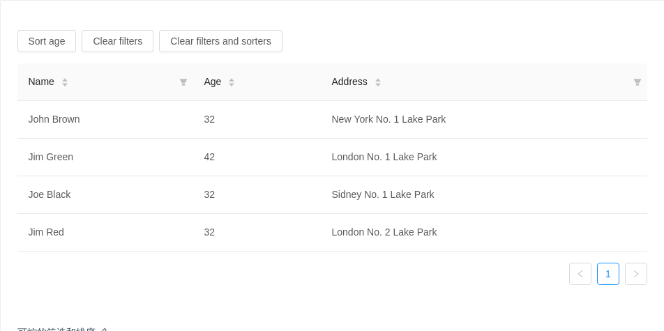
可控的筛选和排序
使用受控属性对筛选和排序状态进行控制。
columns 中定义了 filteredValue 和 sortOrder 属性即视为受控模式。
只支持同时对一列进行排序,请保证只有一列的 sortOrder 属性是生效的。
务必指定
column.key。
import { Table, Button } from 'antd';const data = [{key: '1',name: 'John Brown',age: 32,address: 'New York No. 1 Lake Park',},{key: '2',name: 'Jim Green',age: 42,address: 'London No. 1 Lake Park',},{key: '3',name: 'Joe Black',age: 32,address: 'Sidney No. 1 Lake Park',},{key: '4',name: 'Jim Red',age: 32,address: 'London No. 2 Lake Park',},];class App extends React.Component {state = {filteredInfo: null,sortedInfo: null,};handleChange = (pagination, filters, sorter) => {console.log('Various parameters', pagination, filters, sorter);this.setState({filteredInfo: filters,sortedInfo: sorter,});};clearFilters = () => {this.setState({ filteredInfo: null });};clearAll = () => {this.setState({filteredInfo: null,sortedInfo: null,});};setAgeSort = () => {this.setState({sortedInfo: {order: 'descend',columnKey: 'age',},});};render() {let { sortedInfo, filteredInfo } = this.state;sortedInfo = sortedInfo || {};filteredInfo = filteredInfo || {};const columns = [{title: 'Name',dataIndex: 'name',key: 'name',filters: [{ text: 'Joe', value: 'Joe' }, { text: 'Jim', value: 'Jim' }],filteredValue: filteredInfo.name || null,onFilter: (value, record) => record.name.includes(value),sorter: (a, b) => a.name.length - b.name.length,sortOrder: sortedInfo.columnKey === 'name' && sortedInfo.order,},{title: 'Age',dataIndex: 'age',key: 'age',sorter: (a, b) => a.age - b.age,sortOrder: sortedInfo.columnKey === 'age' && sortedInfo.order,},{title: 'Address',dataIndex: 'address',key: 'address',filters: [{ text: 'London', value: 'London' }, { text: 'New York', value: 'New York' }],filteredValue: filteredInfo.address || null,onFilter: (value, record) => record.address.includes(value),sorter: (a, b) => a.address.length - b.address.length,sortOrder: sortedInfo.columnKey === 'address' && sortedInfo.order,},];return (<div><div className="table-operations"><Button onClick={this.setAgeSort}>Sort age</Button><Button onClick={this.clearFilters}>Clear filters</Button><Button onClick={this.clearAll}>Clear filters and sorters</Button></div><Table columns={columns} dataSource={data} onChange={this.handleChange} /></div>);}}ReactDOM.render(<App />, mountNode);
.table-operations {margin-bottom: 16px;}.table-operations > button {margin-right: 8px;}
自定义筛选菜单
通过 filterDropdown 自定义的列筛选功能,并实现一个搜索列的示例。
import { Table, Input, Button, Icon } from 'antd';import Highlighter from 'react-highlight-words';const data = [{key: '1',name: 'John Brown',age: 32,address: 'New York No. 1 Lake Park',},{key: '2',name: 'Joe Black',age: 42,address: 'London No. 1 Lake Park',},{key: '3',name: 'Jim Green',age: 32,address: 'Sidney No. 1 Lake Park',},{key: '4',name: 'Jim Red',age: 32,address: 'London No. 2 Lake Park',},];class App extends React.Component {state = {searchText: '',};getColumnSearchProps = dataIndex => ({filterDropdown: ({ setSelectedKeys, selectedKeys, confirm, clearFilters }) => (<div style={{ padding: 8 }}><Inputref={node => {this.searchInput = node;}}placeholder={`Search ${dataIndex}`}value={selectedKeys[0]}onChange={e => setSelectedKeys(e.target.value ? [e.target.value] : [])}onPressEnter={() => this.handleSearch(selectedKeys, confirm)}style={{ width: 188, marginBottom: 8, display: 'block' }}/><Buttontype="primary"onClick={() => this.handleSearch(selectedKeys, confirm)}icon="search"size="small"style={{ width: 90, marginRight: 8 }}>Search</Button><Button onClick={() => this.handleReset(clearFilters)} size="small" style={{ width: 90 }}>Reset</Button></div>),filterIcon: filtered => (<Icon type="search" style={{ color: filtered ? '#1890ff' : undefined }} />),onFilter: (value, record) =>record[dataIndex].toString().toLowerCase().includes(value.toLowerCase()),onFilterDropdownVisibleChange: visible => {if (visible) {setTimeout(() => this.searchInput.select());}},render: text => (<HighlighterhighlightStyle={{ backgroundColor: '#ffc069', padding: 0 }}searchWords={[this.state.searchText]}autoEscapetextToHighlight={text.toString()}/>),});handleSearch = (selectedKeys, confirm) => {confirm();this.setState({ searchText: selectedKeys[0] });};handleReset = clearFilters => {clearFilters();this.setState({ searchText: '' });};render() {const columns = [{title: 'Name',dataIndex: 'name',key: 'name',width: '30%',...this.getColumnSearchProps('name'),},{title: 'Age',dataIndex: 'age',key: 'age',width: '20%',...this.getColumnSearchProps('age'),},{title: 'Address',dataIndex: 'address',key: 'address',...this.getColumnSearchProps('address'),},];return <Table columns={columns} dataSource={data} />;}}ReactDOM.render(<App />, mountNode);
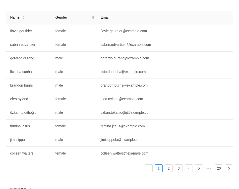
远程加载数据
这个例子通过简单的 ajax 读取方式,演示了如何从服务端读取并展现数据,具有筛选、排序等功能以及页面 loading 效果。开发者可以自行接入其他数据处理方式。
另外,本例也展示了筛选排序功能如何交给服务端实现,列不需要指定具体的 onFilter 和 sorter 函数,而是在把筛选和排序的参数发到服务端来处理。
注意,此示例使用 模拟接口,展示数据可能不准确,请打开网络面板查看请求。
import { Table } from 'antd';import reqwest from 'reqwest';const columns = [{title: 'Name',dataIndex: 'name',sorter: true,render: name => `${name.first} ${name.last}`,width: '20%',},{title: 'Gender',dataIndex: 'gender',filters: [{ text: 'Male', value: 'male' }, { text: 'Female', value: 'female' }],width: '20%',},{title: 'Email',dataIndex: 'email',},];class App extends React.Component {state = {data: [],pagination: {},loading: false,};componentDidMount() {this.fetch();}handleTableChange = (pagination, filters, sorter) => {const pager = { ...this.state.pagination };pager.current = pagination.current;this.setState({pagination: pager,});this.fetch({results: pagination.pageSize,page: pagination.current,sortField: sorter.field,sortOrder: sorter.order,...filters,});};fetch = (params = {}) => {console.log('params:', params);this.setState({ loading: true });reqwest({url: 'https://randomuser.me/api',method: 'get',data: {results: 10,...params,},type: 'json',}).then(data => {const pagination = { ...this.state.pagination };// Read total count from server// pagination.total = data.totalCount;pagination.total = 200;this.setState({loading: false,data: data.results,pagination,});});};render() {return (<Tablecolumns={columns}rowKey={record => record.login.uuid}dataSource={this.state.data}pagination={this.state.pagination}loading={this.state.loading}onChange={this.handleTableChange}/>);}}ReactDOM.render(<App />, mountNode);
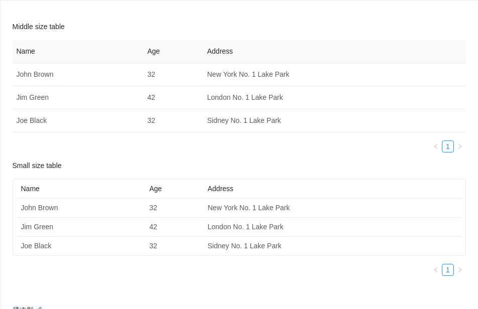
紧凑型
两种紧凑型的列表,小型列表只用于对话框内。
import { Table } from 'antd';const columns = [{title: 'Name',dataIndex: 'name',},{title: 'Age',dataIndex: 'age',},{title: 'Address',dataIndex: 'address',},];const data = [{key: '1',name: 'John Brown',age: 32,address: 'New York No. 1 Lake Park',},{key: '2',name: 'Jim Green',age: 42,address: 'London No. 1 Lake Park',},{key: '3',name: 'Joe Black',age: 32,address: 'Sidney No. 1 Lake Park',},];ReactDOM.render(<div><h4>Middle size table</h4><Table columns={columns} dataSource={data} size="middle" /><h4>Small size table</h4><Table columns={columns} dataSource={data} size="small" /></div>,mountNode,);
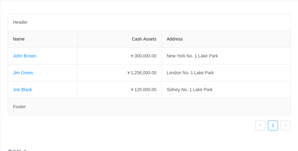
带边框
添加表格边框线,页头和页脚。
import { Table } from 'antd';const columns = [{title: 'Name',dataIndex: 'name',render: text => <a href="javascript:;">{text}</a>,},{title: 'Cash Assets',className: 'column-money',dataIndex: 'money',},{title: 'Address',dataIndex: 'address',},];const data = [{key: '1',name: 'John Brown',money: '¥300,000.00',address: 'New York No. 1 Lake Park',},{key: '2',name: 'Jim Green',money: '¥1,256,000.00',address: 'London No. 1 Lake Park',},{key: '3',name: 'Joe Black',money: '¥120,000.00',address: 'Sidney No. 1 Lake Park',},];ReactDOM.render(<Tablecolumns={columns}dataSource={data}borderedtitle={() => 'Header'}footer={() => 'Footer'}/>,mountNode,);
th.column-money,td.column-money {text-align: right !important;}
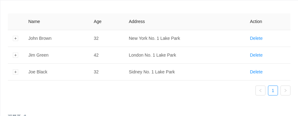
可展开
当表格内容较多不能一次性完全展示时。
import { Table } from 'antd';const columns = [{ title: 'Name', dataIndex: 'name', key: 'name' },{ title: 'Age', dataIndex: 'age', key: 'age' },{ title: 'Address', dataIndex: 'address', key: 'address' },{title: 'Action',dataIndex: '',key: 'x',render: () => <a href="javascript:;">Delete</a>,},];const data = [{key: 1,name: 'John Brown',age: 32,address: 'New York No. 1 Lake Park',description: 'My name is John Brown, I am 32 years old, living in New York No. 1 Lake Park.',},{key: 2,name: 'Jim Green',age: 42,address: 'London No. 1 Lake Park',description: 'My name is Jim Green, I am 42 years old, living in London No. 1 Lake Park.',},{key: 3,name: 'Joe Black',age: 32,address: 'Sidney No. 1 Lake Park',description: 'My name is Joe Black, I am 32 years old, living in Sidney No. 1 Lake Park.',},];ReactDOM.render(<Tablecolumns={columns}expandedRowRender={record => <p style={{ margin: 0 }}>{record.description}</p>}dataSource={data}/>,mountNode,);
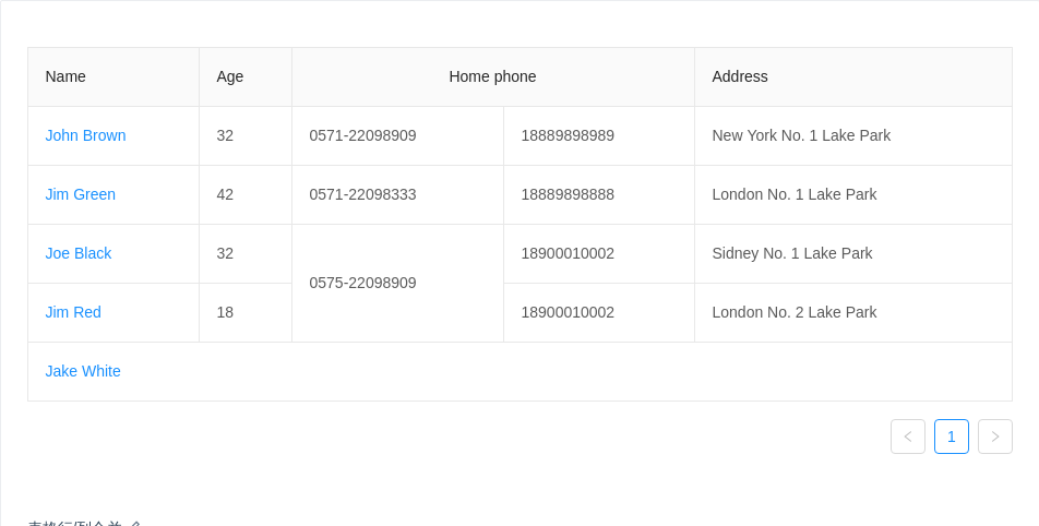
表格行/列合并
表头只支持列合并,使用 column 里的 colSpan 进行设置。
表格支持行/列合并,使用 render 里的单元格属性 colSpan 或者 rowSpan 设值为 0 时,设置的表格不会渲染。
import { Table } from 'antd';// In the fifth row, other columns are merged into first column// by setting it's colSpan to be 0const renderContent = (value, row, index) => {const obj = {children: value,props: {},};if (index === 4) {obj.props.colSpan = 0;}return obj;};const columns = [{title: 'Name',dataIndex: 'name',render: (text, row, index) => {if (index < 4) {return <a href="javascript:;">{text}</a>;}return {children: <a href="javascript:;">{text}</a>,props: {colSpan: 5,},};},},{title: 'Age',dataIndex: 'age',render: renderContent,},{title: 'Home phone',colSpan: 2,dataIndex: 'tel',render: (value, row, index) => {const obj = {children: value,props: {},};if (index === 2) {obj.props.rowSpan = 2;}// These two are merged into above cellif (index === 3) {obj.props.rowSpan = 0;}if (index === 4) {obj.props.colSpan = 0;}return obj;},},{title: 'Phone',colSpan: 0,dataIndex: 'phone',render: renderContent,},{title: 'Address',dataIndex: 'address',render: renderContent,},];const data = [{key: '1',name: 'John Brown',age: 32,tel: '0571-22098909',phone: 18889898989,address: 'New York No. 1 Lake Park',},{key: '2',name: 'Jim Green',tel: '0571-22098333',phone: 18889898888,age: 42,address: 'London No. 1 Lake Park',},{key: '3',name: 'Joe Black',age: 32,tel: '0575-22098909',phone: 18900010002,address: 'Sidney No. 1 Lake Park',},{key: '4',name: 'Jim Red',age: 18,tel: '0575-22098909',phone: 18900010002,address: 'London No. 2 Lake Park',},{key: '5',name: 'Jake White',age: 18,tel: '0575-22098909',phone: 18900010002,address: 'Dublin No. 2 Lake Park',},];ReactDOM.render(<Table columns={columns} dataSource={data} bordered />, mountNode);
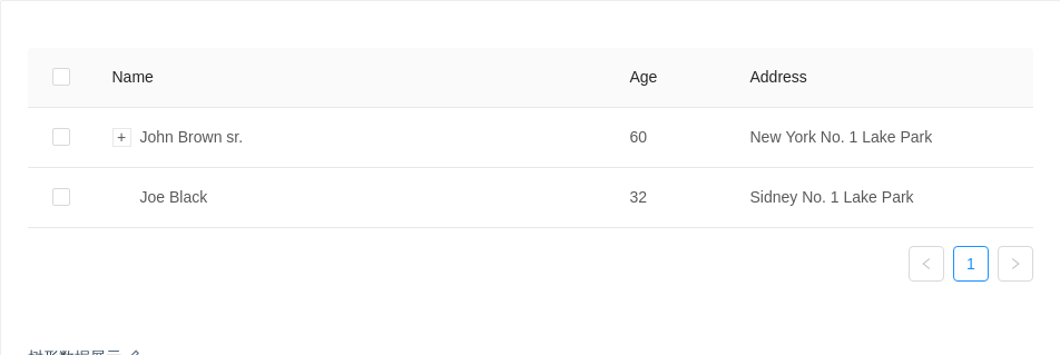
树形数据展示
表格支持树形数据的展示,当数据中有 children 字段时会自动展示为树形表格,如果不需要或配置为其他字段可以用 childrenColumnName 进行配置。
可以通过设置 indentSize 以控制每一层的缩进宽度。
注:暂不支持父子数据递归关联选择。
import { Table } from 'antd';const columns = [{title: 'Name',dataIndex: 'name',key: 'name',},{title: 'Age',dataIndex: 'age',key: 'age',width: '12%',},{title: 'Address',dataIndex: 'address',width: '30%',key: 'address',},];const data = [{key: 1,name: 'John Brown sr.',age: 60,address: 'New York No. 1 Lake Park',children: [{key: 11,name: 'John Brown',age: 42,address: 'New York No. 2 Lake Park',},{key: 12,name: 'John Brown jr.',age: 30,address: 'New York No. 3 Lake Park',children: [{key: 121,name: 'Jimmy Brown',age: 16,address: 'New York No. 3 Lake Park',},],},{key: 13,name: 'Jim Green sr.',age: 72,address: 'London No. 1 Lake Park',children: [{key: 131,name: 'Jim Green',age: 42,address: 'London No. 2 Lake Park',children: [{key: 1311,name: 'Jim Green jr.',age: 25,address: 'London No. 3 Lake Park',},{key: 1312,name: 'Jimmy Green sr.',age: 18,address: 'London No. 4 Lake Park',},],},],},],},{key: 2,name: 'Joe Black',age: 32,address: 'Sidney No. 1 Lake Park',},];// rowSelection objects indicates the need for row selectionconst rowSelection = {onChange: (selectedRowKeys, selectedRows) => {console.log(`selectedRowKeys: ${selectedRowKeys}`, 'selectedRows: ', selectedRows);},onSelect: (record, selected, selectedRows) => {console.log(record, selected, selectedRows);},onSelectAll: (selected, selectedRows, changeRows) => {console.log(selected, selectedRows, changeRows);},};ReactDOM.render(<Table columns={columns} rowSelection={rowSelection} dataSource={data} />,mountNode,);
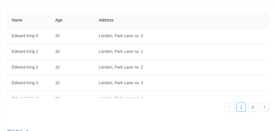
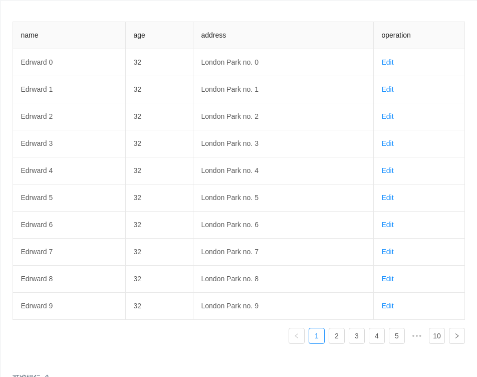
固定表头
方便一页内展示大量数据。
需要指定 column 的 width 属性,否则列头和内容可能不对齐。如果指定 width 不生效,请尝试建议留一列不设宽度以适应弹性布局,或者检查是否有超长连续字段破坏布局。
import { Table } from 'antd';const columns = [{title: 'Name',dataIndex: 'name',width: 150,},{title: 'Age',dataIndex: 'age',width: 150,},{title: 'Address',dataIndex: 'address',},];const data = [];for (let i = 0; i < 100; i++) {data.push({key: i,name: `Edward King ${i}`,age: 32,address: `London, Park Lane no. ${i}`,});}ReactDOM.render(<Table columns={columns} dataSource={data} pagination={{ pageSize: 50 }} scroll={{ y: 240 }} />,mountNode,);
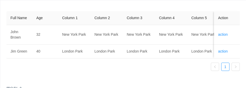
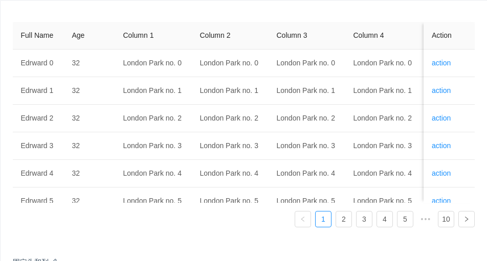
固定列
对于列数很多的数据,可以固定前后的列,横向滚动查看其它数据,需要和 scroll.x 配合使用。
若列头与内容不对齐或出现列重复,请指定固定列的宽度
width。如果指定width不生效,请尝试建议留一列不设宽度以适应弹性布局,或者检查是否有超长连续字段破坏布局。建议指定
scroll.x为大于表格宽度的固定值或百分比。注意,且非固定列宽度之和不要超过scroll.x。
import { Table } from 'antd';const columns = [{title: 'Full Name',width: 100,dataIndex: 'name',key: 'name',fixed: 'left',},{title: 'Age',width: 100,dataIndex: 'age',key: 'age',fixed: 'left',},{ title: 'Column 1', dataIndex: 'address', key: '1' },{ title: 'Column 2', dataIndex: 'address', key: '2' },{ title: 'Column 3', dataIndex: 'address', key: '3' },{ title: 'Column 4', dataIndex: 'address', key: '4' },{ title: 'Column 5', dataIndex: 'address', key: '5' },{ title: 'Column 6', dataIndex: 'address', key: '6' },{ title: 'Column 7', dataIndex: 'address', key: '7' },{ title: 'Column 8', dataIndex: 'address', key: '8' },{title: 'Action',key: 'operation',fixed: 'right',width: 100,render: () => <a href="javascript:;">action</a>,},];const data = [{key: '1',name: 'John Brown',age: 32,address: 'New York Park',},{key: '2',name: 'Jim Green',age: 40,address: 'London Park',},];ReactDOM.render(<Table columns={columns} dataSource={data} scroll={{ x: 1300 }} />, mountNode);
固定头和列
适合同时展示有大量数据和数据列。
若列头与内容不对齐或出现列重复,请指定固定列的宽度
width。如果指定width不生效,请尝试建议留一列不设宽度以适应弹性布局,或者检查是否有超长连续字段破坏布局。建议指定
scroll.x为大于表格宽度的固定值或百分比。注意,且非固定列宽度之和不要超过scroll.x。
import { Table } from 'antd';const columns = [{title: 'Full Name',width: 100,dataIndex: 'name',key: 'name',fixed: 'left',},{title: 'Age',width: 100,dataIndex: 'age',key: 'age',fixed: 'left',},{title: 'Column 1',dataIndex: 'address',key: '1',width: 150,},{title: 'Column 2',dataIndex: 'address',key: '2',width: 150,},{title: 'Column 3',dataIndex: 'address',key: '3',width: 150,},{title: 'Column 4',dataIndex: 'address',key: '4',width: 150,},{title: 'Column 5',dataIndex: 'address',key: '5',width: 150,},{title: 'Column 6',dataIndex: 'address',key: '6',width: 150,},{title: 'Column 7',dataIndex: 'address',key: '7',width: 150,},{ title: 'Column 8', dataIndex: 'address', key: '8' },{title: 'Action',key: 'operation',fixed: 'right',width: 100,render: () => <a href="javascript:;">action</a>,},];const data = [];for (let i = 0; i < 100; i++) {data.push({key: i,name: `Edrward ${i}`,age: 32,address: `London Park no. ${i}`,});}ReactDOM.render(<Table columns={columns} dataSource={data} scroll={{ x: 1500, y: 300 }} />,mountNode,);
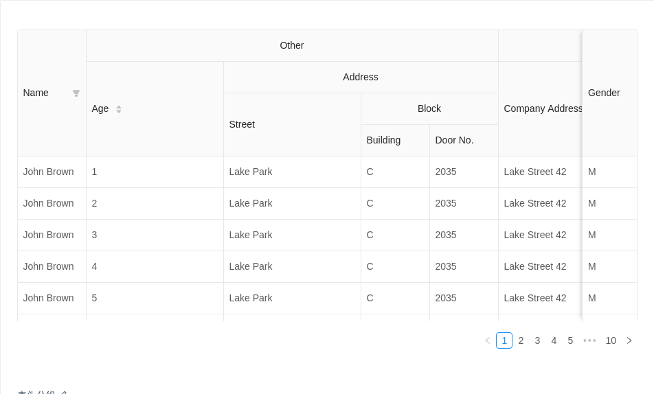
表头分组
columns[n] 可以内嵌 children,以渲染分组表头。
import { Table } from 'antd';const columns = [{title: 'Name',dataIndex: 'name',key: 'name',width: 100,fixed: 'left',filters: [{text: 'Joe',value: 'Joe',},{text: 'John',value: 'John',},],onFilter: (value, record) => record.name.indexOf(value) === 0,},{title: 'Other',children: [{title: 'Age',dataIndex: 'age',key: 'age',width: 200,sorter: (a, b) => a.age - b.age,},{title: 'Address',children: [{title: 'Street',dataIndex: 'street',key: 'street',width: 200,},{title: 'Block',children: [{title: 'Building',dataIndex: 'building',key: 'building',width: 100,},{title: 'Door No.',dataIndex: 'number',key: 'number',width: 100,},],},],},],},{title: 'Company',children: [{title: 'Company Address',dataIndex: 'companyAddress',key: 'companyAddress',},{title: 'Company Name',dataIndex: 'companyName',key: 'companyName',},],},{title: 'Gender',dataIndex: 'gender',key: 'gender',width: 80,fixed: 'right',},];const data = [];for (let i = 0; i < 100; i++) {data.push({key: i,name: 'John Brown',age: i + 1,street: 'Lake Park',building: 'C',number: 2035,companyAddress: 'Lake Street 42',companyName: 'SoftLake Co',gender: 'M',});}ReactDOM.render(<Tablecolumns={columns}dataSource={data}borderedsize="middle"scroll={{ x: '130%', y: 240 }}/>,mountNode,);
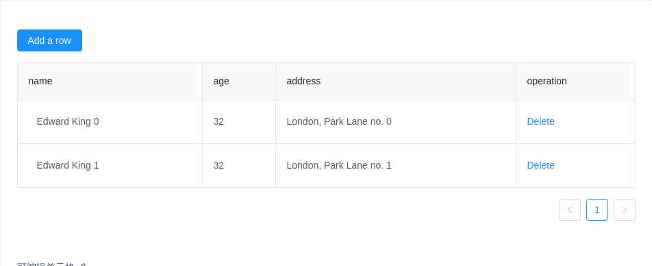
可编辑单元格
带单元格编辑功能的表格。
import { Table, Input, Button, Popconfirm, Form } from 'antd';const EditableContext = React.createContext();const EditableRow = ({ form, index, ...props }) => (<EditableContext.Provider value={form}><tr {...props} /></EditableContext.Provider>);const EditableFormRow = Form.create()(EditableRow);class EditableCell extends React.Component {state = {editing: false,};toggleEdit = () => {const editing = !this.state.editing;this.setState({ editing }, () => {if (editing) {this.input.focus();}});};save = e => {const { record, handleSave } = this.props;this.form.validateFields((error, values) => {if (error && error[e.currentTarget.id]) {return;}this.toggleEdit();handleSave({ ...record, ...values });});};renderCell = form => {this.form = form;const { children, dataIndex, record, title } = this.props;const { editing } = this.state;return editing ? (<Form.Item style={{ margin: 0 }}>{form.getFieldDecorator(dataIndex, {rules: [{required: true,message: `${title} is required.`,},],initialValue: record[dataIndex],})(<Input ref={node => (this.input = node)} onPressEnter={this.save} onBlur={this.save} />)}</Form.Item>) : (<divclassName="editable-cell-value-wrap"style={{ paddingRight: 24 }}onClick={this.toggleEdit}>{children}</div>);};render() {const {editable,dataIndex,title,record,index,handleSave,children,...restProps} = this.props;return (<td {...restProps}>{editable ? (<EditableContext.Consumer>{this.renderCell}</EditableContext.Consumer>) : (children)}</td>);}}class EditableTable extends React.Component {constructor(props) {super(props);this.columns = [{title: 'name',dataIndex: 'name',width: '30%',editable: true,},{title: 'age',dataIndex: 'age',},{title: 'address',dataIndex: 'address',},{title: 'operation',dataIndex: 'operation',render: (text, record) =>this.state.dataSource.length >= 1 ? (<Popconfirm title="Sure to delete?" onConfirm={() => this.handleDelete(record.key)}><a href="javascript:;">Delete</a></Popconfirm>) : null,},];this.state = {dataSource: [{key: '0',name: 'Edward King 0',age: '32',address: 'London, Park Lane no. 0',},{key: '1',name: 'Edward King 1',age: '32',address: 'London, Park Lane no. 1',},],count: 2,};}handleDelete = key => {const dataSource = [...this.state.dataSource];this.setState({ dataSource: dataSource.filter(item => item.key !== key) });};handleAdd = () => {const { count, dataSource } = this.state;const newData = {key: count,name: `Edward King ${count}`,age: 32,address: `London, Park Lane no. ${count}`,};this.setState({dataSource: [...dataSource, newData],count: count + 1,});};handleSave = row => {const newData = [...this.state.dataSource];const index = newData.findIndex(item => row.key === item.key);const item = newData[index];newData.splice(index, 1, {...item,...row,});this.setState({ dataSource: newData });};render() {const { dataSource } = this.state;const components = {body: {row: EditableFormRow,cell: EditableCell,},};const columns = this.columns.map(col => {if (!col.editable) {return col;}return {...col,onCell: record => ({record,editable: col.editable,dataIndex: col.dataIndex,title: col.title,handleSave: this.handleSave,}),};});return (<div><Button onClick={this.handleAdd} type="primary" style={{ marginBottom: 16 }}>Add a row</Button><Tablecomponents={components}rowClassName={() => 'editable-row'}bordereddataSource={dataSource}columns={columns}/></div>);}}ReactDOM.render(<EditableTable />, mountNode);
.editable-cell {position: relative;}.editable-cell-value-wrap {padding: 5px 12px;cursor: pointer;}.editable-row:hover .editable-cell-value-wrap {border: 1px solid #d9d9d9;border-radius: 4px;padding: 4px 11px;}
可编辑行
带行编辑功能的表格。
import { Table, Input, InputNumber, Popconfirm, Form } from 'antd';const data = [];for (let i = 0; i < 100; i++) {data.push({key: i.toString(),name: `Edrward ${i}`,age: 32,address: `London Park no. ${i}`,});}const EditableContext = React.createContext();class EditableCell extends React.Component {getInput = () => {if (this.props.inputType === 'number') {return <InputNumber />;}return <Input />;};renderCell = ({ getFieldDecorator }) => {const {editing,dataIndex,title,inputType,record,index,children,...restProps} = this.props;return (<td {...restProps}>{editing ? (<Form.Item style={{ margin: 0 }}>{getFieldDecorator(dataIndex, {rules: [{required: true,message: `Please Input ${title}!`,},],initialValue: record[dataIndex],})(this.getInput())}</Form.Item>) : (children)}</td>);};render() {return <EditableContext.Consumer>{this.renderCell}</EditableContext.Consumer>;}}class EditableTable extends React.Component {constructor(props) {super(props);this.state = { data, editingKey: '' };this.columns = [{title: 'name',dataIndex: 'name',width: '25%',editable: true,},{title: 'age',dataIndex: 'age',width: '15%',editable: true,},{title: 'address',dataIndex: 'address',width: '40%',editable: true,},{title: 'operation',dataIndex: 'operation',render: (text, record) => {const { editingKey } = this.state;const editable = this.isEditing(record);return editable ? (<span><EditableContext.Consumer>{form => (<ahref="javascript:;"onClick={() => this.save(form, record.key)}style={{ marginRight: 8 }}>Save</a>)}</EditableContext.Consumer><Popconfirm title="Sure to cancel?" onConfirm={() => this.cancel(record.key)}><a>Cancel</a></Popconfirm></span>) : (<a disabled={editingKey !== ''} onClick={() => this.edit(record.key)}>Edit</a>);},},];}isEditing = record => record.key === this.state.editingKey;cancel = () => {this.setState({ editingKey: '' });};save(form, key) {form.validateFields((error, row) => {if (error) {return;}const newData = [...this.state.data];const index = newData.findIndex(item => key === item.key);if (index > -1) {const item = newData[index];newData.splice(index, 1, {...item,...row,});this.setState({ data: newData, editingKey: '' });} else {newData.push(row);this.setState({ data: newData, editingKey: '' });}});}edit(key) {this.setState({ editingKey: key });}render() {const components = {body: {cell: EditableCell,},};const columns = this.columns.map(col => {if (!col.editable) {return col;}return {...col,onCell: record => ({record,inputType: col.dataIndex === 'age' ? 'number' : 'text',dataIndex: col.dataIndex,title: col.title,editing: this.isEditing(record),}),};});return (<EditableContext.Provider value={this.props.form}><Tablecomponents={components}bordereddataSource={this.state.data}columns={columns}rowClassName="editable-row"pagination={{onChange: this.cancel,}}/></EditableContext.Provider>);}}const EditableFormTable = Form.create()(EditableTable);ReactDOM.render(<EditableFormTable />, mountNode);
.editable-row .ant-form-explain {position: absolute;font-size: 12px;margin-top: -4px;}
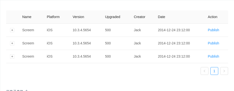
嵌套子表格
展示每行数据更详细的信息。
import { Table, Badge, Menu, Dropdown, Icon } from 'antd';const menu = (<Menu><Menu.Item>Action 1</Menu.Item><Menu.Item>Action 2</Menu.Item></Menu>);function NestedTable() {const expandedRowRender = () => {const columns = [{ title: 'Date', dataIndex: 'date', key: 'date' },{ title: 'Name', dataIndex: 'name', key: 'name' },{title: 'Status',key: 'state',render: () => (<span><Badge status="success" />Finished</span>),},{ title: 'Upgrade Status', dataIndex: 'upgradeNum', key: 'upgradeNum' },{title: 'Action',dataIndex: 'operation',key: 'operation',render: () => (<span className="table-operation"><a href="javascript:;">Pause</a><a href="javascript:;">Stop</a><Dropdown overlay={menu}><a href="javascript:;">More <Icon type="down" /></a></Dropdown></span>),},];const data = [];for (let i = 0; i < 3; ++i) {data.push({key: i,date: '2014-12-24 23:12:00',name: 'This is production name',upgradeNum: 'Upgraded: 56',});}return <Table columns={columns} dataSource={data} pagination={false} />;};const columns = [{ title: 'Name', dataIndex: 'name', key: 'name' },{ title: 'Platform', dataIndex: 'platform', key: 'platform' },{ title: 'Version', dataIndex: 'version', key: 'version' },{ title: 'Upgraded', dataIndex: 'upgradeNum', key: 'upgradeNum' },{ title: 'Creator', dataIndex: 'creator', key: 'creator' },{ title: 'Date', dataIndex: 'createdAt', key: 'createdAt' },{ title: 'Action', key: 'operation', render: () => <a href="javascript:;">Publish</a> },];const data = [];for (let i = 0; i < 3; ++i) {data.push({key: i,name: 'Screem',platform: 'iOS',version: '10.3.4.5654',upgradeNum: 500,creator: 'Jack',createdAt: '2014-12-24 23:12:00',});}return (<TableclassName="components-table-demo-nested"columns={columns}expandedRowRender={expandedRowRender}dataSource={data}/>);}ReactDOM.render(<NestedTable />, mountNode);
拖拽排序
使用自定义元素,我们可以集成 react-dnd 来实现拖拽排序。
import { Table } from 'antd';import { DragDropContext, DragSource, DropTarget } from 'react-dnd';import HTML5Backend from 'react-dnd-html5-backend';import update from 'immutability-helper';let dragingIndex = -1;class BodyRow extends React.Component {render() {const { isOver, connectDragSource, connectDropTarget, moveRow, ...restProps } = this.props;const style = { ...restProps.style, cursor: 'move' };let className = restProps.className;if (isOver) {if (restProps.index > dragingIndex) {className += ' drop-over-downward';}if (restProps.index < dragingIndex) {className += ' drop-over-upward';}}return connectDragSource(connectDropTarget(<tr {...restProps} className={className} style={style} />),);}}const rowSource = {beginDrag(props) {dragingIndex = props.index;return {index: props.index,};},};const rowTarget = {drop(props, monitor) {const dragIndex = monitor.getItem().index;const hoverIndex = props.index;// Don't replace items with themselvesif (dragIndex === hoverIndex) {return;}// Time to actually perform the actionprops.moveRow(dragIndex, hoverIndex);// Note: we're mutating the monitor item here!// Generally it's better to avoid mutations,// but it's good here for the sake of performance// to avoid expensive index searches.monitor.getItem().index = hoverIndex;},};const DragableBodyRow = DropTarget('row', rowTarget, (connect, monitor) => ({connectDropTarget: connect.dropTarget(),isOver: monitor.isOver(),}))(DragSource('row', rowSource, connect => ({connectDragSource: connect.dragSource(),}))(BodyRow),);const columns = [{title: 'Name',dataIndex: 'name',key: 'name',},{title: 'Age',dataIndex: 'age',key: 'age',},{title: 'Address',dataIndex: 'address',key: 'address',},];class DragSortingTable extends React.Component {state = {data: [{key: '1',name: 'John Brown',age: 32,address: 'New York No. 1 Lake Park',},{key: '2',name: 'Jim Green',age: 42,address: 'London No. 1 Lake Park',},{key: '3',name: 'Joe Black',age: 32,address: 'Sidney No. 1 Lake Park',},],};components = {body: {row: DragableBodyRow,},};moveRow = (dragIndex, hoverIndex) => {const { data } = this.state;const dragRow = data[dragIndex];this.setState(update(this.state, {data: {$splice: [[dragIndex, 1], [hoverIndex, 0, dragRow]],},}),);};render() {return (<Tablecolumns={columns}dataSource={this.state.data}components={this.components}onRow={(record, index) => ({index,moveRow: this.moveRow,})}/>);}}const Demo = DragDropContext(HTML5Backend)(DragSortingTable);ReactDOM.render(<Demo />, mountNode);
#components-table-demo-drag-sorting tr.drop-over-downward td {border-bottom: 2px dashed #1890ff;}#components-table-demo-drag-sorting tr.drop-over-upward td {border-top: 2px dashed #1890ff;}
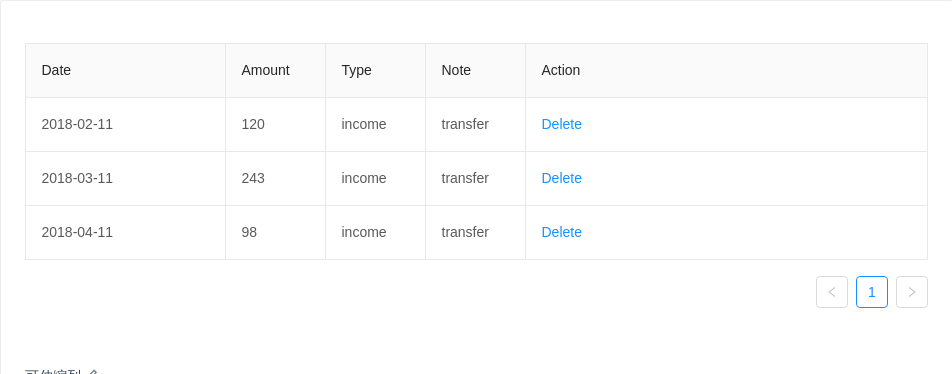
可伸缩列
集成 react-resizable 来实现可伸缩列。
import { Table } from 'antd';import { Resizable } from 'react-resizable';const ResizeableTitle = props => {const { onResize, width, ...restProps } = props;if (!width) {return <th {...restProps} />;}return (<Resizable width={width} height={0} onResize={onResize}><th {...restProps} /></Resizable>);};class Demo extends React.Component {state = {columns: [{title: 'Date',dataIndex: 'date',width: 200,},{title: 'Amount',dataIndex: 'amount',width: 100,},{title: 'Type',dataIndex: 'type',width: 100,},{title: 'Note',dataIndex: 'note',width: 100,},{title: 'Action',key: 'action',render: () => <a href="javascript:;">Delete</a>,},],};components = {header: {cell: ResizeableTitle,},};data = [{key: 0,date: '2018-02-11',amount: 120,type: 'income',note: 'transfer',},{key: 1,date: '2018-03-11',amount: 243,type: 'income',note: 'transfer',},{key: 2,date: '2018-04-11',amount: 98,type: 'income',note: 'transfer',},];handleResize = index => (e, { size }) => {this.setState(({ columns }) => {const nextColumns = [...columns];nextColumns[index] = {...nextColumns[index],width: size.width,};return { columns: nextColumns };});};render() {const columns = this.state.columns.map((col, index) => ({...col,onHeaderCell: column => ({width: column.width,onResize: this.handleResize(index),}),}));return <Table bordered components={this.components} columns={columns} dataSource={this.data} />;}}ReactDOM.render(<Demo />, mountNode);
#components-table-demo-resizable-column .react-resizable {position: relative;}#components-table-demo-resizable-column .react-resizable-handle {position: absolute;width: 10px;height: 100%;bottom: 0;right: -5px;cursor: col-resize;}
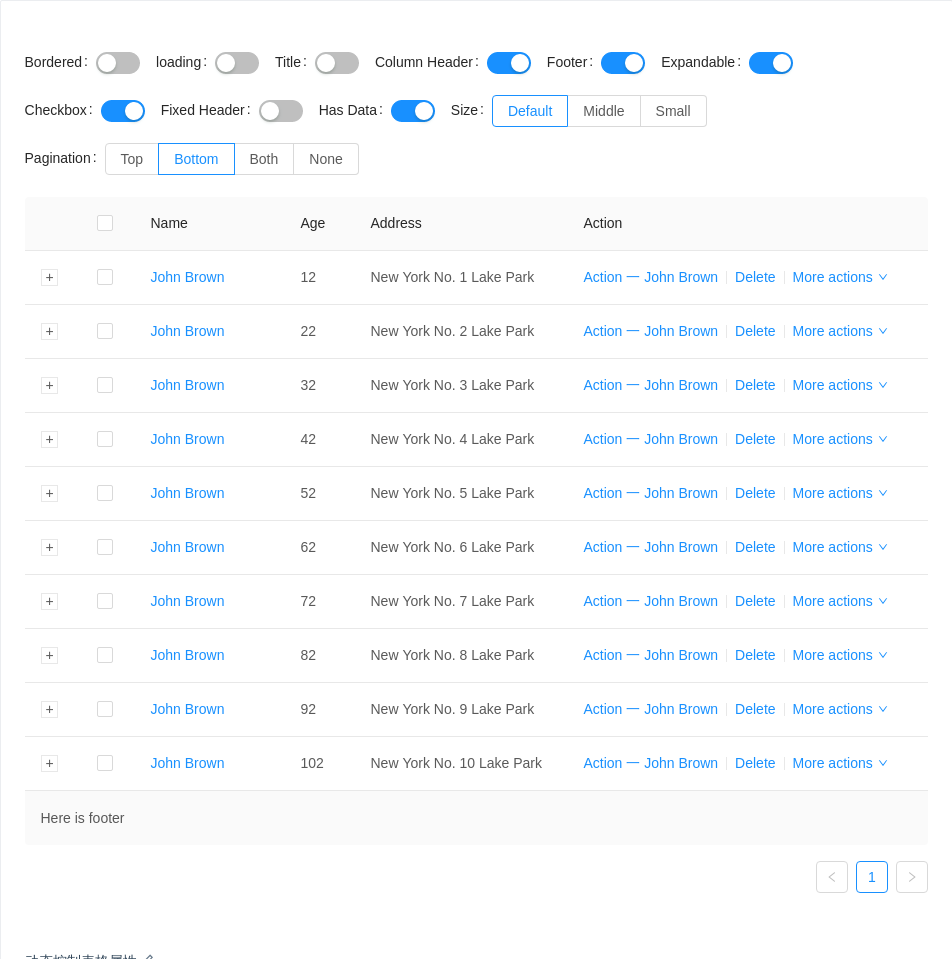
动态控制表格属性
选择不同配置组合查看效果。
import { Table, Icon, Switch, Radio, Form, Divider } from 'antd';const FormItem = Form.Item;const columns = [{title: 'Name',dataIndex: 'name',key: 'name',width: 150,render: text => <a href="javascript:;">{text}</a>,},{title: 'Age',dataIndex: 'age',key: 'age',width: 70,},{title: 'Address',dataIndex: 'address',key: 'address',},{title: 'Action',key: 'action',width: 360,render: (text, record) => (<span><a href="javascript:;">Action 一 {record.name}</a><Divider type="vertical" /><a href="javascript:;">Delete</a><Divider type="vertical" /><a href="javascript:;" className="ant-dropdown-link">More actions <Icon type="down" /></a></span>),},];const data = [];for (let i = 1; i <= 10; i++) {data.push({key: i,name: 'John Brown',age: `${i}2`,address: `New York No. ${i} Lake Park`,description: `My name is John Brown, I am ${i}2 years old, living in New York No. ${i} Lake Park.`,});}const expandedRowRender = record => <p>{record.description}</p>;const title = () => 'Here is title';const showHeader = true;const footer = () => 'Here is footer';const scroll = { y: 240 };const pagination = { position: 'bottom' };class Demo extends React.Component {state = {bordered: false,loading: false,pagination,size: 'default',expandedRowRender,title: undefined,showHeader,footer,rowSelection: {},scroll: undefined,hasData: true,};handleToggle = prop => enable => {this.setState({ [prop]: enable });};handleSizeChange = e => {this.setState({ size: e.target.value });};handleExpandChange = enable => {this.setState({ expandedRowRender: enable ? expandedRowRender : undefined });};handleTitleChange = enable => {this.setState({ title: enable ? title : undefined });};handleHeaderChange = enable => {this.setState({ showHeader: enable ? showHeader : false });};handleFooterChange = enable => {this.setState({ footer: enable ? footer : undefined });};handleRowSelectionChange = enable => {this.setState({ rowSelection: enable ? {} : undefined });};handleScollChange = enable => {this.setState({ scroll: enable ? scroll : undefined });};handleDataChange = hasData => {this.setState({ hasData });};handlePaginationChange = e => {const { value } = e.target;this.setState({pagination: value === 'none' ? false : { position: value },});};render() {const state = this.state;return (<div><div className="components-table-demo-control-bar"><Form layout="inline"><FormItem label="Bordered"><Switch checked={state.bordered} onChange={this.handleToggle('bordered')} /></FormItem><FormItem label="loading"><Switch checked={state.loading} onChange={this.handleToggle('loading')} /></FormItem><FormItem label="Title"><Switch checked={!!state.title} onChange={this.handleTitleChange} /></FormItem><FormItem label="Column Header"><Switch checked={!!state.showHeader} onChange={this.handleHeaderChange} /></FormItem><FormItem label="Footer"><Switch checked={!!state.footer} onChange={this.handleFooterChange} /></FormItem><FormItem label="Expandable"><Switch checked={!!state.expandedRowRender} onChange={this.handleExpandChange} /></FormItem><FormItem label="Checkbox"><Switch checked={!!state.rowSelection} onChange={this.handleRowSelectionChange} /></FormItem><FormItem label="Fixed Header"><Switch checked={!!state.scroll} onChange={this.handleScollChange} /></FormItem><FormItem label="Has Data"><Switch checked={!!state.hasData} onChange={this.handleDataChange} /></FormItem><FormItem label="Size"><Radio.Group size="default" value={state.size} onChange={this.handleSizeChange}><Radio.Button value="default">Default</Radio.Button><Radio.Button value="middle">Middle</Radio.Button><Radio.Button value="small">Small</Radio.Button></Radio.Group></FormItem><FormItem label="Pagination"><Radio.Groupvalue={state.pagination ? state.pagination.position : 'none'}onChange={this.handlePaginationChange}><Radio.Button value="top">Top</Radio.Button><Radio.Button value="bottom">Bottom</Radio.Button><Radio.Button value="both">Both</Radio.Button><Radio.Button value="none">None</Radio.Button></Radio.Group></FormItem></Form></div><Table {...this.state} columns={columns} dataSource={state.hasData ? data : null} /></div>);}}ReactDOM.render(<Demo />, mountNode);
API
Table
| 参数 | 说明 | 类型 | 默认值 |
|---|---|---|---|
| bordered | 是否展示外边框和列边框 | boolean | false |
| childrenColumnName | 指定树形结构的列名 | string[] | children |
| columns | 表格列的配置描述,具体项见下表 | ColumnProps[] | - |
| components | 覆盖默认的 table 元素 | TableComponents | - |
| dataSource | 数据数组 | any[] | |
| defaultExpandAllRows | 初始时,是否展开所有行 | boolean | false |
| defaultExpandedRowKeys | 默认展开的行 | string[] | - |
| expandedRowKeys | 展开的行,控制属性 | string[] | - |
| expandedRowRender | 额外的展开行 | Function(record, index, indent, expanded):ReactNode | - |
| expandIcon | 自定义展开图标,参考示例 | Function(props):ReactNode | - |
| expandRowByClick | 通过点击行来展开子行 | boolean | false |
| footer | 表格尾部 | Function(currentPageData) | |
| indentSize | 展示树形数据时,每层缩进的宽度,以 px 为单位 | number | 15 |
| loading | 页面是否加载中 | boolean|object (更多) | false |
| locale | 默认文案设置,目前包括排序、过滤、空数据文案 | object | filterConfirm: '确定' filterReset: '重置' emptyText: '暂无数据' 默认值 |
| pagination | 分页器,参考配置项或 pagination 文档,设为 false 时不展示和进行分页 | object | |
| rowClassName | 表格行的类名 | Function(record, index):string | - |
| rowKey | 表格行 key 的取值,可以是字符串或一个函数 | string|Function(record):string | 'key' |
| rowSelection | 表格行是否可选择,配置项 | object | null |
| scroll | 设置横向或纵向滚动,也可用于指定滚动区域的宽和高,可以设置为像素值,百分比,true 和 'max-content' | { x: number | true, y: number } | - |
| showHeader | 是否显示表头 | boolean | true |
| size | 表格大小 | default | middle | small | default |
| title | 表格标题 | Function(currentPageData) | |
| onChange | 分页、排序、筛选变化时触发 | Function(pagination, filters, sorter, extra: { currentDataSource: [] }) | |
| onExpand | 点击展开图标时触发 | Function(expanded, record) | |
| onExpandedRowsChange | 展开的行变化时触发 | Function(expandedRows) | |
| onHeaderRow | 设置头部行属性 | Function(column, index) | - |
| onRow | 设置行属性 | Function(record, index) | - |
onRow 用法
适用于 onRow onHeaderRow onCell onHeaderCell。
<TableonRow={record => {return {onClick: event => {}, // 点击行onDoubleClick: event => {},onContextMenu: event => {},onMouseEnter: event => {}, // 鼠标移入行onMouseLeave: event => {},};}}onHeaderRow={column => {return {onClick: () => {}, // 点击表头行};}}/>
Column
列描述数据对象,是 columns 中的一项,Column 使用相同的 API。
| 参数 | 说明 | 类型 | 默认值 |
|---|---|---|---|
| align | 设置列的对齐方式 | 'left' | 'right' | 'center' | 'left' |
| className | 列样式类名 | string | - |
| colSpan | 表头列合并,设置为 0 时,不渲染 | number | |
| dataIndex | 列数据在数据项中对应的 key,支持 a.b.c、a[0].b.c[1] 的嵌套写法 | string | - |
| defaultSortOrder | 默认排序顺序 | 'ascend' | 'descend' | - |
| filterDropdown | 可以自定义筛选菜单,此函数只负责渲染图层,需要自行编写各种交互 | ReactNode | - |
| filterDropdownVisible | 用于控制自定义筛选菜单是否可见 | boolean | - |
| filtered | 标识数据是否经过过滤,筛选图标会高亮 | boolean | false |
| filteredValue | 筛选的受控属性,外界可用此控制列的筛选状态,值为已筛选的 value 数组 | string[] | - |
| filterIcon | 自定义 filter 图标。 | ReactNode|(filtered: boolean) => ReactNode | false |
| filterMultiple | 是否多选 | boolean | true |
| filters | 表头的筛选菜单项 | object[] | - |
| fixed | 列是否固定,可选 true(等效于 left) 'left' 'right' | boolean|string | false |
| key | React 需要的 key,如果已经设置了唯一的 dataIndex,可以忽略这个属性 | string | - |
| render | 生成复杂数据的渲染函数,参数分别为当前行的值,当前行数据,行索引,@return 里面可以设置表格行/列合并 | Function(text, record, index) {} | - |
| sorter | 排序函数,本地排序使用一个函数(参考 Array.sort 的 compareFunction),需要服务端排序可设为 true | Function|boolean | - |
| sortOrder | 排序的受控属性,外界可用此控制列的排序,可设置为 'ascend' 'descend' false | boolean|string | - |
| sortDirections | 支持的排序方式,取值为 'ascend' 'descend' | Array | ['ascend', 'descend'] |
| title | 列头显示文字 | ReactNode|({ sortOrder, filters }) => ReactNode | - |
| width | 列宽度(指定了也不生效?) | string|number | - |
| onCell | 设置单元格属性 | Function(record, rowIndex) | - |
| onFilter | 本地模式下,确定筛选的运行函数 | Function | - |
| onFilterDropdownVisibleChange | 自定义筛选菜单可见变化时调用 | function(visible) {} | - |
| onHeaderCell | 设置头部单元格属性 | Function(column) | - |
ColumnGroup
| 参数 | 说明 | 类型 | 默认值 |
|---|---|---|---|
| title | 列头显示文字 | string|ReactNode | - |
pagination
分页的配置项。
| 参数 | 说明 | 类型 | 默认值 |
|---|---|---|---|
| position | 指定分页显示的位置 | 'top' | 'bottom' | 'both' | 'bottom' |
更多配置项,请查看 Pagination。
rowSelection
选择功能的配置。
| 参数 | 说明 | 类型 | 默认值 |
|---|---|---|---|
| columnWidth | 自定义列表选择框宽度 | string|number | 60px |
| columnTitle | 自定义列表选择框标题 | string|React.ReactNode | - |
| fixed | 把选择框列固定在左边 | boolean | - |
| getCheckboxProps | 选择框的默认属性配置 | Function(record) | - |
| hideDefaultSelections | 去掉『全选』『反选』两个默认选项 | boolean | false |
| selectedRowKeys | 指定选中项的 key 数组,需要和 onChange 进行配合 | string[] | [] |
| selections | 自定义选择项 配置项, 设为 true 时使用默认选择项 | object[]|boolean | true |
| type | 多选/单选,checkbox or radio | string | checkbox |
| onChange | 选中项发生变化时的回调 | Function(selectedRowKeys, selectedRows) | - |
| onSelect | 用户手动选择/取消选择某行的回调 | Function(record, selected, selectedRows, nativeEvent) | - |
| onSelectAll | 用户手动选择/取消选择所有行的回调 | Function(selected, selectedRows, changeRows) | - |
| onSelectInvert | 用户手动选择反选的回调 | Function(selectedRows) | - |
selection
| 参数 | 说明 | 类型 | 默认值 |
|---|---|---|---|
| key | React 需要的 key,建议设置 | string | - |
| text | 选择项显示的文字 | string|React.ReactNode | - |
| onSelect | 选择项点击回调 | Function(changeableRowKeys) | - |
在 TypeScript 中使用
import { Table } from 'antd';import { ColumnProps } from 'antd/lib/table';interface IUser {key: number;name: string;}const columns: ColumnProps<IUser>[] = [{key: 'name',title: 'Name',dataIndex: 'name',}];const data: IUser[] = [{key: 0,name: 'Jack',}];class UserTable extends Table<IUser> {}<UserTable columns={columns} dataSource={data} />// 使用 JSX 风格的 APIclass NameColumn extends Table.Column<IUser> {}<UserTable dataSource={data}><NameColumn key="name" title="Name" dataIndex="name" /></UserTable>// TypeScript 2.9 之后也可以这样写// https://www.typescriptlang.org/docs/handbook/release-notes/typescript-2-9.html#generic-type-arguments-in-jsx-elements<Table<IUser> columns={columns} dataSource={data} /><Table<IUser> dataSource={data}><Table.Column<IUser> key="name" title="Name" dataIndex="name" /></Table>
注意
按照 React 的规范,所有的组件数组必须绑定 key。在 Table 中,dataSource 和 columns 里的数据值都需要指定 key 值。对于 dataSource 默认将每列数据的 key 属性作为唯一的标识。
如果你的数据没有这个属性,务必使用 rowKey 来指定数据列的主键。若没有指定,控制台会出现以下的提示,表格组件也会出现各类奇怪的错误。

// 比如你的数据主键是 uidreturn <Table rowKey="uid" />;// 或return <Table rowKey={record => record.uid} />;
