 我的书签
我的书签
 添加书签
添加书签 移除书签
移除书签- AutoComplete自动完成
- 何时使用
- 代码演示
- API
- 方法
AutoComplete自动完成
输入框自动完成功能。
何时使用
需要自动完成时。
代码演示
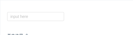
基本使用
基本使用。通过 dataSource 设置自动完成的数据源
import { AutoComplete } from 'antd';function onSelect(value) {console.log('onSelect', value);}class Complete extends React.Component {state = {dataSource: [],};handleSearch = value => {this.setState({dataSource: !value ? [] : [value, value + value, value + value + value],});};render() {const { dataSource } = this.state;return (<AutoCompletedataSource={dataSource}style={{ width: 200 }}onSelect={onSelect}onSearch={this.handleSearch}placeholder="input here"/>);}}ReactDOM.render(<Complete />, mountNode);
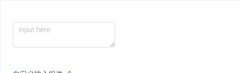
自定义输入组件
自定义输入组件。
import { AutoComplete, Input } from 'antd';const { TextArea } = Input;function onSelect(value) {console.log('onSelect', value);}class Complete extends React.Component {state = {dataSource: [],};handleSearch = value => {this.setState({dataSource: !value ? [] : [value, value + value, value + value + value],});};handleKeyPress = ev => {console.log('handleKeyPress', ev);};render() {const { dataSource } = this.state;return (<AutoCompletedataSource={dataSource}style={{ width: 200 }}onSelect={onSelect}onSearch={this.handleSearch}><TextAreaplaceholder="input here"className="custom"style={{ height: 50 }}onKeyPress={this.handleKeyPress}/></AutoComplete>);}}ReactDOM.render(<Complete />, mountNode);
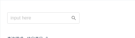
查询模式 - 确定类目
查询模式: 确定类目 示例。
import { Icon, Input, AutoComplete } from 'antd';const Option = AutoComplete.Option;const OptGroup = AutoComplete.OptGroup;const dataSource = [{title: '话题',children: [{title: 'AntDesign',count: 10000,},{title: 'AntDesign UI',count: 10600,},],},{title: '问题',children: [{title: 'AntDesign UI 有多好',count: 60100,},{title: 'AntDesign 是啥',count: 30010,},],},{title: '文章',children: [{title: 'AntDesign 是一个设计语言',count: 100000,},],},];function renderTitle(title) {return (<span>{title}<astyle={{ float: 'right' }}href="https://www.google.com/search?q=antd"target="_blank"rel="noopener noreferrer">更多</a></span>);}const options = dataSource.map(group => (<OptGroup key={group.title} label={renderTitle(group.title)}>{group.children.map(opt => (<Option key={opt.title} value={opt.title}>{opt.title}<span className="certain-search-item-count">{opt.count} 人 关注</span></Option>))}</OptGroup>)).concat([<Option disabled key="all" className="show-all"><a href="https://www.google.com/search?q=antd" target="_blank" rel="noopener noreferrer">查看所有结果</a></Option>,]);function Complete() {return (<div className="certain-category-search-wrapper" style={{ width: 250 }}><AutoCompleteclassName="certain-category-search"dropdownClassName="certain-category-search-dropdown"dropdownMatchSelectWidth={false}dropdownStyle={{ width: 300 }}size="large"style={{ width: '100%' }}dataSource={options}placeholder="input here"optionLabelProp="value"><Input suffix={<Icon type="search" className="certain-category-icon" />} /></AutoComplete></div>);}ReactDOM.render(<Complete />, mountNode);
.certain-category-search.ant-select-auto-complete .ant-input-affix-wrapper .ant-input-suffix {right: 12px;}.certain-category-search-dropdown .ant-select-dropdown-menu-item-group-title {color: #666;font-weight: bold;}.certain-category-search-dropdown .ant-select-dropdown-menu-item-group {border-bottom: 1px solid #f6f6f6;}.certain-category-search-dropdown .ant-select-dropdown-menu-item {padding-left: 16px;}.certain-category-search-dropdown .ant-select-dropdown-menu-item.show-all {text-align: center;cursor: default;}.certain-category-search-dropdown .ant-select-dropdown-menu {max-height: 300px;}.certain-search-item-count {position: absolute;color: #999;right: 16px;}.certain-category-search.ant-select-focused .certain-category-icon {color: #108ee9;}.certain-category-icon {color: #6e6e6e;transition: all 0.3s cubic-bezier(0.645, 0.045, 0.355, 1);font-size: 16px;}
自定义选项
也可以直接传 AutoComplete.Option 作为 AutoComplete 的 children,而非使用 dataSource。
import { AutoComplete } from 'antd';const Option = AutoComplete.Option;class Complete extends React.Component {state = {result: [],};handleSearch = value => {let result;if (!value || value.indexOf('@') >= 0) {result = [];} else {result = ['gmail.com', '163.com', 'qq.com'].map(domain => `${value}@${domain}`);}this.setState({ result });};render() {const { result } = this.state;const children = result.map(email => <Option key={email}>{email}</Option>);return (<AutoComplete style={{ width: 200 }} onSearch={this.handleSearch} placeholder="input here">{children}</AutoComplete>);}}ReactDOM.render(<Complete />, mountNode);
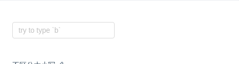
不区分大小写
不区分大小写的 AutoComplete
import { AutoComplete } from 'antd';const dataSource = ['Burns Bay Road', 'Downing Street', 'Wall Street'];function Complete() {return (<AutoCompletestyle={{ width: 200 }}dataSource={dataSource}placeholder="try to type `b`"filterOption={(inputValue, option) =>option.props.children.toUpperCase().indexOf(inputValue.toUpperCase()) !== -1}/>);}ReactDOM.render(<Complete />, mountNode);
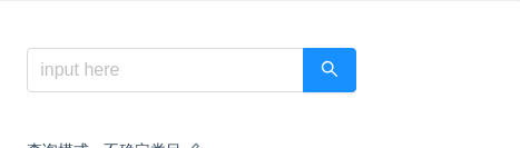
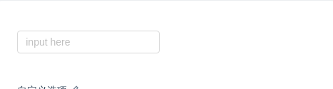
查询模式 - 不确定类目
查询模式: 不确定类目 示例。
import { Icon, Button, Input, AutoComplete } from 'antd';const Option = AutoComplete.Option;function onSelect(value) {console.log('onSelect', value);}function getRandomInt(max, min = 0) {return Math.floor(Math.random() * (max - min + 1)) + min; // eslint-disable-line no-mixed-operators}function searchResult(query) {return new Array(getRandomInt(5)).join('.').split('.').map((item, idx) => ({query,category: `${query}${idx}`,count: getRandomInt(200, 100),}));}function renderOption(item) {return (<Option key={item.category} text={item.category}><div className="global-search-item"><span className="global-search-item-desc">{item.query} 在<ahref={`https://s.taobao.com/search?q=${item.query}`}target="_blank"rel="noopener noreferrer">{item.category}</a>区块中</span><span className="global-search-item-count">约 {item.count} 个结果</span></div></Option>);}class Complete extends React.Component {state = {dataSource: [],};handleSearch = value => {this.setState({dataSource: value ? searchResult(value) : [],});};render() {const { dataSource } = this.state;return (<div className="global-search-wrapper" style={{ width: 300 }}><AutoCompleteclassName="global-search"size="large"style={{ width: '100%' }}dataSource={dataSource.map(renderOption)}onSelect={onSelect}onSearch={this.handleSearch}placeholder="input here"optionLabelProp="text"><Inputsuffix={<Button className="search-btn" size="large" type="primary"><Icon type="search" /></Button>}/></AutoComplete></div>);}}ReactDOM.render(<Complete />, mountNode);
.global-search-wrapper {padding-right: 50px;}.global-search {width: 100%;}.global-search.ant-select-auto-complete .ant-select-selection--single {margin-right: -46px;}.global-search.ant-select-auto-complete .ant-input-affix-wrapper .ant-input:not(:last-child) {padding-right: 62px;}.global-search.ant-select-auto-complete .ant-input-affix-wrapper .ant-input-suffix {right: 0;}.global-search.ant-select-auto-complete .ant-input-affix-wrapper .ant-input-suffix button {border-top-left-radius: 0;border-bottom-left-radius: 0;}.global-search-item {display: flex;}.global-search-item-desc {flex: auto;text-overflow: ellipsis;overflow: hidden;}.global-search-item-count {flex: none;}
API
const dataSource = ['12345', '23456', '34567'];<AutoComplete dataSource={dataSource} />;
| 参数 | 说明 | 类型 | 默认值 |
|---|---|---|---|
| allowClear | 支持清除, 单选模式有效 | boolean | false |
| autoFocus | 自动获取焦点 | boolean | false |
| backfill | 使用键盘选择选项的时候把选中项回填到输入框中 | boolean | false |
| children (自动完成的数据源) | 自动完成的数据源 | React.ReactElement | - |
| children (自定义输入框) | 自定义输入框 | HTMLInputElement / HTMLTextAreaElement / React.ReactElement | <Input /> |
| dataSource | 自动完成的数据源 | DataSourceItemType[] | |
| defaultActiveFirstOption | 是否默认高亮第一个选项。 | boolean | true |
| defaultValue | 指定默认选中的条目 | string|string[]| 无 | |
| disabled | 是否禁用 | boolean | false |
| filterOption | 是否根据输入项进行筛选。当其为一个函数时,会接收 inputValue option 两个参数,当 option 符合筛选条件时,应返回 true,反之则返回 false。 | boolean or function(inputValue, option) | true |
| optionLabelProp | 回填到选择框的 Option 的属性值,默认是 Option 的子元素。比如在子元素需要高亮效果时,此值可以设为 value。 | string | children |
| placeholder | 输入框提示 | string | - |
| value | 指定当前选中的条目 | string|string[]|{ key: string, label: string|ReactNode }|Array<{ key: string, label: string|ReactNode }> | 无 |
| onBlur | 失去焦点时的回调 | function() | - |
| onChange | 选中 option,或 input 的 value 变化时,调用此函数 | function(value) | 无 |
| onFocus | 获得焦点时的回调 | function() | - |
| onSearch | 搜索补全项的时候调用 | function(value) | 无 |
| onSelect | 被选中时调用,参数为选中项的 value 值 | function(value, option) | 无 |
| defaultOpen | 是否默认展开下拉菜单 | boolean | - |
| open | 是否展开下拉菜单 | boolean | - |
| onDropdownVisibleChange | 展开下拉菜单的回调 | function(open) | - |
方法
| 名称 | 描述 |
|---|---|
| blur() | 移除焦点 |
| focus() | 获取焦点 |
