 我的书签
我的书签
 添加书签
添加书签 移除书签
移除书签- Spin加载中
- 何时使用
- 代码演示
- API
- 静态方法
- 静态方法
Spin加载中
用于页面和区块的加载中状态。
何时使用
页面局部处于等待异步数据或正在渲染过程时,合适的加载动效会有效缓解用户的焦虑。
代码演示

基本用法
一个简单的 loading 状态。
import { Spin } from 'antd';ReactDOM.render(<Spin />, mountNode);

容器
放入一个容器中。
import { Spin } from 'antd';ReactDOM.render(<div className="example"><Spin /></div>,mountNode,);
.example {text-align: center;background: rgba(0, 0, 0, 0.05);border-radius: 4px;margin-bottom: 20px;padding: 30px 50px;margin: 20px 0;}
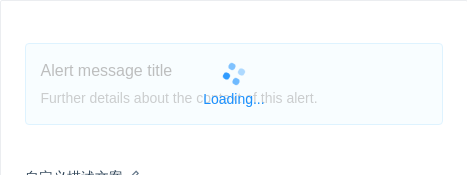
自定义描述文案
自定义描述文案。
import { Spin, Alert } from 'antd';ReactDOM.render(<Spin tip="Loading..."><Alertmessage="Alert message title"description="Further details about the context of this alert."type="info"/></Spin>,mountNode,);

自定义指示符
使用自定义指示符。
import { Spin, Icon } from 'antd';const antIcon = <Icon type="loading" style={{ fontSize: 24 }} spin />;ReactDOM.render(<Spin indicator={antIcon} />, mountNode);

各种大小
小的用于文本加载,默认用于卡片容器级加载,大的用于页面级加载。
import { Spin } from 'antd';ReactDOM.render(<div><Spin size="small" /><Spin /><Spin size="large" /></div>,mountNode,);
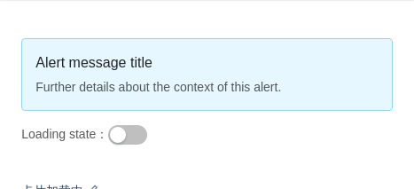
卡片加载中
可以直接把内容内嵌到 Spin 中,将现有容器变为加载状态。
import { Spin, Switch, Alert } from 'antd';class Card extends React.Component {state = { loading: false };toggle = value => {this.setState({ loading: value });};render() {return (<div><Spin spinning={this.state.loading}><Alertmessage="Alert message title"description="Further details about the context of this alert."type="info"/></Spin><div style={{ marginTop: 16 }}>Loading state:<Switch checked={this.state.loading} onChange={this.toggle} /></div></div>);}}ReactDOM.render(<Card />, mountNode);
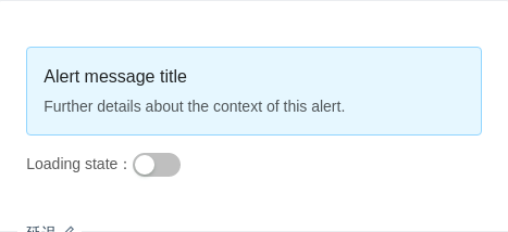
延迟
延迟显示 loading 效果。当 spinning 状态在 delay 时间内结束,则不显示 loading 状态。
import { Spin, Alert, Switch } from 'antd';class Card extends React.Component {state = { loading: false };toggle = value => {this.setState({ loading: value });};render() {const container = (<Alertmessage="Alert message title"description="Further details about the context of this alert."type="info"/>);return (<div><Spin spinning={this.state.loading} delay={500}>{container}</Spin><div style={{ marginTop: 16 }}>Loading state:<Switch checked={this.state.loading} onChange={this.toggle} /></div></div>);}}ReactDOM.render(<Card />, mountNode);
API
| 参数 | 说明 | 类型 | 默认值 |
|---|---|---|---|
| delay | 延迟显示加载效果的时间(防止闪烁) | number (毫秒) | - |
| indicator | 加载指示符 | ReactElement | - |
| size | 组件大小,可选值为 small default large | string | 'default' |
| spinning | 是否为加载中状态 | boolean | true |
| tip | 当作为包裹元素时,可以自定义描述文案 | string | - |
| wrapperClassName | 包装器的类属性 | string | - |
静态方法
Spin.setDefaultIndicator(indicator: ReactElement)同上indicator,你可以自定义全局默认元素
