 我的书签
我的书签
 添加书签
添加书签 移除书签
移除书签- 引入
- 使用指南
- 代码演示
- 普通输入框
- 业务场景输入框
- 表单控件
- 请在移动设备中扫码预览
- 标题浮动输入框
- 大尺寸金融表单
- 错误提示
- API
- InputItem Props
- InputItem Slots
- left
- right
- brief
- error
- InputItem Methods
- focus()
- blur()
- getValue()
- InputItem Events
- @focus(name)
- @blur(name)
- @change(name, value)
- @confirm(name, value)
- @keyup(name, event)
- @keydown(name, event)
- 表单校验
InputItem 输入框

单行文本输入框,支持特殊场景文本格式化
引入
import { InputItem } from 'mand-mobile'Vue.component(InputItem.name, InputItem)
使用指南
input-item的表单校验可使用第三方工具,如vee-validate,使用示例可参考表单校验)
代码演示
普通输入框
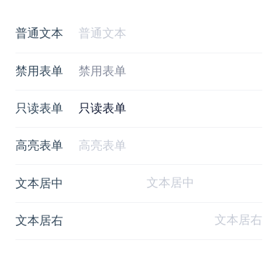
<template><div class="md-example-child md-example-child-input-item-0"><md-field><md-input-itemref="input0"title="普通文本"placeholder="普通文本"is-amount:maxlength="5"></md-input-item><md-input-itemref="input1"title="禁用表单"value="禁用表单"disabled></md-input-item><md-input-itemref="input12"title="只读表单"value="只读表单"readonly></md-input-item><md-input-itemref="input13"title="高亮表单"placeholder="高亮表单"is-highlight></md-input-item><md-input-itemref="input3"title="文本居中"placeholder="文本居中"align="center"></md-input-item><md-input-itemref="input4"title="文本居右"placeholder="文本居右"align="right"></md-input-item></md-field></div></template><script>import {InputItem, Field} from 'mand-mobile'export default {name: 'input-item-demo',components: {[InputItem.name]: InputItem,[Field.name]: Field,},}</script>
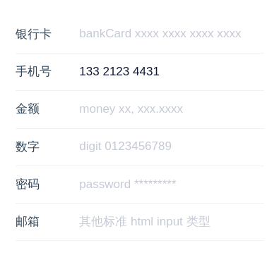
业务场景输入框
        <template>
  <div class="md-example-child md-example-child-input-item-2">
    <md-field>
      <md-input-item
        title="银行卡"
        type="bankCard"
        placeholder="bankCard xxxx xxxx xxxx xxxx"
      ></md-input-item>
      <md-input-item
        title="手机号"
        type="phone"
        v-model="phone"
        placeholder="phone xxx xxxx xxxx"
      ></md-input-item>
      <md-input-item
        title="金额"
        type="money"
        v-model="money"
        @keydown="onInputKeydown"
        @change="onInputChange"
        placeholder="money xx, xxx.xxxx"
      ></md-input-item>
      <md-input-item
        title="数字"
        type="digit"
        v-model="digit"
        placeholder="digit 0123456789"
      ></md-input-item>
      <md-input-item
        title="密码"
        type="password"
        placeholder="password *********"
      ></md-input-item>
      <md-input-item
        title="邮箱"
        type="email"
        placeholder="其他标准 html input 类型"
      ></md-input-item>
    </md-field>
  </div>
</template>

<script>
import {InputItem, Field} from 'mand-mobile'

export default {
  name: 'input-item-demo',
  components: {
    [InputItem.name]: InputItem,
    [Field.name]: Field,
  },
  data() {
    return {
      phone: '13321234431',
      money: '',
      digit: '',
    }
  },
  methods: {
    onInputKeydown(name, event) {
      console.log(`[Mand Mobile InputItem keydown] ${event.keyCode}`)
    },
    onInputChange(name, value) {
      console.log(`[Mand Mobile InputItem change] ${value}`)
    },
  },
}

</script>
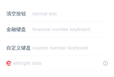
表单控件
请在移动设备中扫码预览
        <template>
  <div class="md-example-child md-example-child-input-item-4">
    <md-field>
      <md-input-item
        ref="input9"
        title="清空按钮"
        placeholder="normal text"
        clearable
      ></md-input-item>

      <md-input-item
        ref="input10"
        title="金融键盘"
        placeholder="financial number keyboard"
        is-virtual-keyboard
        clearable
        @focus="onFakeInputFocus"
        @blur="onFakeInputBlur"
      ></md-input-item>

      <md-input-item
        ref="input11"
        title="自定义键盘"
        placeholder="custom number keyboard"
        is-virtual-keyboard
        virtual-keyboard-vm="myNumberKeyBoard"
        clearable
      ></md-input-item>
      <md-number-keyboard type="simple" ref="myNumberKeyBoard"></md-number-keyboard>

      <md-input-item
        ref="input11"
        placeholder="left/right slots"
      >
        <md-icon name="bank-zs" slot="left" svg></md-icon>
        <md-icon name="info" slot="right" @click.native="onClick"></md-icon>
      </md-input-item>
    </md-field>
  </div>
</template>

<script>
import {InputItem, NumberKeyboard, Field, Icon, Toast} from 'mand-mobile'
import '@examples/assets/images/bank-zs.svg'

export default {
  name: 'input-item-demo',
  components: {
    [InputItem.name]: InputItem,
    [NumberKeyboard.name]: NumberKeyboard,
    [Field.name]: Field,
    [Icon.name]: Icon,
  },
  methods: {
    onClick() {
      Toast({
        content: 'some information',
        icon: 'warn',
      })
    },
    onFakeInputFocus() {
      // function getElementPosition(element) {
      //   const defaultRect = {top: 0, left: 0}
      //   const rect = element
      //     ? (element.getBoundingClientRect && element.getBoundingClientRect()) || defaultRect
      //     : defaultRect
      //   const ret = {
      //     top: rect.top,
      //     left: rect.left,
      //   }
      //   return ret
      // }
      // setTimeout(() => {
      //   const wrapper = this.$el
      //   const inputer = this.$refs['input10']
      //   const inputEl = inputer.$el
      //   const keyboardEl = document
      //     .querySelector(`#${inputer.name}-number-keyboard`)
      //     .querySelector('.md-number-keyboard-container')
      //   const offset =
      //     keyboardEl.clientHeight +
      //     inputEl.clientHeight -
      //     document.documentElement.clientHeight +
      //     getElementPosition(inputEl).top +
      //     30
      //   const oldPaddingBottom = +wrapper.style.paddingBottom.replace(/px|rem|em/gi, '')
      //   const oldScrollTop = document.body.scrollTop
      //   const newPaddingBottom = oldPaddingBottom + offset
      //   const newScrollTop = oldScrollTop + offset
      //   wrapper.style.paddingBottom = `${newPaddingBottom}px`
      //   document.body.scrollTop = newScrollTop
      //   this.scrollInputBack = () => {
      //     wrapper.style.paddingBottom = `${oldPaddingBottom}px`
      //     document.body.scrollTop = oldScrollTop
      //     this.scrollInputBack = null
      //   }
      // }, 300)
    },
    onFakeInputBlur() {
      this.scrollInputBack && this.scrollInputBack()
    },
  },
}

</script>

<style lang="stylus">
.md-example-child-input-item-2
  .md-number-keyboard .md-popup-box
    max-width 720px
</style>
标题浮动输入框

        <template>
  <div class="md-example-child md-example-child-input-item-1">
    <md-field>
      <md-input-item
        ref="name"
        title="真实姓名"
        placeholder="投保人姓名"
        is-title-latent
        clearable
      ></md-input-item>
      <md-input-item
        ref="id"
        title="身份证号"
        placeholder="投保人身份证号"
        is-title-latent
        clearable
        ></md-input-item>
    </md-field>
  </div>
</template>

<script>
import {InputItem, Field} from 'mand-mobile'

export default {
  name: 'input-item-demo',
  components: {
    [InputItem.name]: InputItem,
    [Field.name]: Field,
  },
}

</script>

<style lang="stylus">
.md-example-child-input-item-1
  .md-field
    padding-bottom 40px
</style>
大尺寸金融表单

        <template>
  <div class="md-example-child md-example-child-input-item-3">
    <md-field title="转出金额(元)">
      <div
        class="field-operator"
        slot="action"
        @click="onClick"
      >
        <md-icon name="info"></md-icon>
      </div>
      <md-input-item
        type="money"
        v-model="value"
        brief="理财提示文案,字符超出10个自动变小"
        placeholder="最多30万元"
        :size="size"
        is-amount
        is-highlight
      >
        <div class="input-operator" slot="right" @click="takeAll">全部取出</div>
      </md-input-item>
    </md-field>
  </div>
</template>

<script>
import {InputItem, Field, Icon, Toast} from 'mand-mobile'

export default {
  name: 'input-item-demo',
  components: {
    [InputItem.name]: InputItem,
    [Field.name]: Field,
    [Icon.name]: Icon,
  },
  data() {
    return {
      value: '',
    }
  },
  computed: {
    size() {
      return this.value.length > 10 ? 'small' : 'large'
    },
  },
  methods: {
    takeAll() {
      this.value = '300000'
    },
    onClick() {
      Toast({
        content: 'some information',
        icon: 'warn',
      })
    },
  },
}

</script>

<style lang="stylus">
.md-example-child-input-item-3
  .md-field
    padding-bottom 20px
    .md-field-title
      .value
        display flex
        align-items center
        justify-content flex-end
        .field-operator
          display flex
          align-items center
    .md-field-item-content::before
      background-color #C5CAD5
    .input-operator
      font-size 28px
      color #5878B4
</style>
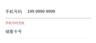
错误提示
        <template>
  <div class="md-example-child md-example-child-input-item-5">
    <md-field>
      <md-input-item
        type="phone"
        title="手机号码"
        value="1999999999999"
        error="手机号码无效"
        clearable
      ></md-input-item>
      <md-input-item
        type="bankCard"
        title="储蓄卡号"
        v-model="bankCardNo"
        clearable
        @blur="checkBankCard"
      >
        <p
          v-if="isError"
          class="error"
          slot="error"
        >
          不支持当前银行<span class="error-action" @click="bankCardTip">查看支持银行</span>
        </p>
      </md-input-item>
    </md-field>
  </div>
</template>

<script>
import {InputItem, Field, Dialog} from 'mand-mobile'

export default {
  name: 'input-item-demo',
  components: {
    [InputItem.name]: InputItem,
    [Field.name]: Field,
  },
  data() {
    return {
      bankCardNo: '',
      isError: false,
    }
  },
  methods: {
    checkBankCard() {
      if (this.bankCardNo && this.bankCardNo.substr(0, 4) !== '6222') {
        this.isError = true
      } else {
        this.isError = false
      }
    },
    bankCardTip() {
      Dialog.alert({
        content: '以6222开头',
      })
    },
  },
}

</script>

<style lang="stylus">
.md-example-child-input-item-5
  .error
    float left
    width 100%
    .error-action
      float right
      color #5878B4
</style>
API
InputItem Props
| 属性 | 说明 | 类型 | 默认值 | 备注 |
|---|---|---|---|---|
| type | 表单类型,特殊类型自带文本格式化 | String | text | text(文本),bankCard(银行卡号),phone(手机号),money(金额),digit(数字),password(密码),以及其他的标准Html Input类型 |
| name | 表单名称 | String | - | 事件入参之一,可用于区分表单组件 |
| v-model | 表单值 | String | - | - |
| title | 表单左侧标题 | String | - | 可直接使用slot left代替 |
| solid 2.2.1+ | 是否固定标题宽度,超出会自动换行 | Boolean | true | - |
| placeholder | 表单占位符 | String | - | - |
| brief | 表单描述 | String | - | - |
| maxlength | 表单最大字符数 | String/Number | - | phone类型固定为11 |
| size | 表单尺寸 | String | normal | large,normal |
| align | 表单文本对齐方式 | String | left | left,center,right |
| error | 表单错误提示信息 | String | - | - |
| readonly | 表单是否只读 | Boolean | false | - |
| disabled | 表单是否禁用 | Boolean | false | - |
| is-title-latent | 表单标题是否隐藏 | Boolean | false | 表单获得焦点或内容不为空时展示 |
| is-highlight | 表单是否高亮 | Boolean | false | 表单获得焦点边框高亮 |
| is-formative | 表单文本是否根据类型自动格式化 | Boolean | type为bankCard,phone, money默认为true,否则为false | - |
| is-amount | 表单内容为金融数字 | Boolean | false | - |
| formation | 表单文本格式化回调方法 | Function(name, curValue, curPos): {value: curValue, range: curPos} | - | 传入参数name为表单名称,curValue为表单值,curPos为表单光标当前所在位置返回参数value格式化值, range表单光标格式化后所在位置 |
| clearable | 表单是否使用清除控件 | Boolean | false | - |
| is-virtual-keyboard | 表单是否使用金融数字键盘控件 | Boolean | false | - |
| virtual-keyboard-disorder | 金融数字键盘数字键乱序 | Boolean | false | - |
| virtual-keyboard-ok-text | 金融数字键盘确认键文案 | String | 确定 | - |
| virtual-keyboard-vm | 金融数字键盘ref名称 | String | - | 一般用于自定义键盘 |
InputItem Slots
left
左侧插槽,一般用于放置图标等
right
右侧插槽,一般用于放置图标等
brief
表单描述插槽,一般用于描述内容较复杂,用Props中brief无法满足的情况,需用v-if控制(不推荐)
error
表单错误插槽,一般用于错误内容较复杂,用Props中error无法满足的情况,需用v-if控制,参考示例中的错误提示(不推荐)
InputItem Methods
focus()
表单获得焦点
blur()
表单失去焦点
getValue()
获取表单值
InputItem Events
@focus(name)
表单获得焦点事件
@blur(name)
表单失去焦点事件
@change(name, value)
表单值变化事件
@confirm(name, value)
表单值确认事件, 仅使用金融数字键盘或组件在form元素内时有效
@keyup(name, event)
表单按键按下事件,仅is-virtual-keyboard为false时触发
@keydown(name, event)
表单按键释放事件,仅is-virtual-keyboard为false时触发
